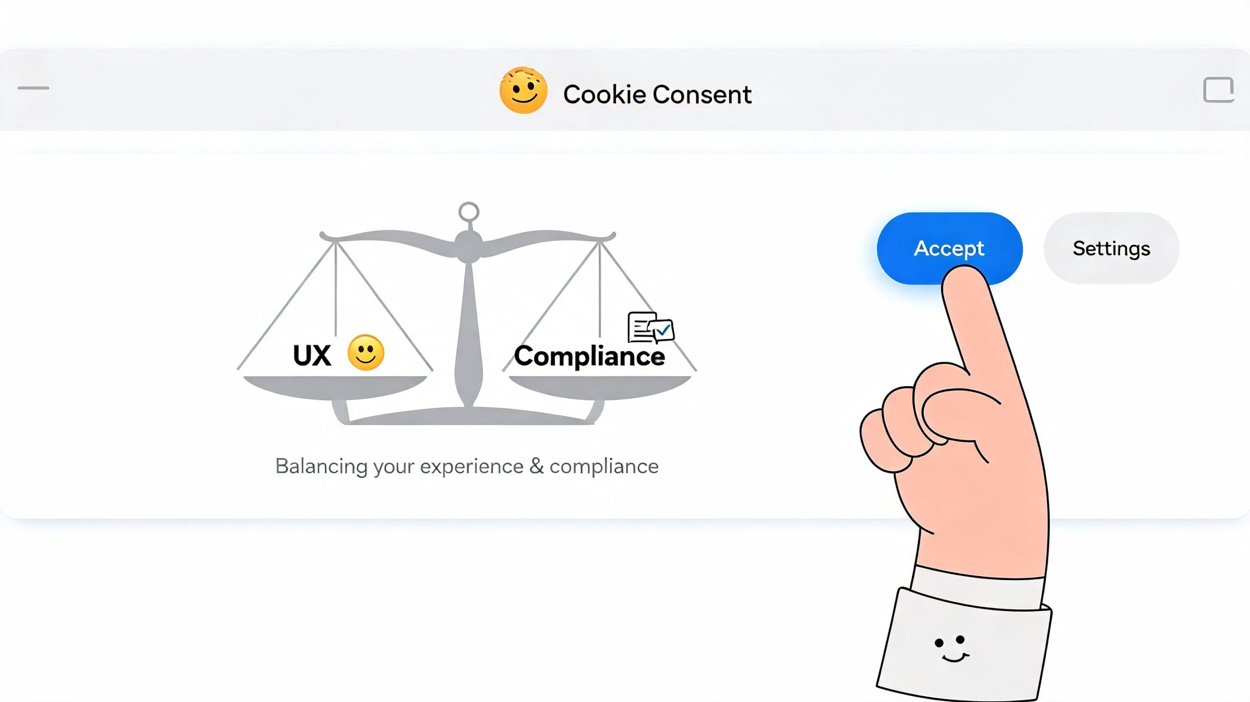
To improve customer retention, you need to nail three things: make an unforgettable first impression, use your data to understand what customers want, and build proactive, personal relationships. This means shifting focus from the expensive chase for new leads to maximizing the value of the customers you’ve already won.
This isn’t just about plugging a leaky bucket; it’s about turning your existing customer base into a powerful engine for sustainable growth.
Why Retention Is Your Most Powerful Growth Engine
The constant chase for new customers is exhausting and expensive. For too long, companies have treated retention as a defensive move. It’s time to flip that script. The most successful SaaS and ecommerce brands understand a simple truth: your existing customers are your most profitable asset.
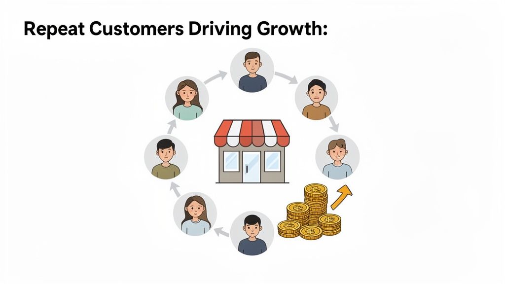
Moving from a purely acquisition-focused mindset to one that puts retention first isn’t just a nice-to-have strategy; it’s a direct path to a healthier bottom line. When you put real effort into nurturing the relationships you already have, you kickstart a flywheel of recurring revenue, invaluable feedback, and powerful brand advocacy.
The Real Numbers Behind Retention
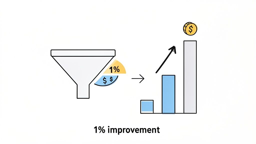
The financial impact of keeping customers around is staggering. Consider this: a tiny 5% increase in retention can boost your profits by an incredible 25-95%.
Why such a massive jump? Because loyal customers simply spend more—about 67% more than new ones, on average. When you realize that U.S. businesses lose an estimated $168 billion every year from customers walking away, retention starts to feel less like a metric and more like a critical survival strategy.
This isn’t just about preventing churn; it’s about unlocking predictable, exponential growth. Every customer you keep adds to a stable revenue stream, which is the bedrock of any scalable business—especially in the recurring-revenue world of SaaS. Our other articles on https://blog.receiverhq.com/tag/saas-growth/ offer more ways to build on this solid foundation.
The core idea is simple: it costs far more to acquire a new customer than it does to keep an existing one happy. By investing in the post-purchase experience, you’re not just saving money—you’re actively building a more resilient and profitable business.
Customer Retention Benchmarks SaaS vs Ecommerce (2026 Data)
What “good” retention looks like varies wildly by industry. Both SaaS and ecommerce businesses live and die by repeat customers, but they face different challenges and opportunities.
Here’s a quick look at how the benchmarks stack up based on recent data.
| Industry | Average Retention Rate (2026) | Key Challenge | Primary Opportunity |
|---|---|---|---|
| SaaS | 81% (annual) | Preventing “feature fatigue” and standing out in a crowded market. | Becoming indispensable by deeply integrating into the customer’s daily workflow. |
| Ecommerce | 38% (annual) | Overcoming price sensitivity and the “one-and-done” purchase mindset. | Building a strong community and creating a personalized shopping experience. |
A SaaS company’s fight is to remain essential, while an ecommerce brand’s battle is to create a connection that transcends price. The strategies that work for one won’t necessarily work for the other, which is why a tailored approach is so crucial.
From Metric to Mindset
Thinking of retention as your primary growth driver requires a fundamental shift in company culture. It’s about seeing every single interaction—from the first onboarding email to a random support ticket—as another chance to strengthen that customer relationship.
This proactive approach helps you get ahead of problems, solve issues before they become deal-breakers, and consistently prove your value. For a deeper dive into making retention your primary growth driver, explore this actionable guide to increasing customer retention.
Ultimately, this mindset fosters a loyal customer base that not only sticks around but also becomes your best marketing channel through word-of-mouth. The goal is to create fans, not just customers.
Make the First Impression Count with Killer Onboarding
You only get one chance to make a first impression. For any business, those initial moments a new customer spends with your product are absolutely critical. This is where you set the stage for the entire relationship.
A clunky, confusing, or uninspiring start will have users looking for the exit before they’ve even had a chance to see what you’re about. A smooth, rewarding onboarding experience can turn a curious newcomer into a loyal advocate for life.
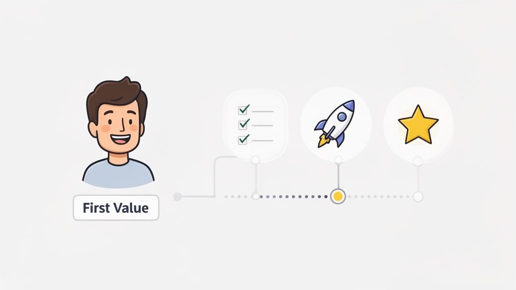
The goal isn’t to show off every feature you’ve built. It’s about getting that person to their first “aha!” moment as fast as humanly possible—that magical point where they truly get how your product makes their life better.

Find and Fast-Track the “Aha!” Moment
Before you design anything, you must define your “aha!” moment. What is the one key action that delivers the core value of your product?
- For a SaaS tool, it might be creating their first report or inviting a team member.
- For an ecommerce brand, it could be the satisfaction of a one-click checkout or the delight of unboxing a beautifully packaged order.
Once you’ve identified it, your entire onboarding flow should be a direct, guided path to that moment. Be ruthless: cut any extra steps, forms, or pop-ups that don’t serve that one specific goal.
Create a Welcome Email Series That Actually Helps
Your first email is your digital handshake. Don’t waste it on a generic “Welcome!” message. Instead, kick off a multi-day series that reinforces their decision and sets them up for success.
Actionable Welcome Series Template:
- Email 1 (Right away): Welcome them and give them one clear call to action. This CTA should lead directly toward the “aha!” moment you defined. Example: “Click here to create your first project.”
- Email 2 (Day 2): Share a quick win or a pro-tip. Show them a simple, high-value feature they can use in seconds. Example: “Did you know? You can sync your calendar in just two clicks.”
- Email 3 (Day 4): Point them toward your help center, community forums, or tutorials. This shows you have their back and builds trust.
- Email 4 (Day 7): Highlight a customer success story. Social proof helps new users see what’s possible and imagine themselves achieving similar results.
This approach makes people feel supported from day one. If you want to dive deeper into turning signups into active users, check out our other guides on conversion optimization.
The best onboarding isn’t a firehose of information. It’s a steady drip of value that takes someone from “What is this?” to “How did I ever live without this?”
Guide Them with In-App Checklists and Tooltips
While email is great for keeping in touch, the real learning happens inside your product. Forget old-school, one-size-fits-all product tours that everyone clicks through. Instead, focus on interactive guidance that helps people accomplish real tasks.
Actionable In-App Guidance Tactics:
- Onboarding Checklists: A simple checklist (e.g., “3 steps to get started”) gamifies setup. It visually shows progress and gives people a clear path to follow.
- Contextual Tooltips: Use small tooltips that pop up when a user explores a new area of your app. This delivers help at the exact moment it’s needed, not before.
- Personalized Setup: For higher-value customers, offer a 15-minute setup call. This can resolve their specific issues and build a strong connection that pays dividends down the line.
To build an experience that truly sticks, it’s worth exploring the latest customer onboarding best practices. The trick is to make your guidance feel less like a pushy salesperson and more like a helpful concierge.
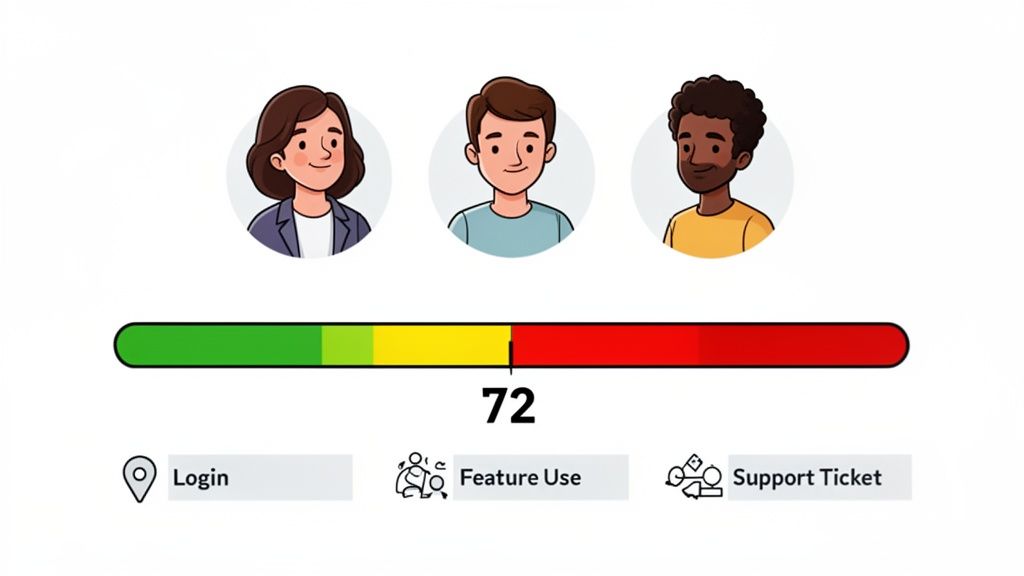
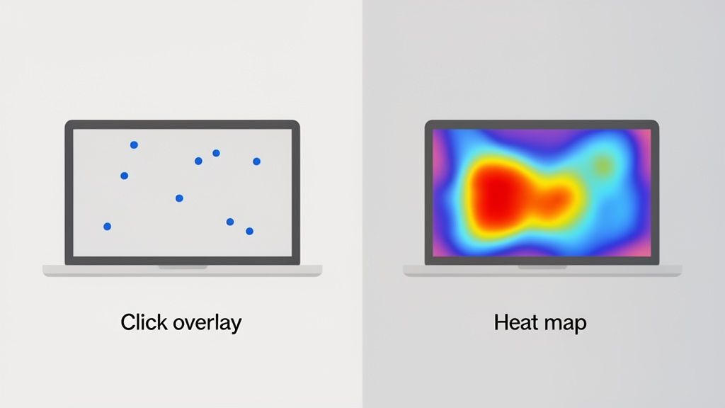
Using Customer Data to Predict and Prevent Churn
You can’t fix a problem you can’t see. Trying to boost customer retention without diving into your data is like navigating a maze blindfolded. The key isn’t just collecting data; it’s using it to spot and stop churn before it happens.
First, look past vanity metrics. Focus on the numbers that reveal the health of your customer relationships. These are the vital signs that tell you whether people are sticking around because they love what you offer or are quietly heading for the door.
Tracking the Metrics That Matter
While you could track dozens of metrics, a handful are non-negotiable for understanding retention.
Start by tracking these essentials in your analytics dashboard:
- Customer Lifetime Value (LTV): The total revenue you can expect from a single customer. A rising LTV is a clear sign your retention efforts are working.
- Customer Churn Rate: The percentage of customers who cancel or don’t renew in a given period. This is your most direct measure of attrition.
- Repeat Purchase Rate: For ecommerce, this tracks the percentage of customers who come back to buy again. It’s the clearest line between one-time shoppers and true brand fans.
By consistently monitoring these numbers, you create a baseline. From there, you can spot worrying trends early and see the direct impact of your retention strategies.
The Power of Behavioral Segmentation
The magic happens when you stop seeing customers as a single group and start segmenting them by their actions. This gives you the foresight to get ahead of problems. Imagine knowing which SaaS users haven’t logged in for 15 days, or which ecommerce shoppers haven’t opened your last three emails.
This data is your early-warning system.
The goal is to shift from reactive, “Oh no, they churned!” problem-solving to proactive, “They might churn, let’s reach out and help” engagement. Behavioral data gives you the power to intervene at just the right moment.
This approach also highlights how different business models operate. IT & Software (SaaS) companies are on track to hit an average retention rate of 77% by 2026, largely because they lean into smart onboarding and engagement. Meanwhile, transactional e-commerce is stuck at just 38%—a stark reminder of how easy it is for customers to shop elsewhere. You can learn more about these industry retention benchmarks to see how you stack up. It’s a clear signal that your retention strategy must be built for your specific business.
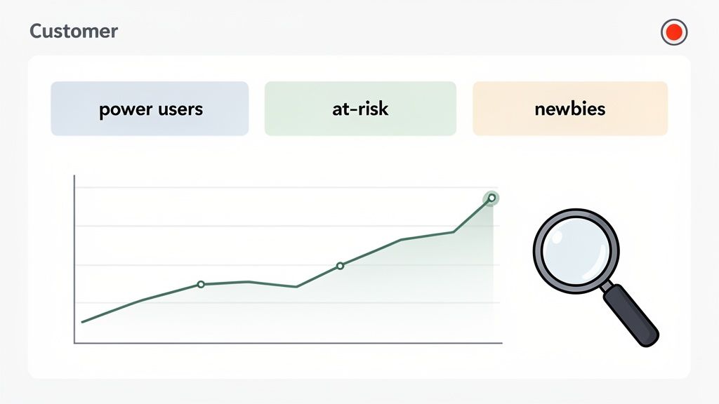
Creating Actionable Customer Cohorts
Forget generic buckets like “new customers.” You need dynamic cohorts based on what people are actually doing (or not doing). This turns abstract data into real groups you can help.
Here are three powerful segments to start with:
- Power Users: They log in daily, use advanced features, or buy regularly. Action: Grant them early access to new features or create an exclusive community to turn them into advocates.
- At-Risk Customers: Their usage has dropped, they haven’t logged in for two weeks, or they haven’t purchased in 90 days. Action: Trigger an automated, personalized outreach campaign to offer help or a special incentive.
- Newly Activated: They just finished onboarding and had their “aha!” moment. Action: Send them a follow-up email showcasing the next logical feature to use, reinforcing the product’s value.
Building a simple “customer health” dashboard to track these segments is a game-changer. It lets you see what’s happening across your customer base, so you can focus your energy, personalize your messages, and ultimately fix problems before they happen.
Shift from Reactive to Proactive Engagement
You’ve identified which customers are at risk. Now what? You can’t just watch them leave. The secret to great retention is getting ahead of the problem. This means shifting from reactive fire-fighting to proactive, personalized engagement—reaching out with the right message, at the right time, long before a customer considers leaving.
Think of retention as a conversation. With today’s tools, you can have that conversation at scale without it feeling robotic. The goal is to make every interaction feel like it was designed just for that person.
Go from Generic Blasts to Personal Nudges
The era of one-size-fits-all email blasts is over. Customers expect you to know them. A generic newsletter can’t compete with a targeted email sent to a specific segment based on their behavior.
This is where your customer cohorts pay off. By setting up automated triggers based on user actions, you can deliver personalized nudges that feel genuinely helpful.
Here are two actionable plays:
- For SaaS: A user signed up a week ago but hasn’t used a key feature. Action: Automatically send them an email with a 2-minute video tutorial explaining how that feature solves a common pain point.
- For Ecommerce: A customer who used to buy monthly hasn’t purchased in 90 days. Action: Send a friendly “we miss you” email with a small, exclusive discount and product recommendations based on their past orders.
These small, context-aware touchpoints show you’re paying attention and are invested in their success.
Use AI and Omnichannel to Deepen Connections
Personalizing engagement with technology is a proven strategy. AI-driven personalization can deliver a 10-15% increase in customer retention. AI is brilliant at sifting through data to predict what a customer needs next and delivering the perfect message at the perfect moment.
It’s not just what you say, but where you say it. Businesses with strong omnichannel strategies—where the customer experience is seamless across email, in-app messages, and social media—retain an incredible 89% of their customers. That’s a massive leap from the 33% retained by companies with disconnected channels. With 80% of enterprises planning to use AI for retention by 2026, getting on board is no longer optional. You can discover more insights about the impact of AI on customer loyalty and see just how powerful this trend is.
The takeaway here is simple: Combining proactive outreach with smart personalization is a potent formula. It creates an experience where customers feel seen and valued, and that’s the bedrock of real, lasting loyalty.
Educate and Empower Your Customers
One of the most powerful ways to build engagement is to make your customers smarter. When you provide valuable educational content, you stop being a vendor and become a trusted partner.
This deepens the relationship beyond a simple transaction. Create content that not only helps customers master your product but also helps them excel in their own jobs or lives.
Actionable Educational Content Ideas:
- SaaS Webinars: Host monthly webinars on advanced product features or broader industry best practices. Record them and create a resource library for on-demand viewing.
- Ecommerce How-To Guides: If you sell kitchen gadgets, create a blog post on “10 Recipes You Can Make With Your New Air Fryer.” This inspires them to use the product.
- Pro-Tip Email Series: Set up a short, automated email series that shares one powerful tip each week. It keeps your brand top-of-mind and delivers a steady stream of value.
This strategy helps you improve customer retention by making your brand indispensable. Customers are far less likely to leave a company that actively helps them achieve their goals.
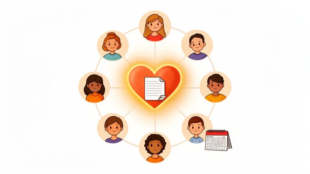
Build a Community That Creates Belonging
Never underestimate the power of community. Creating a space where customers can connect with each other—and your team—is a massive driver of loyalty. A strong community gives customers a reason to stick around that has nothing to do with price or features.
You can start small with a dedicated Slack channel, a private Facebook group, or a simple online forum. Encourage users to share successes, ask for help, and offer advice. The moment your customers start helping each other, you’ve created a self-sustaining ecosystem of support that is incredibly difficult for competitors to replicate.
Mastering Win-Back Campaigns and Learning from Churn
Let’s be real: some customers are going to leave. It happens. But what you do right after a customer churns is what separates good companies from great ones.
That moment is a critical fork in the road. You can try to win them back, and you can learn exactly why they left. Seeing churn as a growth opportunity is a game-changer for improving customer retention. Instead of treating it like a failure, think of it as your most honest feedback loop. It’s your chance to make your product and experience better for everyone.
Winning Back Customers Who’ve Slipped Away
A win-back campaign is your shot at re-engaging a customer who has canceled or stopped buying. To be effective, you must act fast with a personalized, compelling offer. A generic “please come back” email won’t move the needle.
Your approach must be tailored to why they left (if you know) and your business type.
-
For SaaS: When a user cancels, trigger an automated email offering a temporary plan upgrade or a short-term, significant discount. Actionable copy: “We’ve added [New Feature] since you’ve been gone—come see what’s new for 30 days, on us.”
-
For Ecommerce: If a loyal customer hasn’t purchased in over 90 days, they’ve likely lapsed. Action: Send a “we miss you” campaign with an exclusive discount on products related to their past purchases. This jogs their memory and makes it easy to buy again.
The most successful win-back campaigns do more than just dangle a discount. They speak directly to a potential pain point. Whether it’s the price, a missing feature, or just a period of inactivity, your offer should feel like a solution, not a desperate plea.
Why Churn Is Your Most Honest Feedback
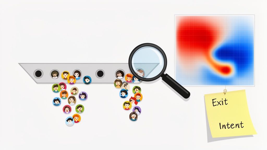
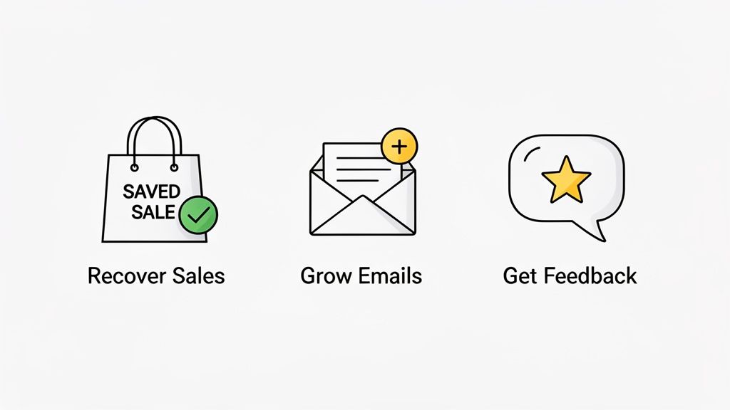
While bringing a customer back is great, the long-term goal is understanding why they left. This is where exit surveys become one of your most powerful tools.
The moment a customer cancels is your window to capture priceless, unfiltered feedback. An effective exit survey is short, simple, and automated, triggering the second a user hits “cancel.” Don’t ask a dozen questions. Just focus on the one that truly matters: “What’s the main reason you’re leaving?”
Give them multiple-choice options for easy analysis, but always include an open-text field for “Other.” That’s often where the most valuable insights are hiding.
From Feedback to Actionable Insights
Collecting feedback is just step one. The real work is digging into responses to find patterns. Are users canceling because your pricing is confusing? Is there a key feature a competitor has that you don’t? Was a recent UI change a disaster?
Bucket the feedback to identify themes:
- Price-Related Churn: Customers feel the service is too expensive.
- Feature-Related Churn: The product is missing something critical.
- Support-Related Churn: A bad experience with your support team was the last straw.
- Competitor-Related Churn: They found a cheaper or better alternative.
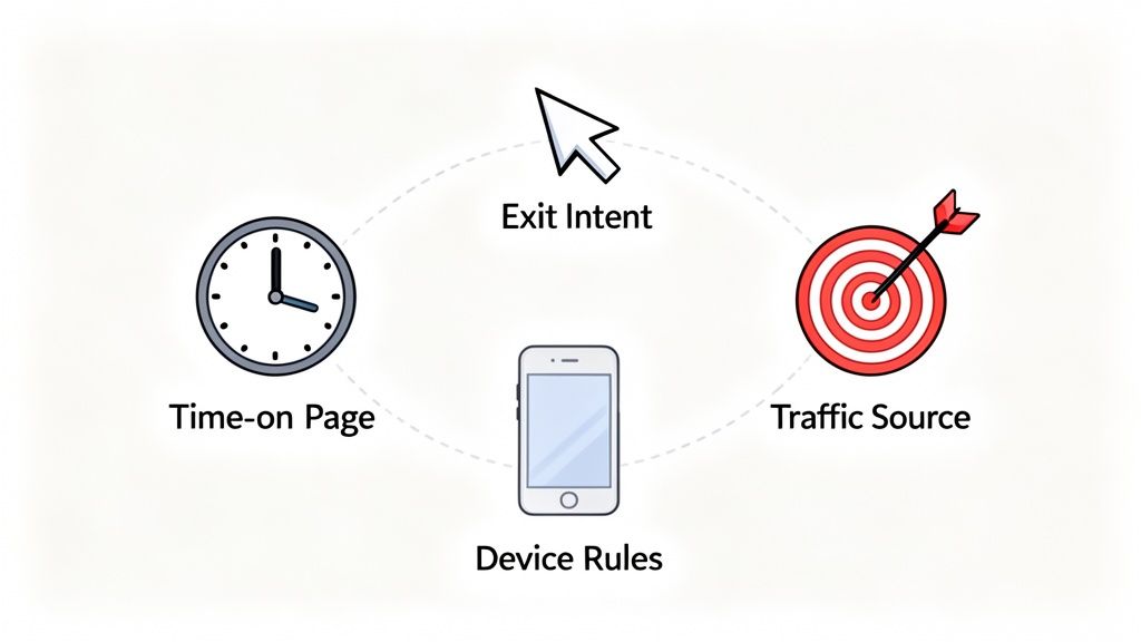
This data becomes your product roadmap. If 30% of churning users point to the same missing feature, your product team knows exactly what to prioritize. To go deeper on this, you can check out our guide on designing a high-converting exit-intent popup. By systematically finding and fixing the root causes of churn, you’re not just patching a leak; you’re strengthening the entire ship.
Your Top Questions About Improving Customer Retention, Answered
When you start digging into customer retention, a lot of questions pop up. Whether you’re running a SaaS company trying to stop revenue from leaking out the door or an ecommerce brand building a loyal following, getting clear answers is your first real step.
Here are practical, no-fluff answers to the most common questions.
What Are the Best Retention Strategies for a SaaS Business?
For a SaaS business, the game is proving your value over and over again. It’s not just about the initial sign-up; it’s about making your product indispensable.
Your first focus should be onboarding. Get new users to their “aha!” moment—where they get the core value—as fast as possible. A smooth start is everything.
From there, it’s all about proactive engagement. Here are three actionable steps:
- Drive Feature Adoption: Use in-app guides or short email drips to point users toward powerful tools they might have missed.
- Communicate Wins: When you ship a new feature, send an email or in-app message explaining what’s new, why it matters, and how to use it.
- Watch for Warning Signs: Monitor usage data. If a user’s login frequency drops, trigger a personal email offering a quick training call before they ghost you.
Finally, consider pricing structures that reward loyalty. Offering a discount for an annual prepayment is a simple but powerful way to lock in customers.
How Can an Ecommerce Store Increase Repeat Purchases?
In ecommerce, turning one-time buyers into repeat customers comes down to two things: personalization and a killer post-purchase experience. You want to make every customer feel seen and keep your brand top-of-mind long after the first package arrives.
A well-thought-out loyalty program is a great starting point. Giving customers points for purchases or exclusive access provides a tangible reason to shop with you again.
The real magic happens when you pair a great first purchase with smart, relevant follow-up. Don’t let the conversation die after the credit card is swiped.
Here are three actionable post-purchase steps:
- Send Personalized Recommendations: Use email and SMS to suggest products based on what they’ve bought or browsed before.
- Provide Proactive Shipping Updates: Send clear tracking information so they’re never left wondering where their order is.
- Create a Memorable Unboxing Experience: Add a personal touch, like a handwritten thank-you note or a small freebie, to transform a simple transaction into a real relationship.
These details show you care and make the experience worth repeating.
What Are the First Steps to Measuring Customer Retention?
If you’re flying blind, you’re just guessing. The very first thing you need to do is pick a few key metrics and track them consistently. This gives you a baseline to measure your progress.
Your north star metric is your Customer Retention Rate (CRR). It’s a simple formula to see what percentage of customers stuck around over a certain period.
CRR = [ (Customers at End of Period – New Customers Acquired) / Customers at Start of Period ] x 100
You’ll also want to track your Customer Churn Rate—the percentage of customers who left in that same period.
Finally, start tracking Customer Lifetime Value (LTV). This number tells you the total revenue you can expect from an average customer. When your LTV starts climbing, you know your retention efforts are paying off. Most payment processors and analytics tools can help you track these automatically.
How Do Exit Surveys Help Improve Customer Retention?
Exit surveys are one of the most underrated tools because they answer the single most important question: “Why are people leaving?” When someone cancels, a short, well-timed survey gives you the unvarnished truth.
This feedback is pure gold for identifying problems you didn’t know you had.
For example, you might uncover that:
- A key feature your competitors have is a deal-breaker for new users.
- Your pricing is confusing or isn’t competitive enough.
- A recent UI update is frustrating your power users.
- A single bad customer support experience was the final straw.
By looking for patterns in the feedback, you can stop guessing what’s wrong and start making targeted fixes. Fixing the root causes of churn is the fastest way to stop other customers from leaving for the same reasons.
Receiver is built to help you turn these insights into action. We bring together exit surveys, targeted “stay” offers, and attribution into one place, so you can see why customers are leaving and automatically give them the right reason to stick around. Start our Timeless Trial and see how you can convert more traffic and improve customer retention today.