
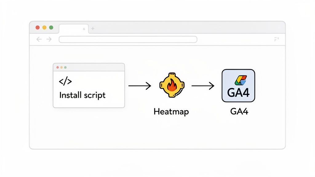
First things first, let’s get one common question out of the way: Google Analytics 4 (GA4) does not have its own built-in heat map. If you’re searching for “heat maps google analytics,” you’re really on the hunt for a third-party tool that can pull in your GA4 data and bring it to life visually.
It’s an easy mistake to make, especially if you’ve been in the digital marketing game for a while.
What Happened to Google’s Old Click Map?
Many of us remember a feature back in the Universal Analytics days called ‘In-Page Analytics.’ It was the closest thing Google ever had to a native heat map, and honestly, it was pretty basic.
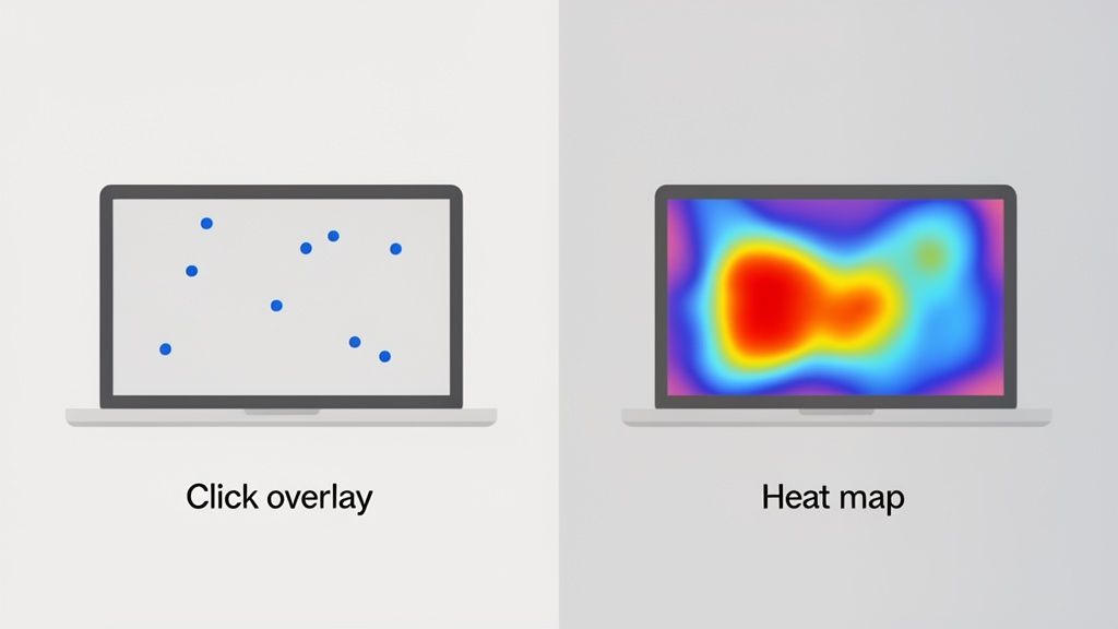
This tool would overlay your website with simple data points—usually colorful bubbles—showing the percentage of clicks on any given link. It was a decent at-a-glance view of where your traffic was heading.
But it was far from the dynamic, behavior-focused tools we rely on today.
From Basic Clicks to Rich Behavioral Insights
The old ‘In-Page Analytics’ had serious blind spots. It only tracked clicks on active links, completely missing all the other ways users interact with a page. It couldn’t tell you how far they scrolled, where their mouse hovered, or if they were getting frustrated and clicking on something that wasn’t even a button.
In the early 2010s, this was a start. You could see that a landing page had a 40-50% bounce rate and that maybe 65% of clicks went to your main ‘Sign Up’ CTA. But that’s where the story ended, leaving you with no clear next steps.
By 2017, Google deprecated the feature, and its standalone Chrome extension stopped working in 2019, leaving a big gap for GA4 users. This shift pushed marketers toward modern platforms like Receiver for real-time behavioral analytics. That change couldn’t have come at a better time, especially when you consider that studies show 70% of users never scroll past the first 2000 pixels of a page. You can dive deeper into this transition in this great guide to Google Analytics heat maps.
The difference between what Google’s old tool offered and what modern platforms provide is night and day.
In-Page Analytics vs Modern Heat Map Tools
To see just how far we’ve come, let’s compare the old ‘In-Page Analytics’ with the features you should expect from a dedicated heat mapping tool today.
| Feature | Google’s Old ‘In-Page Analytics’ | Modern Heat Map Tools (e.g., Receiver) |
|---|---|---|
| Click Tracking | Clicks on links only | Clicks on all elements (links, images, text) |
| Scroll Tracking | Not available | Visual maps showing scroll depth |
| Mouse Movement | Not available | “Move maps” tracking cursor paths and hovers |
| Rage Clicks | Not available | Identifies areas of user frustration |
| Dynamic Content | Often failed on pop-ups, menus | Tracks interactions with dynamic elements |
| Data Segmentation | Basic (e.g., by traffic source) | Advanced (by device, campaign, user behavior) |
As you can see, today’s tools aren’t just about clicks. They are built to uncover the why behind user actions.
Modern heat mapping software offers a much richer view of the user experience. You can see things like:
- Scroll Maps: Pinpoint the exact spot where most users give up and stop scrolling. Actionable Insight: If your primary CTA is below this fold, move it up.
- Move Maps: Watch where users move their cursors. This is a fantastic proxy for eye-tracking and reveals what captures their attention, even if they don’t click. Actionable Insight: If users hover over a feature but don’t click, your copy might be unclear. Test new messaging.
- Rage Clicks: Find out where users are clicking repeatedly in frustration. Actionable Insight: This is a clear signal to fix a broken link or make a non-interactive element look less like a button.
Relying solely on GA4’s quantitative data tells you what happened (e.g., a high exit rate), but a modern heat map shows you why it happened (e.g., users couldn’t find the ‘Next’ button below the fold).
That’s the crucial difference. Google Analytics is fantastic for tracking metrics, goals, and conversions. But it doesn’t give you the visual context to understand the human behavior driving those numbers.
That’s why a dedicated heat map tool has become a non-negotiable part of any serious strategy for conversion optimization. When you combine the hard numbers from GA4 with the visual, behavioral insights from a heat map, you get the full story. And that’s when you can make changes that truly move the needle.
Connecting a Heat Map Tool with Google Analytics
First things first: since Google Analytics doesn’t come with a built-in heat map, you’ll need to pair it with a specialized third-party tool. This integration is what marries the hard, quantitative data from GA4 with the visual, “why-is-this-happening” story you get from a heat map.
I like to think of it this way: GA4 hands you a detailed spreadsheet telling you what happened on your site. A great heat map tool shows you how and why it happened. When you connect them, you get the complete picture needed for action.
Choosing and Installing Your Heat Map Tool
You’ve got a ton of options out there for heat map tools. Some are laser-focused on visual analysis, while others, like our own platform Receiver, bundle heat maps with other conversion tools like exit-intent pop-ups and marketing attribution. Actionable Insight: Before you pick one, define your primary goal. Are you diagnosing UX problems or do you need a full toolkit to fix them and measure the impact?
Once you’ve made your choice, getting it installed is usually a breeze. The process will feel familiar if you’ve already set up GA4. You’ll get a small JavaScript snippet that needs to go into the <head> section of your website’s HTML, right alongside your existing GA4 tracking code.
If you’re using Google Tag Manager (and you really should be), this is even easier. You just create a new custom HTML tag, paste in the script from your heat map provider, and tell it to fire on all pages. No need to dig into your site’s code.
My two cents: Always use Google Tag Manager to install tracking scripts if you can. It keeps your website’s code clean, lets you manage everything from a single dashboard, and dramatically lowers the risk of accidentally breaking your site.
Verifying the Connection
With the script installed, the next step is to make sure it’s actually working. Most heat map tools have a simple verification process built right in. All you usually have to do is visit your own website to create some activity, and the tool’s dashboard will give you a thumbs-up once it starts receiving data.
This is also the perfect moment to double-check that the GA4 integration is enabled within your heat map tool’s settings. This connection is what lets you slice and dice your heat map data using GA4 dimensions. For instance, you could create heat maps for Google Analytics segments like “Organic Traffic from Google” or “Mobile Users” to see how different audiences behave.
This is the kind of dashboard you’ll be looking for, where you can officially link the two accounts so they can start sharing data.
Let’s run through a quick, real-world scenario. Say you’ve noticed in GA4 that your pricing page has a painfully high exit rate. Here’s how you’d set up a heat map to figure out why:
- Jump into your heat map tool’s dashboard and find the option to create a new heat map.
- Enter the URL of your pricing page as the target.
- Set the tracking period. For a busy page, a few days might be enough. For pages with less traffic, I’d suggest waiting until you hit at least 1,000-2,000 pageviews to get reliable data.
- Connect it to your GA4 data. This is where you can apply a filter to isolate behavior from a specific campaign or traffic source you’re worried about.
By doing this, you’ve gone from just knowing that people are leaving your pricing page to being able to see exactly where they lose interest, what they’re clicking (or not clicking), and what might be causing them to give up.
How to Interpret What Your Heat Maps Are Telling You
Alright, the data’s coming in and your pages are lit up with reds, yellows, and blues. But a colorful map is just a pretty picture until you learn how to read it. This is where the real work begins—turning that visual data into changes that actually improve your site.
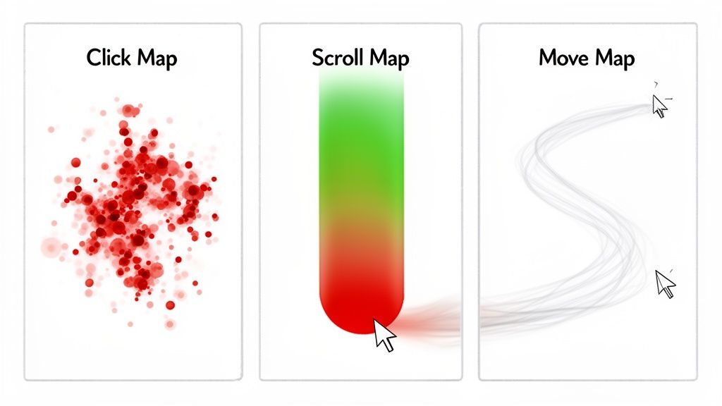
Most of what you’ll be looking at falls into three buckets: click maps, scroll maps, and move maps. Each gives you a unique window into how people really use your website.
Reading Click Maps for Hidden Opportunities
Click maps are the most intuitive—they show you exactly where people are clicking. Red and yellow “hot spots” are popular, while the cooler blue and green areas are mostly ignored. But don’t just look at the obvious.
Actionable Insight: Look for clicks on non-clickable elements. A cluster of clicks on an image, a specific phrase, or an icon is a direct request from your users. Add a link there or redesign the element to manage expectations.
Also, keep an eye out for “rage clicks.” These are frantic, repeated clicks on the same element. It’s a dead giveaway that something is broken, loading too slowly, or just not working the way a user expects. Your immediate action is to test that element and fix it.
Uncovering User Attention with Scroll Maps
Scroll maps are brilliant for understanding how much of your page people actually see. A bright red band at the top that quickly fades to blue is a massive red flag. It tells you that most visitors are leaving before they ever get to the content you’ve worked so hard on.
Actionable Insight: Look for a “false bottom”—a design element, like a full-width banner, that creates an abrupt color change and makes users think the page has ended. If your scroll map shows a sudden drop-off there, you’ve found a major design flaw to fix.
You should also pay close attention to where the “average fold” is on your map. If your primary call-to-action is sitting in a cold, blue zone, your immediate task is to test moving it higher.
Decoding Intent with Move Maps
Move maps track where users hover their mouse cursor. While it isn’t a perfect one-to-one for eye-tracking, it’s a surprisingly good indicator of what’s holding a user’s attention. People naturally drift their cursor toward what they’re reading or thinking about clicking.
Actionable Insight: Seeing a lot of hovering over a product feature or a pricing option—but very few actual clicks—often signals hesitation. Your copy might be confusing or the value proposition isn’t strong enough. Your next step is to A/B test clearer copy or add a clarifying tooltip.
By 2026, the evolution of heatmaps is moving beyond basic clicks. Modern tools synthesize hover data to reveal 25% more frustration zones and scroll behavior that shows 57% of users abandoning mid-page. In major markets, pages with low conversions often have 29% rage clicks on non-clickable elements, an issue easily fixed by moving offers into high-attention zones.
To get the full story, you can’t analyze heat maps in a vacuum. Always cross-reference your findings with other metrics. For example, if a scroll map shows a big drop-off, check that page’s bounce rate in Google Analytics to confirm if people are truly leaving the site.
This combined approach helps you connect the dots. You might find that the hesitation you see on a move map is directly contributing to your cart abandonment rate, giving you a clear path to reduce shopping cart abandonment by fixing that specific point of friction.
Alright, you’ve stared at the colorful blobs on your heat maps and know exactly where people are clicking, scrolling, and getting frustrated. Now for the fun part: turning those insights into changes that actually boost your conversions.
This is where the rubber meets the road. Data is great, but it’s what you do with it that matters. The whole point is to move from just observing user behavior to forming educated guesses—hypotheses—that you can test to improve your site. If you’re new to this, it’s worth getting a handle on what is Conversion Rate Optimization is all about, since that’s the playbook we’re following here.
From “Huh, That’s Weird” to “What If We…”
Every odd pattern on your heat map is a clue. Think of it less as a problem and more as a question your users are asking you. That angry red spot on a non-clickable image? That’s a user screaming, “Hey, I thought this did something!”
Let’s turn common heat map findings into actionable hypotheses:
Observation: Your scroll map shows 80% of visitors never see the CTA at the bottom of the page.
Hypothesis: If we move the primary CTA above the fold, then we will increase clicks because more users will see it.
Observation: Your click map reveals many clicks on company logos in your “Our Clients” section, but the logos aren’t linked.
Hypothesis: If we link each logo to a relevant case study, then we can provide social proof and increase user engagement.
You’ll probably come up with a dozen or more ideas like this. Don’t get overwhelmed.
Picking Your Battles: Prioritizing CRO Tasks
You can’t do everything at once, so you need a system to decide what to tackle first. I always come back to two simple factors: impact and effort.
A high-impact, low-effort fix should always be at the top of your list. For example, if your heat map shows people are rage-clicking a broken “Add to Cart” button, that’s an all-hands-on-deck emergency. Fix it now.
On the other hand, a complete homepage redesign might have a huge impact, but the effort involved is massive. That’s something you plan for, not rush into.
The global adoption of Google Analytics highlights a massive demand for visual insights. With GA4 lacking native heat maps, many teams struggle with high bounce rates, especially when eye-tracking studies show visitors ignore 80% of page content. Data from extensions show that even on pages with 50,000 monthly sessions, only 12% of clicks reach ‘Start Trial’ buttons, correlating with low conversion rates. By using heat maps to identify these issues, marketers can replicate successes from top-performing pages where moving a CTA above the fold lifted conversions by 28%. You can learn more about these findings on Google Analytics heat maps.
To help you connect the dots, I’ve put together a quick reference table. It’s designed to help you translate what you’re seeing on your heat maps into concrete actions you can take right away.
Common Heat Map Findings and Actionable Solutions
| Observation | Potential Problem | Actionable Next Step |
|---|---|---|
| Clicks on non-linked images or text. | Users expect more information or a link. | Add a link to a relevant page or expand the content. |
| Significant drop-off on a scroll map. | Content is boring, or the value isn’t clear. | Move key CTAs higher or add more engaging visuals. |
| “Rage clicks” on a form or button. | The element is broken, slow, or confusing. | Test the element for technical errors or UX friction. |
| No clicks on the primary CTA. | The CTA is poorly placed, worded, or designed. | A/B test a new location, color, or copy for the button. |
| Hesitation or random clicks on a page. | Users are confused or can’t find what they need. | Review the page hierarchy and navigation clarity. |
This table is just a starting point, but it covers some of the most common issues you’ll likely uncover. Use it to build your initial list of hypotheses.
Put Your Theories to the Test
Once you have a prioritized hypothesis, it’s time to see if you’re right. This is where A/B testing comes in. It’s the scientific method for marketers.
For each idea, you’ll create a new version of the page (the “variant”) and run it against the original page (the “control”).
Let’s go back to our example of the unseen CTA:
- Control (A): The original page with the CTA at the very bottom.
- Variant (B): Your new and improved page with the CTA moved above the fold.
You’ll use an A/B testing tool to split your traffic between these two versions and measure which one gets more conversions. Once you have a statistically significant winner—meaning the results aren’t just a fluke—you can confidently roll out the change.
And just like that, you’ve turned a colorful splotch on a heat map into a data-driven decision that improves your bottom line. Once you’ve optimized the on-page experience, you can also think about winning back users who are about to leave with our guide on creating an effective exit-intent popup.
Integrating Heat Maps with Your Full Analytics Stack
Heat maps are fantastic, but they don’t tell you the whole story. On their own, they’re just one piece of a much larger puzzle. The real breakthroughs happen when you start combining that visual data with the other analytics tools you’re already using. This is how you move from just reacting to numbers to actually understanding the people behind them and driving real growth.
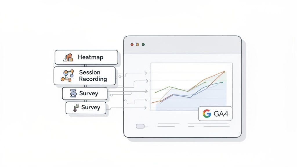
When you start layering heat maps for Google Analytics data with other insights, you finally get the full picture. Think of it like going from a flat, 2D map of your website to a full-blown 3D model of your user’s experience. This is how you uncover not just what your users are doing, but the all-important why behind their actions.
Beyond Clicks and Scrolls
While a heat map gives you a brilliant aggregate view of where people click and scroll, other tools provide the missing context. Once you start combining them, you can tackle much more complex questions about user behavior.
Session Recordings: Let’s say your scroll map shows a huge 70% drop-off right above the fold. That’s the “what.” By watching a few session recordings for that page, you can see the “why.” Actionable Insight: If users are immediately distracted by a chat pop-up or a slow-loading element, you’ve found your culprit.
Exit-Intent Surveys: Your click map shows the pricing table is a “cold” blue zone with almost no interaction. To find out why, you could set up an exit-intent survey that triggers on that page. Actionable Insight: Ask, “What’s stopping you from signing up today?” to get direct feedback. You might discover your pricing is unclear or a key feature is missing.
Performance Data: Imagine a move map showing chaotic, random mouse movements—a classic sign of confusion. By cross-referencing this with GA4, you might find this behavior is happening almost exclusively with users from a specific marketing campaign. Actionable Insight: This signals a mismatch between your ad copy and your landing page content. Rewrite one or the other to align expectations.
Building a Proactive Analytics Engine
When you integrate these tools, your analytics setup transforms from a simple reporting dashboard into a proactive engine for improving your site. Instead of just looking at historical data, you’re actively hunting for opportunities.
Here’s a practical workflow I’ve used countless times to connect the dots between heat maps, Google Analytics, and other behavioral data:
- Start with the “What” in GA4: Find a page with a high exit rate in GA4. For example, your
/featurespage has an 80% exit rate. - Investigate the “Where” with Heat Maps: Run a scroll map on the
/featurespage. You discover only 20% of users scroll past the first hero image. - Uncover the “Why” with Session Recordings: Watch recordings of users who left from that page. You see them repeatedly trying to click on a non-interactive icon in the hero image and then leaving in frustration.
- Confirm with Direct Feedback: Deploy an exit-intent survey asking, “What information were you looking for?” The responses are clear: “I wanted to see pricing” or “I couldn’t find the demo video.”
By layering your analytics, you’ve turned a vague problem (“high exit rate”) into a crystal-clear, actionable directive: “We need to make the hero image icon clickable and add a prominent ‘View Pricing’ button above the fold.”
This multi-tool approach gives you a complete narrative. You move beyond simple observations and start building a rich, evidence-based understanding of the entire user experience. This holistic view is what truly separates good conversion rate optimization from great CRO.
Common Questions I Hear About Heat Maps
When you’re diving into heat maps and Google Analytics, a few questions always pop up. It’s completely normal—you’re trying to connect the dots between what users do and what the data says. Let’s tackle some of the most common ones I hear from founders and marketers.
Can I Just Get a Heat Map Inside Google Analytics 4?
I wish I could say yes, but the short answer is no. Google Analytics 4 (GA4) doesn’t have a native, built-in heat map feature.
The old ‘In-Page Analytics’ Chrome extension from the Universal Analytics days is long gone and won’t work with GA4. Your actionable next step is to select a third-party tool. The good news is that these tools often connect to GA4, letting you filter your heat map data with all the rich segments you’ve already built, like traffic sources or conversion events.
How Much Traffic Do I Actually Need for a Heat Map to Be Useful?
This is a great question. While you can technically start collecting data from your very first visitor, you won’t get actionable insights until you have a decent sample size.
A good rule of thumb is to aim for at least 1,000-2,000 pageviews for each specific page you want to analyze. If you’re looking at a lower-traffic page, that just means you’ll need to run your heat map for a longer period. The whole point is to gather enough data to spot real trends, not just react to the random clicks of a few stray visitors.
Are Heat Maps and A/B Testing the Same Thing?
Not at all, but they are a powerhouse combination. Thinking one replaces the other is a common misconception. They serve two very different, but equally important, roles.
Heat maps are for discovery (finding the “why”). They show you where people are clicking, scrolling, and getting stuck. This is how you generate hypotheses for what to change. For example, “I see no one is clicking our CTA, maybe it’s the color.”
A/B testing is for validation (proving the “what if”). It takes that hypothesis and tests it scientifically. You create a variant page with a different button color and run it against the original to see which one actually improves conversions.
Use heat maps for insights and A/B testing for proof. This combination is the foundation of a strong conversion rate optimization strategy.
By following this process, you stop guessing and start making data-backed improvements. You’re turning behavioral observations into measurable wins for your business.
Ready to see who’s ready to buy and why others leave? With Receiver, you can unify intent scoring, exit surveys, and attribution in a single dashboard to convert more of the traffic you already have. Get started with Receiver today.