Want to get more conversions from your landing pages? Forget guesswork and random button color changes. Effective landing page conversion rate optimization is a disciplined cycle: analyze what users are actually doing, form an educated hypothesis about why, and test your ideas to turn more traffic into customers.
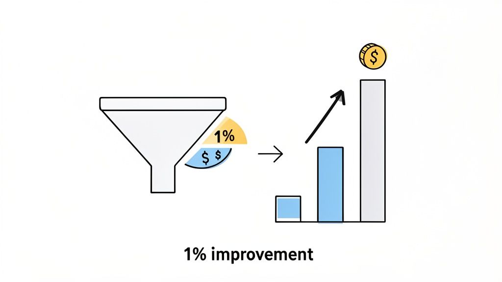
This isn’t just about tweaking your marketing—it’s about making your marketing budget work smarter, not harder. By implementing a clear process, you can systematically increase your ROI.
Setting the Stage for Higher Conversions
Before you touch a single headline, you must know your target. A successful optimization strategy begins by defining what a “win” looks like for your business. Don’t aim for fuzzy goals like “more engagement.” Your targets must be specific, measurable outcomes tied directly to revenue. Without this clarity, any A/B test is a shot in the dark. A methodical, data-backed process will always beat throwing spaghetti at the wall.
Define Your Primary and Secondary Goals
Every landing page needs one primary job. It’s also smart to track smaller wins—secondary goals—from visitors who aren’t ready to commit just yet. Here’s how to define them:
- Primary Goal (Macro-Conversion): This is the main action the page is designed to drive. For a SaaS company, this is a demo request or free trial signup. For an ecommerce store, it’s a completed purchase. Be specific.
- Secondary Goal (Micro-Conversion): These are smaller actions that indicate interest and build your audience. Actionable examples include signing up for a newsletter, downloading a lead magnet, or adding a product to a wishlist.
Distinguishing between these helps you see the full picture. A newsletter signup may not be a sale today, but it’s a lead you can nurture into a customer tomorrow. For a deep dive into ecommerce-specific tactics, this Ultimate Shopify Conversion Rate Optimization Guide is packed with proven strategies.
Identify Your Core KPIs
With your goals defined, select the right Key Performance Indicators (KPIs) to measure success. These numbers tell the true story of your optimization efforts, moving you beyond vanity metrics.
What’s a good conversion rate, anyway? Across all industries, the average landing page converts between 6.6% and 10.76%. But top performers know their industry’s benchmark and aim higher. For instance, a well-tuned B2B SaaS page can push past 15%, while ecommerce often sits in the 4-7% range.
Here are the essential KPIs you must track:
- Conversion Rate: Your north star metric. It’s the percentage of visitors who complete your primary goal. (Conversions / Total Visitors) * 100.
- Cost Per Acquisition (CPA): How much you spend to acquire one new customer. Effective landing page conversion rate optimization directly lowers this number, boosting profitability.
- Average Order Value (AOV): An ecommerce essential. A successful test shouldn’t just increase conversions; it might also persuade customers to spend more per transaction.
By setting clear goals and focusing on these core KPIs, you build a solid foundation for every experiment you run. We cover more practical strategies and deep dives on our own blog at https://blog.receiverhq.com/, tackling everything from attribution to decoding user behavior.
How to Find Where Your Landing Page Is Leaking Money

Think of your landing page as a bucket. You’re pouring traffic in, but holes cause you to lose customers before they convert. Your job is to find and plug those leaks. The most effective way to do this is by combining two types of data: quantitative (the ‘what’) and qualitative (the ‘why’). One tells you where the problem is; the other tells you what’s causing it. You need both to make changes that work.
Your Conversion Diagnostics Toolkit
Before diving into methods, here is your cheat sheet for diagnosing any landing page problem. Use this to move from staring at data to understanding user intent.
| Tool Type | What It Tells You (The ‘What’ vs. ‘Why’) | Actionable Insight Example | Recommended Tool or Method |
|---|---|---|---|
| Web Analytics | The ‘What’: Hard data on traffic, bounce rates, and funnel drop-offs. | “Our checkout page has a 75% exit rate. We need to investigate friction on that specific page.” | Google Analytics, Adobe Analytics |
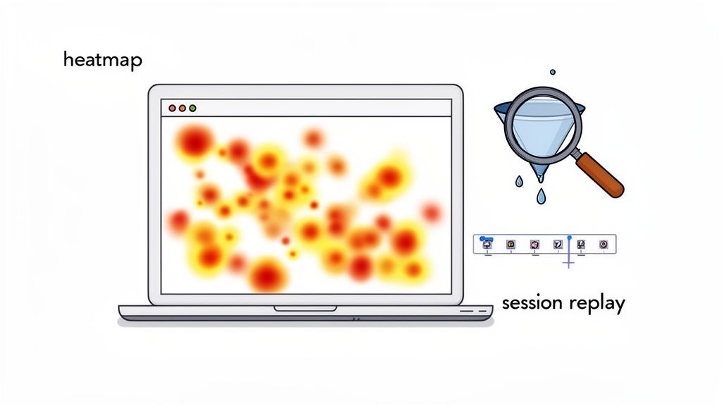
| Behavior Analytics | The ‘Why’: Visual proof of user behavior and frustration points. | “Heatmaps show 30% of users are clicking a non-linked image. We need to link it or redesign.” | Hotjar, FullStory, Microsoft Clarity |
| User Feedback | The ‘Why’: Direct, honest feedback straight from your visitors. | “An exit-intent survey revealed users are abandoning carts because of unexpected shipping costs.” | Exit-intent pop-ups, on-page surveys |
| Usability Testing | The ‘Why’: Observed insights from real people trying to use your page. | “Watching a user test, we saw 3 of 5 participants fail to find pricing details in a dropdown menu.” | Maze, UserTesting.com, manual sessions |
Using a mix of these tools is how you go from guessing what’s wrong to knowing exactly what to fix.
Start with Analytics to Find the Crime Scene
Your first stop is your analytics platform, like Google Analytics. Don’t get lost in vanity metrics. Look for these specific red flags:
- High Exit Rates on Key Pages: If a page is meant to be a step in the journey but is where most users leave, you’ve found a leak. A high exit rate on a pricing page signals that your value isn’t clear or the price is a shock.
- Steep Funnel Drop-offs: Analyze your conversion funnel. If 80% of users add a product to their cart but only 20% start checkout, the problem is on the cart page. That’s your starting point.
These numbers tell you where to dig. Now you need to find out why.
A critical action: Segment your traffic. A visitor from a cold Facebook ad behaves differently than one from your email list. Analyze behavior by traffic source. Often, a “leak” is just a disconnect between your ad’s promise and the landing page’s content.
Watch What Your Users Actually Do
Behavior analytics tools are your secret weapon for understanding the “why” behind the numbers. Here’s how to use them for actionable insights:
- Heatmaps: See exactly where people click. If users are clicking a non-clickable image, that’s a dead end creating frustration. Your action item is to either make it clickable or redesign the element.
- Scroll Maps: Find out how far down the page users scroll. If your primary CTA is below the point where 90% of visitors drop off, your problem isn’t the CTA’s copy—it’s its placement. Move it higher.
- Session Recordings: Watch recordings of actual user visits. You’ll see their mouse movements, where they hesitate, and what they rage-click. Watching just five recordings will give you more actionable ideas than hours of spreadsheet analysis.
These tools bridge the gap between your data and reality. To get even deeper and validate what you’re seeing, it’s a great idea to conduct usability testing.
When in Doubt, Just Ask Them
Sometimes the most direct approach is best. Instead of guessing why visitors leave, ask them. An exit-intent survey is the perfect tool for this. As a visitor is about to leave, a pop-up can ask a single, powerful question: “Quick question: what stopped you from signing up today?”
The answers are pure gold. They’ll pinpoint everything from confusing pricing and missing features to trust issues or technical glitches. We built our SurveyPilot feature at Receiver for this very reason, as it helps teams get ahead of churn by understanding the “why” in the moment.
Building Your Optimization Roadmap
After your detective work, you’ll have a long list of potential fixes. The biggest mistake teams make is trying to tackle everything at once, leading to inconclusive results and burnout. The key to effective landing page optimization isn’t just finding problems; it’s knowing which problem to solve first. Don’t just make a to-do list—build a strategic roadmap.
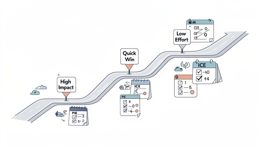
From Ideas to Impact with Prioritization Frameworks
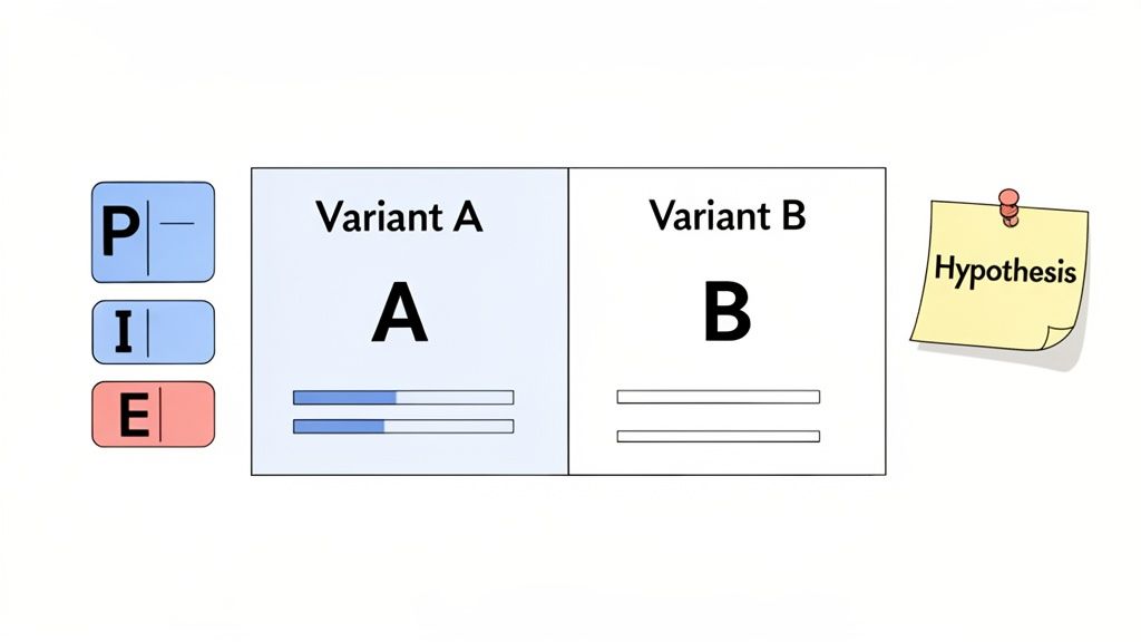
You don’t need a complex system. Use a simple framework like PIE or ICE to bring logic to the chaos. These are quick mental models, not burdensome spreadsheets.
- The PIE Framework: Score each idea from 1 to 10 on three criteria: Potential (how much improvement can it drive?), Importance (how valuable is the traffic to this page?), and Ease (how simple is it to implement?).
- The ICE Framework: A popular alternative using Impact, Confidence, and Ease. The “Confidence” score is key—it forces you to be honest about how certain you are an idea will work based on the data you have.
Average the scores for each idea. The ones with the highest numbers become your top priorities, turning a messy list into an actionable plan.
The SaaS Company Showdown: A Real-World Scenario
Let’s walk through an example. A SaaS company has identified three optimization ideas from its research:
- Test a new headline on the homepage.
- Shorten the signup form from six fields to three.
- Add a video testimonial near the primary CTA.
Without a framework, this is a debate waiting to happen. Let’s apply the ICE framework to get clarity.
Prioritization is your defense against ‘shiny object syndrome’. It forces you to justify every experiment with data and logic, not just excitement. A simple scoring system ensures you’re always working on the highest-leverage task, which is the core of smart landing page conversion rate optimization.
We’ll score each idea on a scale of 1-10 (10 being the best).
| Idea | Impact (How big is the potential win?) | Confidence (How sure are we this will work?) | Ease (How hard is it to implement?) | ICE Score (Average) |
|---|---|---|---|---|
| New Headline | 8 | 6 | 9 | 7.7 |
| Shorten Form | 9 | 9 | 5 | 7.7 |
| Video Testimonial | 7 | 5 | 2 | 4.7 |
Suddenly, the path forward is clearer.
Making the Call: How to Read the Scores
The video testimonial, despite sounding good, drops to the bottom. Its potential Impact is decent (7), but Confidence is low (5) because there’s no hard data suggesting it’s a major blocker for users. The killer is the Ease score of 2—producing a quality video is time-consuming and expensive. Put this idea on the back burner.
Now, we have a tie between the headline and the form test, both at 7.7. This is where context matters.
- The Headline Test: High potential impact, but only moderate confidence (a 6). However, its Ease score is 9. This is a classic “quick win” you can launch in an afternoon.
- The Form Test: This feels like a sure thing. The Impact is massive (9), and confidence is high (9) based on session recordings showing user hesitation. The catch is the implementation Ease is a 5, as it requires developer time.
The actionable plan: Start the headline test immediately. It’s fast, low-risk, and you’ll start learning this week. While that experiment runs, have your developers begin scoping the more complex form-shortening project. This way, you’re always testing, always learning, and keeping the optimization engine running.
Time to Experiment: High-Impact Tests You Can Run Today
You’ve analyzed the data and prioritized your ideas. Now it’s time to run controlled experiments to see what actually moves the needle. Here are some actionable “recipes” for high-impact tests that work across SaaS and ecommerce, each built around a clear hypothesis and key metrics.
The Power of Words: Headline and Copy Tests
Your headline has one job: convince visitors to stay longer than three seconds. If it’s weak, they’ll bounce.
Consider an ecommerce store selling sustainable coffee. A headline like “High-Quality Coffee Beans” is accurate but forgettable. A better approach is to test a benefit-driven alternative.
Hypothesis: Changing the headline to “Taste the Difference, Support the Planet” will create a stronger emotional connection and increase ‘Add to Cart’ clicks.
Action: Run an A/B test showing the original headline to 50% of your traffic and the new one to the other 50%.
Metrics to Watch: Primarily, the click-through rate on your CTA. Also, monitor bounce rate—a better headline should keep more people engaged on the page.
Apply this logic to all your copy. Replace jargon with language that speaks directly to your customer’s problems, and test the impact.
Fine-Tuning Your Call-to-Action
Your call-to-action (CTA) is the finish line. Small tweaks to wording, color, or placement can produce significant wins. For a SaaS business, a common test is “Start Free Trial” vs. “Request a Demo.” These aren’t just words; they appeal to different user mindsets. “Start Free Trial” is for self-starters, while “Request a Demo” is for higher-intent leads ready to talk to sales.
CTA Test Idea for a SaaS Business:
- Hypothesis: Switching the CTA from “Request a Demo” to “Start Free Trial” will increase sign-ups by lowering the commitment.
- The Test: Run an A/B test with the two CTAs on your homepage or pricing page.
- Metrics: Track the submission rate on the form. Critically, you must also track the lead-to-customer conversion rate over the next 30 days. You might get more sign-ups, but you need to know if they become paying customers.
Testing your CTA isn’t just about the words. An experiment where a company changed its button color from green to red saw a 21% increase in conversions. While you shouldn’t just copy that, it proves that visual contrast is a powerful variable worth testing.
Rethinking Your Core Offer
Sometimes, the weak link isn’t the page—it’s the offer itself. No amount of slick design can fix an offer your audience doesn’t value. Testing your core value proposition is one of the most powerful levers you can pull.
For an ecommerce brand, consider what is more enticing:
- Offer A: A 15% discount on the entire order.
- Offer B: Free shipping on all orders.
Unexpected costs, especially shipping, are a leading cause of cart abandonment. This makes “Free Shipping” a fantastic offer to test.
Ecommerce Offer Test Idea:
- Hypothesis: Offering “Free Shipping” will convert more customers than a “15% Off” discount by eliminating a major psychological barrier at checkout.
- The Test: Use a tool to show one offer to 50% of visitors and the second offer to the other 50%.
- Metrics: Monitor your overall conversion rate, but also pay close attention to Average Order Value (AOV). The discount might drive more sales, but free shipping could encourage people to add more to their cart, pushing AOV higher.
The same principle applies to B2B lead magnets. Is a long ebook outperforming a simple, one-page checklist? You won’t know until you test it.
Optimizing Design and Trust Signals
Great design guides the eye and builds confidence. A cluttered page is a conversion killer. Notice how our own landing page at Receiver uses clean design, whitespace, and clear visual hierarchy to build immediate trust.
A simple but powerful experiment is to test the placement of trust signals like customer logos or testimonials.
- Hypothesis: Moving customer logos from the bottom of the page to just below the main hero section will build trust earlier and increase CTA clicks.
- The Test: Create a new page variant with the logos moved “above the fold” and run it against your current version.
- Metrics: Track your primary conversion goal (e.g., demo requests). Also, check scroll maps in a tool like Hotjar to see if placing trust signals higher encourages more users to scroll down the page.
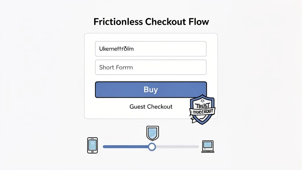
Finally, audit your forms. Reducing the number of fields is a proven optimization tactic. If you’re asking for a phone number you don’t actually need, you are losing sign-ups. Test a shorter version.
Turning Test Results Into Lasting Wins
Declaring an A/B test winner isn’t the finish line; it’s the start of the next lap. A successful experiment delivers more than a higher conversion rate—it provides a powerful insight. The real magic happens when you leverage that single win into a lasting advantage for your entire business. Don’t just push the winning version live and move on. The most successful teams know the work begins after the test concludes.
First, Make Sure the Win Is Real
Before making any change permanent, ensure the result isn’t a fluke. A costly mistake is calling a test too early. A weekend surge or a random traffic spike can easily mislead you.
To avoid this trap, follow these two rules:
- Run for Full Business Cycles: Let your test run for at least one to two full weeks. This is non-negotiable and smooths out daily anomalies.
- Hit Statistical Significance: Your test must reach a confidence level of at least 95%. This confirms the result is due to your changes, not random chance.
Don’t just look at the primary conversion goal. I’ve seen teams get burned by this. A new, aggressive headline might boost sign-ups by 10%, but if you dig into the data and find those new users have a 20% lower customer lifetime value (LTV), was it really a win? Always check the impact on your secondary metrics and the actual bottom line.
For example, if a simplified signup form boosts free trial signups, you must ask the next question: did these new users convert to paid plans at the same rate? Or did you just attract tire-kickers?
Dig Into the “Why” Behind the “What”
Once a winner is confirmed, the real learning begins. Your goal isn’t just to note “Variant B won.” It’s to understand why. This is the insight you’ll carry into all future campaigns.
Create a simple report or an entry in a shared knowledge base for every test, answering these questions:
- What was our hypothesis? (“We believed changing the CTA to ‘Explore the Platform’ would increase clicks because our audience seems wary of high-commitment actions.”)
- What actually happened? (“Variant B, with the new CTA, increased clicks by 18% with 98% confidence.”)
- What did we learn from this? (“Our target persona on this page responds better to low-pressure, exploratory language than direct sales language.”)
This process creates an invaluable playbook. The next time you build a page for this audience, you’ll start with copy that emphasizes exploration, leveraging past wins to inform future strategy.
Scale Your Learnings Across the Board
A winning insight shouldn’t live on a single page. The final, crucial step is to scale what you’ve learned across other relevant marketing assets. This is how you achieve compounding returns.
Brainstorm other pages or channels where the same user psychology might apply. If adding customer logos below the hero section drove more conversions, ask yourself:
- Other Landing Pages: Can we apply this trust-building layout to our other paid search or social media landing pages?
- Key Website Pages: Should we add the same logo bar to our main pricing or features pages to reduce friction?
- Email Campaigns: Can we weave similar social proof into our onboarding sequence to reinforce a new user’s decision?
By methodically rolling out the winning concept, you amplify the impact of your initial discovery. This framework transforms one-off A/B tests from a tactical chore into a powerful engine for strategic growth.
Clearing Up the Big Questions About Landing Page Optimization
Even with a solid plan, questions will arise. Landing page optimization is full of “it depends” scenarios. Here are straight answers to some of the most common questions, based on in-the-trenches experience.
How Long Should I Run an A/B Test?
This is critical. Getting this wrong is the most common reason A/B tests fail. The biggest mistake is stopping a test the moment one variation pulls ahead.
Actionable Rule: Run tests for a minimum of one to two full weeks to account for daily and weekly fluctuations in traffic behavior.
The goal is to collect enough data for confidence. Aim for 95% statistical significance and, as a rule of thumb, at least 100 conversions per variation. Use an A/B test calculator before you start to estimate the required traffic and time. Otherwise, you’re just acting on noise.
What Is a Good Landing Page Conversion Rate?
Everyone wants a magic number, but the answer is always relative. Industry benchmarks hover around 2% to 5%, but comparing yourself to an average is a distraction. A landing page for a branded search term should convert much higher than one for cold traffic from a social ad. Their intent levels are completely different.
Actionable Goal: Instead of chasing a generic number, focus on improving your own baseline. A healthier target is a 10-20% increase over your current conversion rate each quarter. This creates consistent, internal momentum.
Should I Focus on a Big Redesign or Small Tweaks?
This depends entirely on your starting point.
- When to Redesign (Radical Testing): If your page is converting at a very low rate (e.g., under 1%), small tweaks won’t fix it. The problem is fundamental—likely a mismatch between your offer, message, and audience. A radical redesign that rethinks the entire page is your best shot at a breakthrough.
- When to Tweak (Iterative Testing): If your page is already performing reasonably well (e.g., 5% or higher), small, iterative tests are your best path forward. This is where you fine-tune by testing headlines, CTAs, social proof, and form fields to achieve clear, compounding wins.
What if I Don’t Have Enough Traffic for A/B Testing?
Low traffic doesn’t prevent optimization; it just changes your strategy. Shift from quantitative A/B testing to qualitative analysis to gather deep insights.
Here’s your low-traffic optimization action plan:
- Run User Tests: Watch 5 real users attempt a task on your page. You will uncover glaring points of confusion that analytics can’t show you.
- Deploy On-Page Surveys: Use exit-intent surveys to ask direct questions like, “What’s the one thing preventing you from signing up today?” The answers are a goldmine of actionable feedback.
- Watch Session Recordings: Use tools to see where users get stuck, hesitate, or click on non-clickable elements. This provides powerful directional feedback for making smarter changes without needing statistical significance.
These qualitative methods will provide you with strong hypotheses to implement and improve your page, even without the numbers for a traditional A/B test.
Ready to stop guessing what works and start understanding why your visitors convert? Receiver unifies user behavior insights, targeted surveys, and powerful attribution into a single dashboard. See who’s ready to buy, discover why others leave, and trigger smart offers to win them back—all in real time. Start your Timeless Trial and see the value for yourself at https://receiverhq.com.