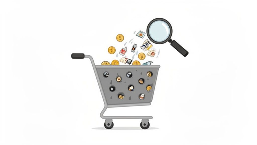
You already know the frustrating version of this story. Traffic is coming in. Product pages get visits. Pricing pages get attention. Blog posts rank. But conversions stay flat, and every popup idea feels risky because you’ve seen so many bad ones.
That’s usually where teams get stuck. They treat popups as a design element instead of a conversion system. If you want to know how to do pop ups well, start with a simpler question: what job is this popup supposed to do, for this visitor, at this moment?
That shift changes everything. Good popups don’t interrupt randomly. They intervene with a relevant ask when the visitor shows intent. That’s why some popups feel spammy and others feel useful.
Why Most Website Popups Fail (And How Yours Won’t)
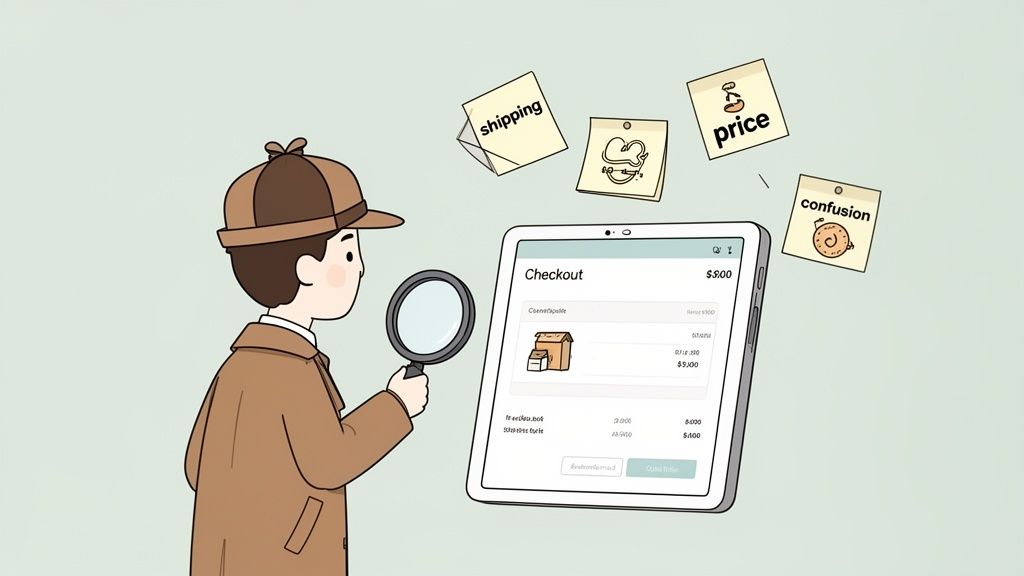
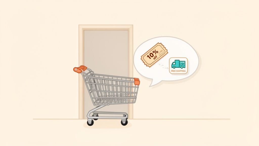
A visitor is reading a high-intent blog post. Ten seconds in, a full-screen email form blocks the page. On a product page, a first-time shopper gets a discount before they have picked a size or viewed shipping. On a SaaS pricing page, a buyer who is clearly comparing plans gets asked to “subscribe for updates.”
That is how teams train visitors to close popups on reflex.
The failure usually starts earlier than design. The popup has no defined job, so the ask shows up at the wrong time, for the wrong person, with the wrong message. A popup built for lead capture behaves very differently from one built for cart recovery or objection capture. If those jobs get mixed together, conversion rates drop and the page experience gets worse.
I treat popup performance as a relevance problem first, and a creative problem second.
Interruption vs. useful timing
Visitors will tolerate a popup that helps them finish what they already came to do. They reject one that forces an unrelated decision.
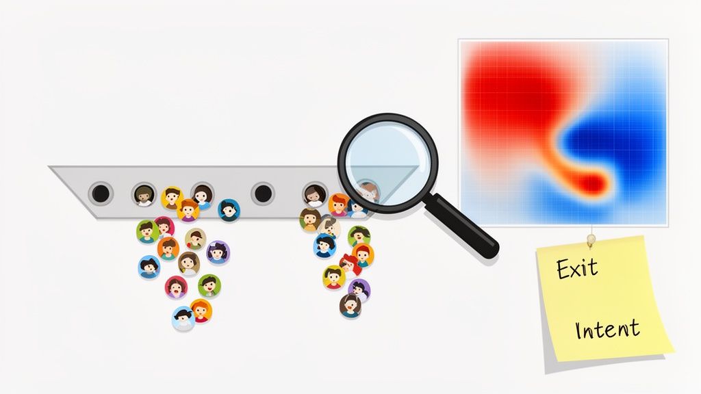
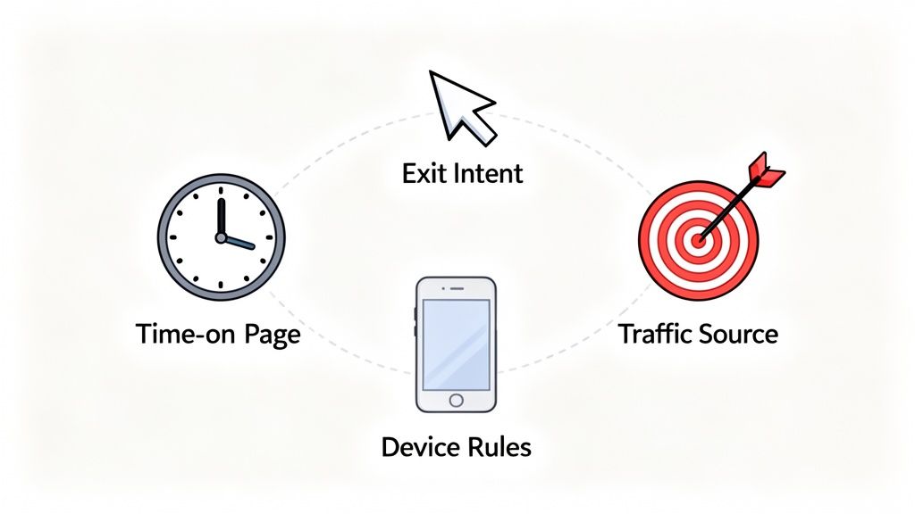
Useful timing comes from behavior. Someone reads 60% of a SaaS comparison article and sees a demo CTA. A shopper adds to cart, hesitates on checkout, and gets a shipping incentive. A pricing-page visitor moves toward the browser bar, and you trigger an objection-handling modal or a short survey. If you need patterns for that last case, this exit-intent popup guide covers the mechanics.
The standard I use is simple. If the team cannot explain why this popup appears for this visitor at this exact moment, it is not ready to launch.
What strong popup strategy looks like
Strong popups do a specific job inside the session. They are not decoration. They are not a generic list-growth box pasted across the whole site.
A popup is more likely to work when it does all three of these things:
- Matches the visitor’s current goal: The offer fits the page, traffic source, and level of intent.
- Removes one point of friction: It answers a question, lowers perceived risk, or gives a clear next step.
- Protects the session: It is easy to dismiss, does not appear too early, and does not keep interrupting the same user.
The trade-off is real. Aggressive display rules can increase raw email captures while hurting qualified leads, revenue per session, or trial starts. I have seen ecommerce teams get a short-term lift from instant discount popups, then lose margin and train shoppers to wait for coupons. I have seen SaaS teams collect more top-of-funnel emails with generic modals, then realize those contacts never turn into demos because the ask was too broad.
What works better is tighter alignment. On SaaS sites, that often means a pricing-page popup focused on objections, trial friction, or plan selection. On ecommerce sites, it often means waiting for signals like product views, cart activity, or exit behavior before making an offer.
Teams that win with popups are not using more popups. They are assigning each popup a job, triggering it from intent, and judging success by business outcomes instead of form fills alone.
Choose the Right Popup Goal and Trigger
Before writing copy, pick the popup’s job. One popup should do one thing well. If it’s trying to capture email leads, recover carts, explain pricing, collect objections, and recommend products at the same time, it usually does none of them well.
The cleanest way to plan popups is to tie each one to a specific conversion problem.
Start with the job
Here’s the framework I use with SaaS and ecommerce teams:
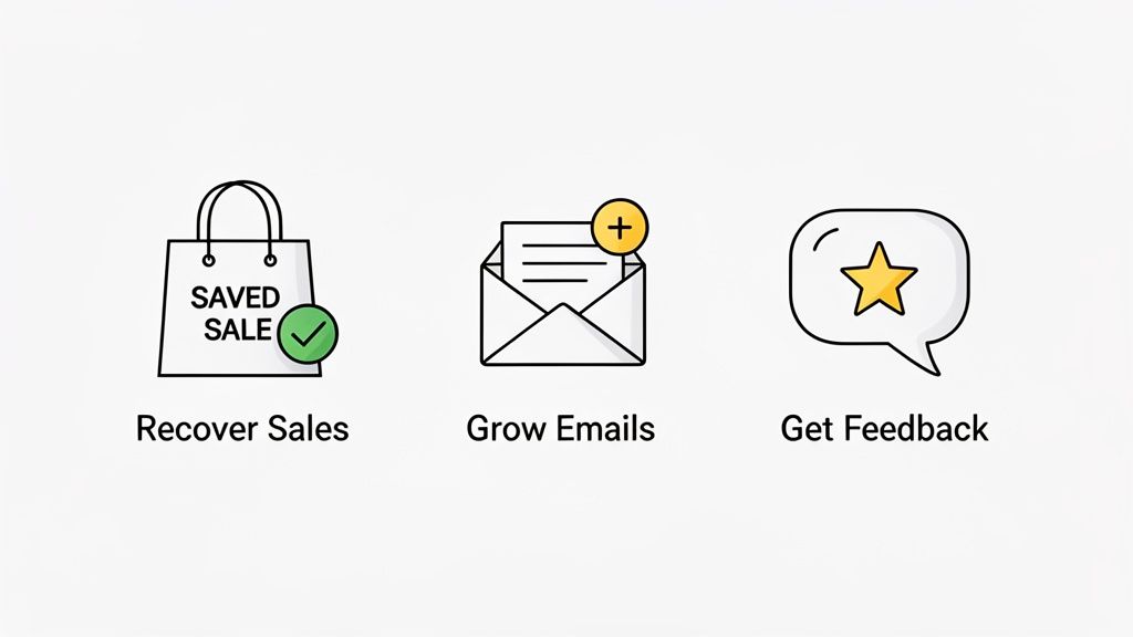
- Lead capture: Turn anonymous visitors into email subscribers or demo leads.
- Cart recovery: Stop a shopper from leaving before checkout.
- Feature guidance: Help a high-intent SaaS visitor understand value on pricing or product pages.
- Feedback capture: Learn why someone is hesitating, abandoning, or bouncing.
- Cross-sell or upsell: Increase order value with a relevant recommendation.
- Retention or rescue: Surface help for users who appear stuck.
A popup with no job becomes generic fast. A popup with a clear job gets easier to trigger, write, and measure.
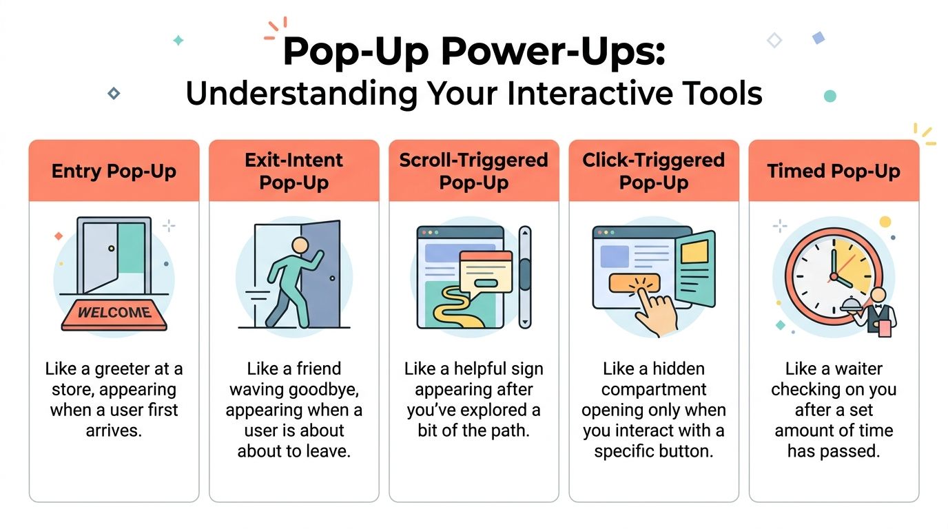
Match the trigger to the intent
A proven methodology starts by delaying the initial display by 10 to 50 seconds or waiting until the visitor loads a second page. That signals genuine interest and can yield a 28.98% conversion rate, according to Wisepops popup best practices. The same guidance recommends capping frequency at once per session to reduce annoyance.
That doesn’t mean every popup should wait the same amount of time. It means instant display is rarely your best move.
| Trigger Type | Best For (Use Case) | Pros | Cons / Risks |
|---|---|---|---|
| Time delay | Blog lead capture, category-page offers, newsletter asks | Easy to set up, filters out quick bounces | Too early feels intrusive, too late can miss exits |
| Scroll depth | Content upgrades, buying guides, long-form education | Strong fit for engaged readers | Weak on short pages or fast product visits |
| Exit intent | Cart abandonment, pricing objections, last-chance offers | Catches hesitation at the right moment | Weak offer makes it feel desperate |
| Second page viewed | SaaS evaluation, repeat product browsing | Strong intent signal, cleaner segmentation | Lower reach than broad triggers |
| Click-triggered | Demo requests, coupon reveals, sizing help | User-initiated, lower friction | Requires a strong on-page prompt |
| Cart-based event | Shipping offers, bundles, checkout reassurance | Highly relevant for ecommerce | Needs event tracking to work well |
Practical pairings that work
For SaaS, use the page context to shape the ask:
- Pricing page exit: Offer a trial extension, implementation help, or a short objection survey.
- Feature page repeat visits: Show a demo CTA tied to that feature, not a generic homepage message.
- Blog readers with deep scroll: Offer a relevant checklist, template, or webinar signup.
For ecommerce, behavior matters more than page type alone:
- Cart activity with exit intent: Surface shipping clarity, returns reassurance, or a focused discount.
- Multiple product views in one category: Recommend a buying guide or product finder.
- Returning shopper: Show a personalized offer, not the same first-visit email gate.
If you want a deeper breakdown of when exit timing makes sense, this guide to an exit-intent popup strategy is worth reading.
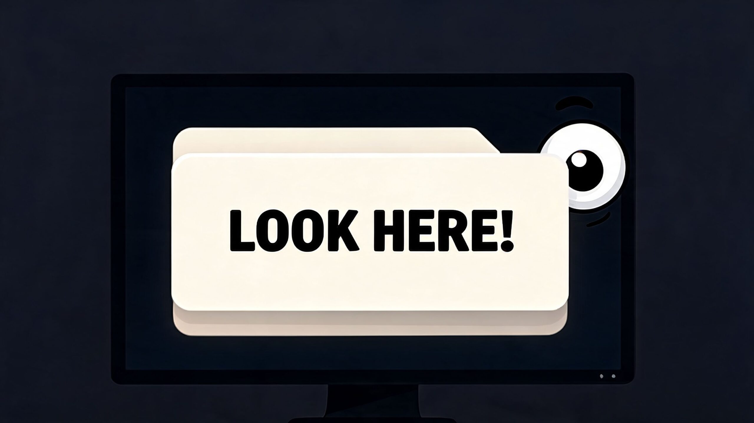
A popup should appear when the visitor’s behavior creates a question. Your popup should answer that question.
Write the trigger rule before the design
I like to document each popup in one line:
Audience + page + behavior + offer + suppression rule
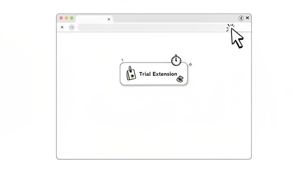
Example for SaaS: returning visitor + pricing page + exit intent + trial extension + suppress after submit or close.
Example for ecommerce: shopper with cart items + checkout entry + hesitation behavior + shipping incentive + suppress after purchase.
That one line prevents most popup mistakes before design even starts.
Designing Popups That Actually Convert
A popup doesn’t need clever design. It needs clear hierarchy, a useful offer, and low friction.
The easiest way to tank performance is to make the visitor work too hard. If the headline is vague, the body copy rambles, the CTA competes with other actions, and the form asks for too much, the popup won’t convert no matter how polished it looks.
Build around one decision
Popups with a single, clear CTA and contrasting color can drive 2 to 3x higher engagement, and that focal point alone can boost clicks by 25 to 40%, according to Unbounce’s popup design guidance. The same source notes that personalized messaging based on geography or referral source can outperform generic messaging by 2x.
That lines up with what is commonly observed in practice. The winning popup usually asks for one action, not three.
Good CTA examples:
- Start free trial
- Get the guide
- See recommended plan
- Receive free shipping
- Answer one question
Weak CTA examples:
- Submit
- Learn more
- Continue
- Click here
Write the copy in this order
Popup copy is typically written top to bottom. I prefer this order:
- Offer
- CTA
- Headline
- Support text
That sounds backward, but it keeps the message honest. If the offer is weak, no headline saves it.
For SaaS
A SaaS popup should remove uncertainty. The message should answer one of these:
- What do I get if I act now?
- Why is this relevant to the page I’m on?
- What happens next?
Example structure:
- Headline: See which plan fits your team
- Body: Answer a few quick questions and get a recommendation
- CTA: Find my plan
For ecommerce
An ecommerce popup should reduce buying friction or increase confidence.
Example structure:
- Headline: Complete your order with free shipping
- Body: Enter your email to save your cart and apply the offer
- CTA: Save my cart
Design choices that usually help
Use visual hierarchy aggressively. Visitors should know what the popup is about in seconds.
- Headline first: Keep it benefit-led and easy to scan.
- Short body copy: One or two concise lines is enough.
- One primary CTA: Secondary links should be visually quieter.
- Brand consistency: The popup should look like part of the site, not an injected ad.
- Supporting image only when useful: Product shots, founder faces, or illustrative graphics can help if they reinforce the offer.
If you’re trying to improve sitewide conversion quality, this practical guide on how to improve website conversion rates connects popup design to the broader funnel.
Copy check: If you remove the logo and brand colors, would the visitor still understand the offer instantly? If not, simplify the message.
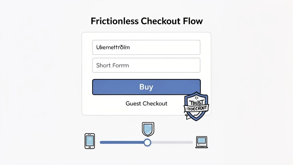
Keep forms brutally short
Every extra field creates friction. Ask only for what you need to fulfill the next step.
For a newsletter or cart save, email is often enough. For a demo flow, you might need more later, but the popup usually isn’t the place to collect everything upfront. If your team wants name, phone, company, role, and budget in a popup, you probably have a sales process problem, not a form problem.
Mobile matters too. Buttons need comfortable tap targets, close controls must be obvious, and the popup can’t consume the entire screen in a way that traps the user.
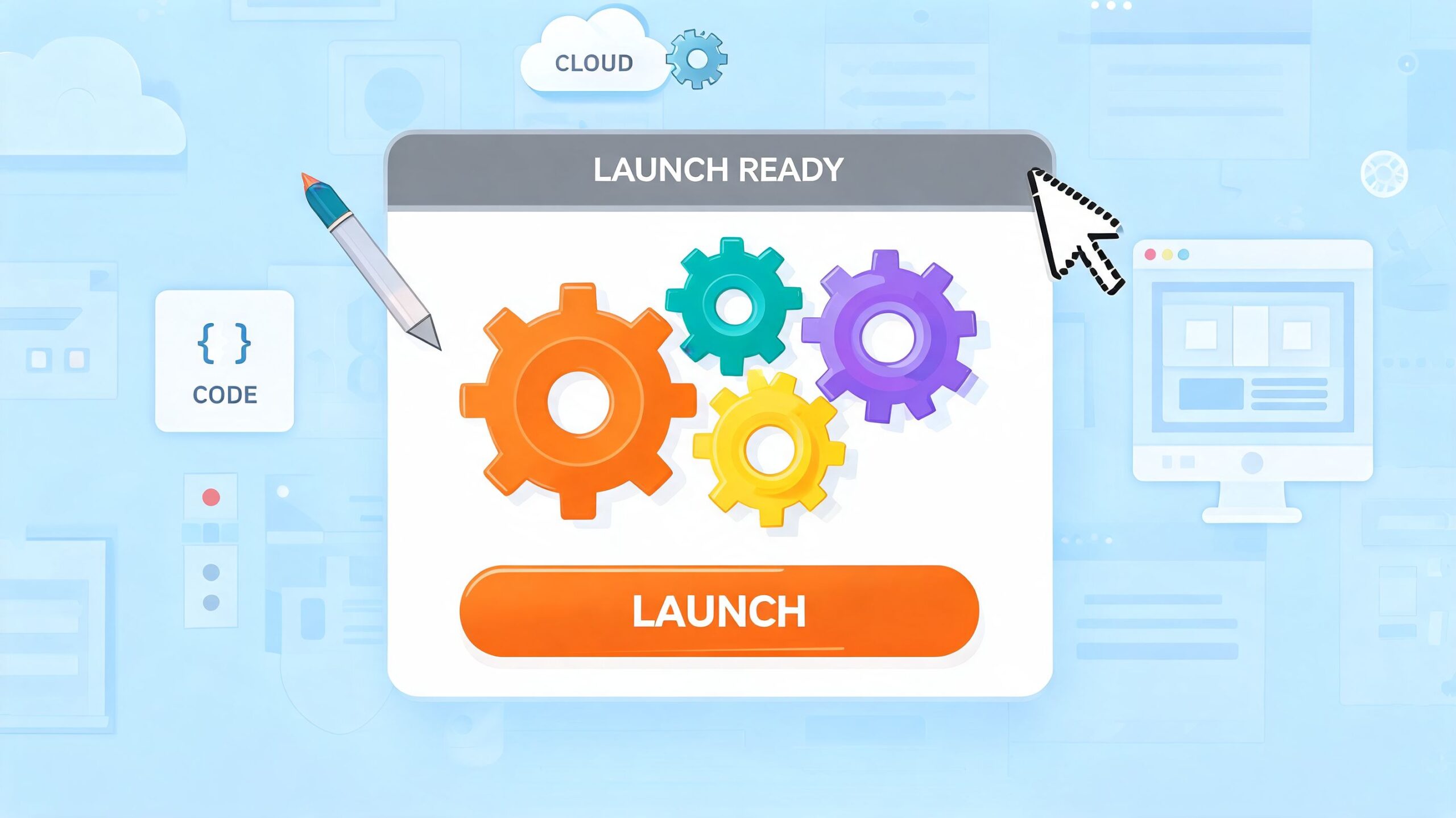
How to Build and Launch Your Popup
There are three practical ways to build popups. Use a popup builder, launch through Google Tag Manager, or code a lightweight custom modal. The right choice depends on who will maintain it and how tightly it needs to connect with your site data.
Option one uses a popup builder
This is the fastest route for most marketing teams.
Tools like Wisepops, OptinMonster, Poper, and Unbounce give you drag-and-drop editing, targeting rules, suppression settings, and basic reporting. If your team wants to iterate on copy and targeting without pulling developers into every change, start here.
Builder tools work well when:
- Marketing owns execution
- Offers change often
- You need page and behavior targeting quickly
- You want built-in A/B testing
The trade-off is control. Complex event logic, unusual layouts, and custom data passing can get messy depending on the tool.
Option two uses Google Tag Manager
GTM is a good middle ground.
You can fire popups based on events such as scroll thresholds, cart actions, form starts, or pricing-page exits without deploying a full third-party popup stack. This works best when your team already uses GA4 events and has someone comfortable managing tags, triggers, and variables.
GTM is usually the better choice when you need:
- Custom event-based triggering
- Cleaner integration with analytics
- Centralized control across multiple pages
- Less dependence on a single vendor UI
The risk is governance. A messy GTM container becomes its own source of bugs, especially if different teams publish tags without a naming convention or QA process.
Option three uses custom JavaScript
If you want maximum control and minimum overhead, write the modal yourself. This is especially useful for product-led SaaS teams, Webflow builds with custom code, and ecommerce sites that need a specific trigger sequence.
Here’s a lightweight vanilla JavaScript pattern for a basic exit-intent modal:
<div id="exit-popup" hidden>
  <div class="popup-backdrop"></div>
  <div class="popup-modal" role="dialog" aria-modal="true" aria-labelledby="popup-title">
    <button id="popup-close" aria-label="Close popup">×</button>
    <h2 id="popup-title">Before you go</h2>
    <p>Want a last look at our best offer?</p>
    <a href="/pricing" class="popup-cta">See the offer</a>
  </div>
</div>

<style>
  #exit-popup[hidden] { display: none; }
  .popup-backdrop {
    position: fixed; inset: 0; background: rgba(0,0,0,.5); z-index: 9998;
  }
  .popup-modal {
    position: fixed; top: 50%; left: 50%; transform: translate(-50%, -50%);
    width: min(90vw, 420px); background: #fff; padding: 24px; border-radius: 12px;
    z-index: 9999; box-shadow: 0 10px 30px rgba(0,0,0,.2);
  }
  #popup-close {
    position: absolute; top: 12px; right: 12px; background: none; border: 0; font-size: 24px; cursor: pointer;
  }
  .popup-cta {
    display: inline-block; margin-top: 12px; padding: 12px 16px; background: #111; color: #fff; text-decoration: none; border-radius: 8px;
  }
</style>

<script>
  (function () {
    const popup = document.getElementById('exit-popup');
    const closeBtn = document.getElementById('popup-close');
    const sessionKey = 'exit_popup_seen';

    function showPopup() {
      if (sessionStorage.getItem(sessionKey)) return;
      popup.hidden = false;
      sessionStorage.setItem(sessionKey, 'true');
    }

    function closePopup() {
      popup.hidden = true;
    }

    document.addEventListener('mouseout', function (e) {
      if (e.clientY <= 0) showPopup();
    });

    closeBtn.addEventListener('click', closePopup);
    popup.addEventListener('click', function (e) {
      if (e.target.classList.contains('popup-backdrop')) closePopup();
    });
  })();
</script>
This gives you a base pattern. Add your own eligibility rules, event logging, and suppression logic before shipping it.
Here’s a walkthrough video if you want to see implementation concepts in action:
Launch checklist before you go live
Use this checklist every time:
- Check suppression: Don’t show the same popup repeatedly in one session.
- Check mobile behavior: Make sure the popup is easy to close and doesn’t break the page.
- Check event tracking: Log views, closes, clicks, and submits.
- Check targeting rules: Test on the exact pages and user states you intended.
- Check fallback states: If data is missing, the popup should still render cleanly or not appear.
A popup that launches cleanly is already ahead of most.
Measuring and Optimizing for Performance
Launching a popup isn’t the win. Learning whether it improves the funnel is the win.
A lot of teams stop at view rate and click rate because those are easy to find in popup tools. That’s not enough. A popup can attract clicks and still hurt revenue if it distracts buyers, lowers page engagement, or creates low-quality leads.
Track the metrics that matter
Start with a short measurement stack:
- Popup conversion rate: How many exposed visitors completed the intended action
- Dismissal rate: How often people close without engaging
- Downstream conversion quality: Did the lead subscribe, trial, purchase, or return
- Page-level impact: Did engagement improve or get worse on affected pages
- Revenue influence: For ecommerce and paid acquisition, did the popup assist real sales
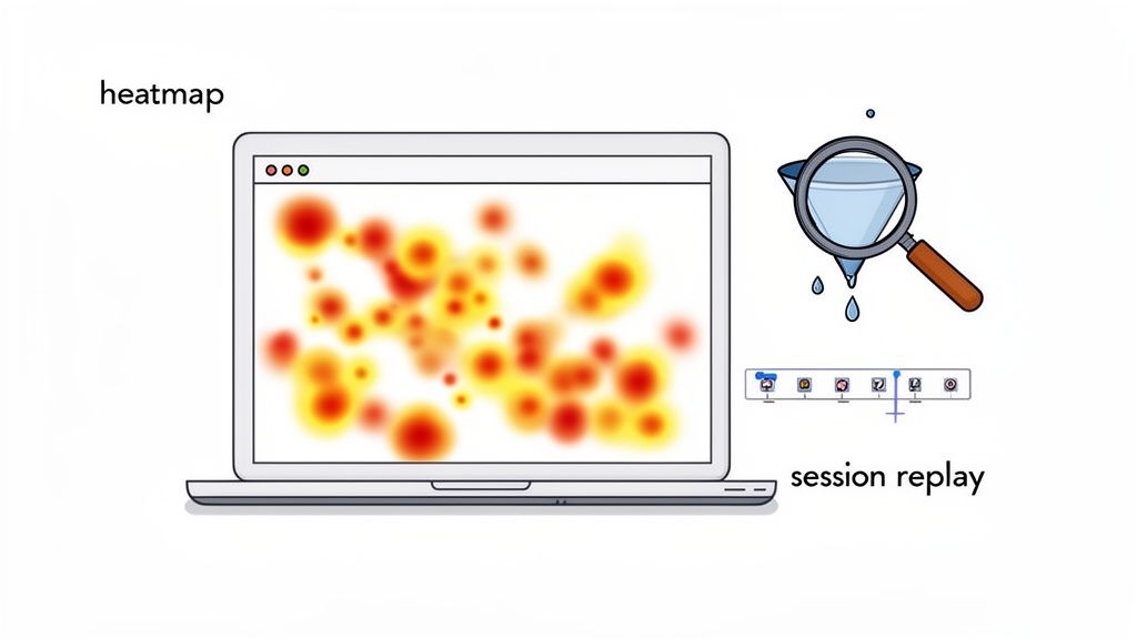
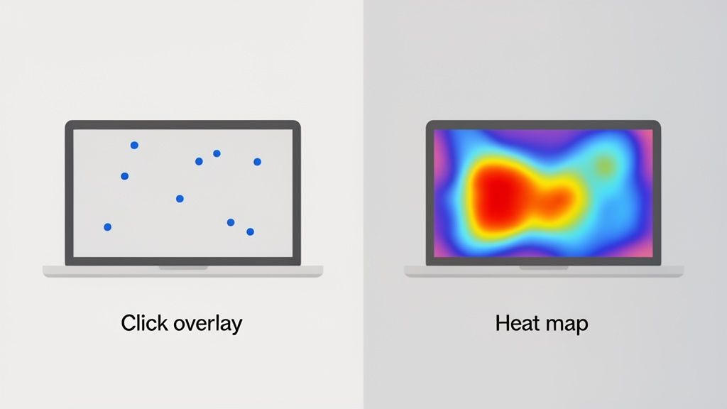
You also want behavioral context. Heatmaps and session review tools can tell you whether the popup appears at a sensible moment or interrupts critical page interaction. This overview of heat maps in Google Analytics workflows is a helpful starting point if your team is trying to connect popup behavior to on-page friction.
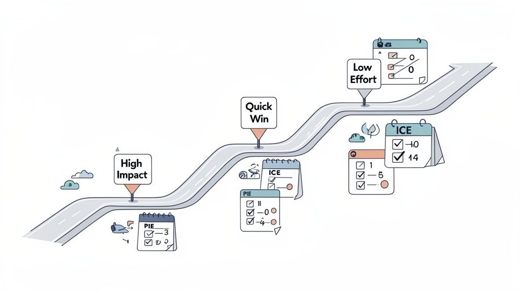
Test the offer before the cosmetics
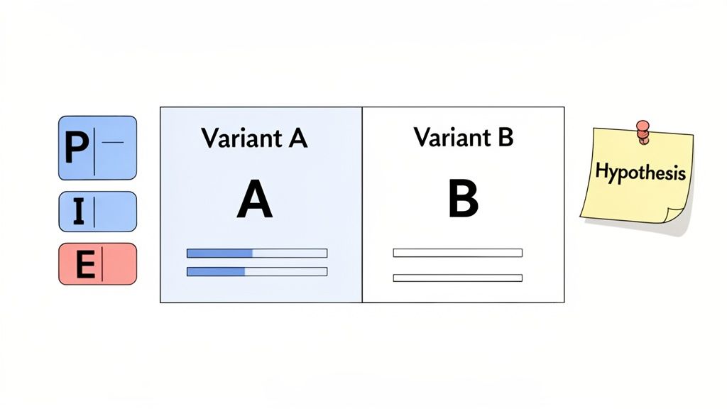
A/B testing works best when you change the biggest lever first.
According to Popupsmart’s research on why popups convert, reducing form fields from three to two can increase conversions by over 200%. The same source notes that segmenting offers for first-time versus returning visitors allows for personalized messaging that converts significantly higher.
That tells you where to focus:
- Offer
- Audience segment
- Form length
- Headline
- Trigger timing
- Layout and imagery
Teams often do this backward. They test button color before fixing a weak offer. They test font size before reducing friction. That wastes time.
Test the thing that changes visitor motivation first. Only then test the thing that changes presentation.
Use a simple optimization rhythm
I like a weekly rhythm for active popup programs:
- Review intent segments: New visitor, returning visitor, cart builder, pricing-page visitor
- Compare popup variants: One variable at a time where possible
- Inspect qualitative signals: Survey responses, session recordings, support chats
- Promote or kill quickly: Keep only variants that help the broader funnel
For email capture popups, don’t ignore list quality after the submit. If a popup starts feeding low-intent contacts into your email program, deliverability can slip. Before scaling a new acquisition popup, run the captured addresses and sending setup through an email spam checker so your follow-up emails reach inboxes.
Know when to stop optimizing
Sometimes a popup is entirely the wrong tool for the page.
If the popup repeatedly underperforms despite changes to offer, trigger, and form length, the issue may be page-message mismatch or a weak underlying proposition. In SaaS, that often means the pricing page needs clearer packaging. In ecommerce, it might mean shipping, returns, or trust signals need work before any modal can rescue the session.
Optimization should sharpen a good idea. It can’t fix a bad one.
Advanced Tactics and Common Pitfalls
A visitor hits your pricing page for the third time, scrolls to the annual plan, hesitates, then moves toward the back button. Asking for a newsletter signup in that moment is the wrong job. A better popup asks what is blocking the decision, then routes the visitor to the next best step.
That is the level where popup programs start to pay off. The popup is not just a form. It is a tool for lead capture, cart recovery, product recommendation, or feedback collection, and the build should follow that job.
Use popups to classify intent before you ask for more
Two-step popups work well because they reduce commitment upfront and improve message match on the second step. In SaaS, the first step can sort visitors by use case, team size, or objection. In ecommerce, it can sort by purchase intent, category interest, or cart hesitation.
Good first-step prompts include:
- Need help choosing a plan?
- Want free shipping on this order?
- What is stopping you from checking out today?
- Shopping for yourself or for a team?
The first click gives you signal. Then the second screen can do its actual job, whether that is collecting an email, showing a discount, recommending a plan, or capturing feedback for the team.
I use this pattern often on high-intent pages because it stops the common mistake of showing the same generic modal to every visitor. Pricing-page traffic in SaaS usually needs qualification or objection handling. Cart and checkout traffic in ecommerce usually needs reassurance, urgency, or a simple incentive.
Match the popup to the page’s job
Advanced popup strategy is mostly about alignment.
On a blog post, the popup’s job might be lead generation. On a pricing page, it might be sales assist. On cart and checkout pages, it might be abandonment recovery. On an account area or post-purchase page, it might be feedback.
That sounds obvious, but many teams still run one popup across the whole site and call it optimization.
Use different logic for different moments:
- SaaS blog traffic: Offer a template, checklist, webinar, or email course
- SaaS pricing traffic: Ask what is blocking the decision, then route to demo, trial, or plan help
- Ecommerce product pages: Recommend related products, bundles, or first-order incentives
- Ecommerce cart pages: Surface shipping thresholds, limited-time offers, or objection capture
- Post-purchase flows: Ask for feedback, review intent, or cross-sell interest
As noted earlier, popup results vary a lot by context, device, and execution. Treat that as a design constraint, not a surprise.
Add behavior-based logic, not more noise
The best-performing advanced setups usually feel smaller, not louder. They are triggered by a specific behavior and tied to one clear outcome.
A few patterns that hold up in practice:
- Cart value threshold: Show free-shipping progress or a bundle offer only when the cart is close enough to matter
- Pricing hesitation: Trigger after repeated pricing-page visits, comparison-table interaction, or exit behavior
- Form rescue: If a visitor abandons a trial or checkout form, ask one question instead of pushing the same form again
- Returning visitor suppression: Change the message after a close, a submit, or a product view threshold
- Survey-to-offer sequencing: Ask one short question first, then present the right CTA based on the answer
If you want to implement simple behavior rules without a heavy popup stack, even lightweight JavaScript can handle basic sequencing:
<script>
  const hasClosed = localStorage.getItem('promo_closed');
  const viewedPricing = window.location.pathname.includes('/pricing');

  function showPopup() {
    const popup = document.getElementById('intent-popup');
    if (popup) popup.style.display = 'block';
  }

  function closePopup() {
    localStorage.setItem('promo_closed', 'true');
    const popup = document.getElementById('intent-popup');
    if (popup) popup.style.display = 'none';
  }

  if (!hasClosed && viewedPricing) {
    setTimeout(showPopup, 12000);
  }
</script>
That snippet is intentionally simple. For production, add frequency caps, device checks, accessibility support, analytics events, and separate rules for submit vs. dismiss behavior.
Common mistakes that hurt conversion
These are the issues that drag down performance even when the offer looks solid:
- Hard-to-close popups: If dismissing the modal feels annoying, the brand takes the hit
- One popup trying to do everything: A lead-gen form will not solve cart abandonment, and a discount modal will not help a SaaS buyer who needs plan clarity
- Too many fields: Ask only for what the next step requires
- No suppression logic: If someone closes, converts, or has already seen the offer enough times, stop showing it
- Weak mobile adaptation: A popup built for desktop often breaks the phone experience with cramped copy, oversized forms, or poor close targets
- Ignoring accessibility: Keyboard navigation, focus order, readable contrast, and screen-reader support all affect usability. If your team needs a practical reference, this guide to accessibility tools for websites is a useful place to audit the basics.
- Optimizing to popup metrics only: More submits can still mean worse lead quality, lower AOV, or lower trial-to-paid conversion
One more trap shows up in both SaaS and ecommerce. Teams keep adding urgency, animation, and discounts before they fix message fit. If the popup has the wrong job for the page, extra tactics just make the mismatch more obvious.
A better advanced playbook
Use a simple standard:
- Assign one job per popup: capture, recover, recommend, or learn
- Trigger from behavior: scroll depth, cart state, repeat visits, inactivity, or exit intent
- Adapt by segment: new visitor, returning evaluator, active cart, high-intent product viewer
- Respect suppression rules: after close, after submit, after purchase, and after a set view limit
- Send what you learn back into the funnel: objections should improve pricing pages, product detail pages, onboarding, and checkout copy
That is how popup work matures. It stops being a collection of modals and becomes a conversion system tied to actual visitor intent.