Let’s get straight to the point: getting people to your website is only half the job. The real work—and where the real money is made—is turning those visitors into paying customers. This playbook is all about that. It’s a no-fluff guide to systematically making your website work harder for you.
The whole game of improving your conversion rate boils down to one simple idea: making it easier for people to get what they came for. It’s about finding all the little points of friction in your user’s journey and smoothing them out, one by one.
Why Small Wins Lead to Big Paydays
If you’re wondering what a “good” conversion rate even is, you’re not alone. In 2026, the global average sits at a modest 2.35%. That means for every 100 people who visit, less than three take the action you want them to.
But here’s the exciting part. The top 10% of websites? They’re converting at 11.45% or higher. That massive gap isn’t magic; it’s the result of a deliberate, focused process. Think of that 2.35% as your starting line, not your limit.
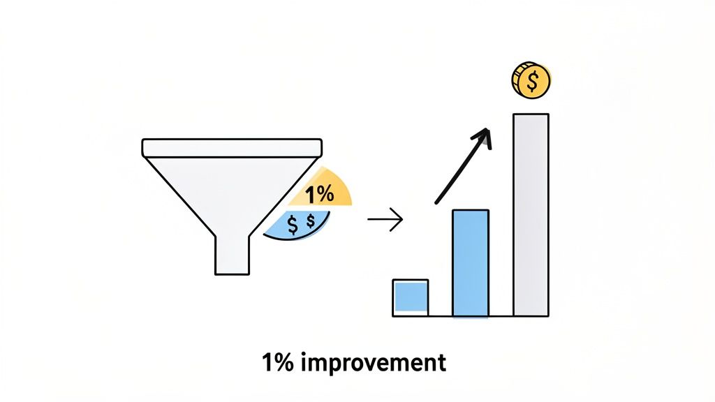
The Power of 1%
The best thing about conversion rate optimization (CRO) is that you don’t need a massive, site-wide redesign to see a real impact. Small, consistent improvements have a compounding effect that can dramatically boost your revenue without you spending a single extra dollar on ads.
Let’s do some quick math. Say your site gets 20,000 visitors a month and you convert at 1%. That’s 200 customers. Now, what if you focus on a few key tweaks and get that rate up to just 2%? You’ve just doubled your business to 400 customers from the exact same traffic. That’s the power we’re talking about.
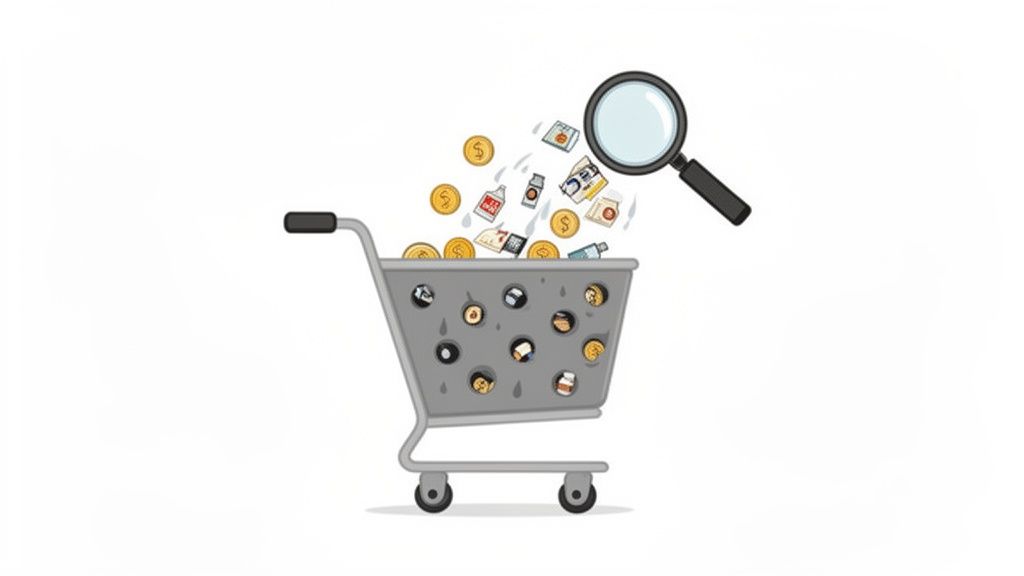
Your website is a funnel, and right now, it’s probably leaking. Every visitor who bounces is a missed opportunity. This guide is your toolkit for finding those leaks and patching them up, focusing only on the fixes that will actually move the needle on revenue.
Your Action Plan
Forget guesswork. We’re going to walk through a proven system for finding the problems, figuring out which ones to tackle first, and making sure your changes are actually working.
Here’s a sneak peek at what we’ll cover:
- Find the Leaks: We’ll use tools like session replays and exit surveys to see exactly where people are getting stuck or giving up.
- Prioritize for Profit: Learn how to focus your limited time and resources on the fixes that offer the biggest financial return.
- Test Like a Pro: I’ll show you how to design and run simple A/B tests that give you clear answers, not confusing data.
- Smooth Out the Finish Line: We’ll dive deep into optimizing your checkout and trial sign-up flows to make converting an absolute breeze.
Core Strategies to Improve Conversion Rates
Before we dive deep, here’s a high-level look at the core strategies we’ll be exploring. Think of this as your cheat sheet for the fundamental pillars of CRO.
| Strategy | Goal | Key Tactic |
|---|---|---|
| Friction Reduction | Make it effortless for users to complete a task. | Simplify forms by removing non-essential fields. |
| Value Proposition | Clearly communicate why a visitor should choose you. | Test different headlines and subheadings on your landing pages. |
| Trust Building | Make visitors feel safe and confident in their decision. | Add customer testimonials, security badges, and clear return policies. |
| Urgency & Scarcity | Encourage immediate action. | Use limited-time offers or display low stock levels. |
| Personalization | Deliver relevant content and offers to user segments. | Show targeted pop-ups based on visitor behavior or referral source. |
Each of these strategies plays a critical role in turning a casual browser into a committed customer.
This methodical approach turns CRO from a guessing game into a predictable growth engine. If you’re looking for even more foundational knowledge, you can get a broader overview of how to improve website conversion rates.
Ready to get started? Let’s begin.
Finding the Leaks in Your Conversion Funnel

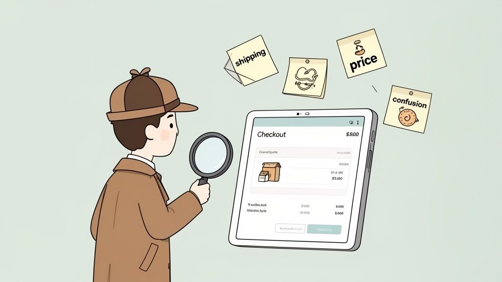
Before you start changing buttons and rewriting copy, you have to play detective. Your first job is to figure out exactly where your funnel is leaking. Your standard analytics tools are great for telling you what is happening—a huge drop-off on the pricing page, for instance—but they almost never tell you why.
This is where we go beyond the dashboards. To really understand the friction points, you need to see your site through your users’ eyes. We’re going to use a few specific tools to do just that, uncovering the hidden roadblocks that are quietly killing your conversions.
This isn’t just about collecting a mountain of data. It’s about turning those raw observations into smart, testable ideas. You’ll go from guessing to confidently saying, “I have a strong hunch we can lift signups by making our feature comparison clearer, and here’s the proof.”
Watch Real Users with Session Replays
What if you could literally look over a user’s shoulder as they browse your site? That’s exactly what session replay tools like Hotjar or FullStory let you do. They create video-like recordings of anonymous user sessions, showing you every mouse movement, click, scroll, and even “rage clicks”—those moments of pure frustration when someone repeatedly clicks on an element that isn’t working.
Honestly, watching these recordings is one of the most humbling and eye-opening things you can do. You’ll quickly spot issues you never would have noticed, like a broken button on a certain browser, a confusing form field, or a key feature nobody can seem to find.
I once watched a replay where a user on a SaaS site spent a full two minutes trying to find the “Contact Us” link. It was buried in the footer, and they were clearly getting agitated. We added a support link to the main navigation, and frustrated support tickets dropped almost immediately.
Look for the patterns. Are different users getting stuck at the same step? Do they hesitate before clicking your main call-to-action? Those are your clues. They point directly to the biggest leaks you need to patch.
Visualize Behavior with Heatmaps
While session replays give you the individual story, heatmaps show you the big picture. They layer a color-coded visual on top of your pages, revealing user behavior aggregated from hundreds or thousands of visits. It’s a powerful way to see where the collective attention is going.
There are three key heatmaps you’ll want to get familiar with:
- Click Maps: See exactly where people click. Red “hotspots” show high activity, while blue or clear areas are being ignored. These are brilliant for finding out if people are clicking on things that aren’t actually links (a sure sign of confusing UI) or completely missing your primary CTA.
- Scroll Maps: This is a simple but critical one. It shows you how far down your pages people actually scroll. If you find out 90% of your visitors never even see that amazing testimonial at the bottom of your homepage, you know you’ve got a layout problem.
- Move Maps: These track where users move their mouse on the screen, which is a surprisingly accurate proxy for where they’re looking. It helps you understand if your headline and value proposition are grabbing attention or being completely overlooked.
Just Ask Them: The Power of Exit-Intent Surveys
You’ve seen where people drop off, but why not just ask them what went wrong? That’s the magic of an exit-intent survey. It’s a simple, one- or two-question pop-up that appears only when a user’s cursor signals they’re about to leave your site—like moving to close the tab.
The goal here isn’t to be annoying, but to get one last piece of honest feedback at that critical moment of decision. A well-timed question can be worth its weight in gold.
For an ecommerce store, a question like, “What stopped you from buying today?” can uncover deal-breakers like high shipping costs or a lack of payment options. For a SaaS site, try asking, “Was there anything you were looking for but couldn’t find?” The answers might point to missing features or unclear pricing.
Keep it simple and always make it easy to close. The feedback you’ll get is from the very people you just failed to convert, making it some of the most valuable information you can gather.
Designing and Prioritizing High-Impact Experiments
Alright, you’ve done the hard work of finding where your funnel is leaking. Now you’re probably staring at a massive list of potential fixes, feeling both excited and overwhelmed. The biggest mistake I see teams make here is trying to tackle everything at once. It’s a surefire way to get chaotic, inconclusive results.
The key to real, sustainable growth is ruthless prioritization. You have to focus your energy where it will make the biggest difference. Think about it: a small copy tweak on a page where 50% of your hottest prospects are dropping off is infinitely more valuable than redesigning a button on a page that gets hardly any traffic.
So, how do you decide what to do first? You need a simple, objective system.
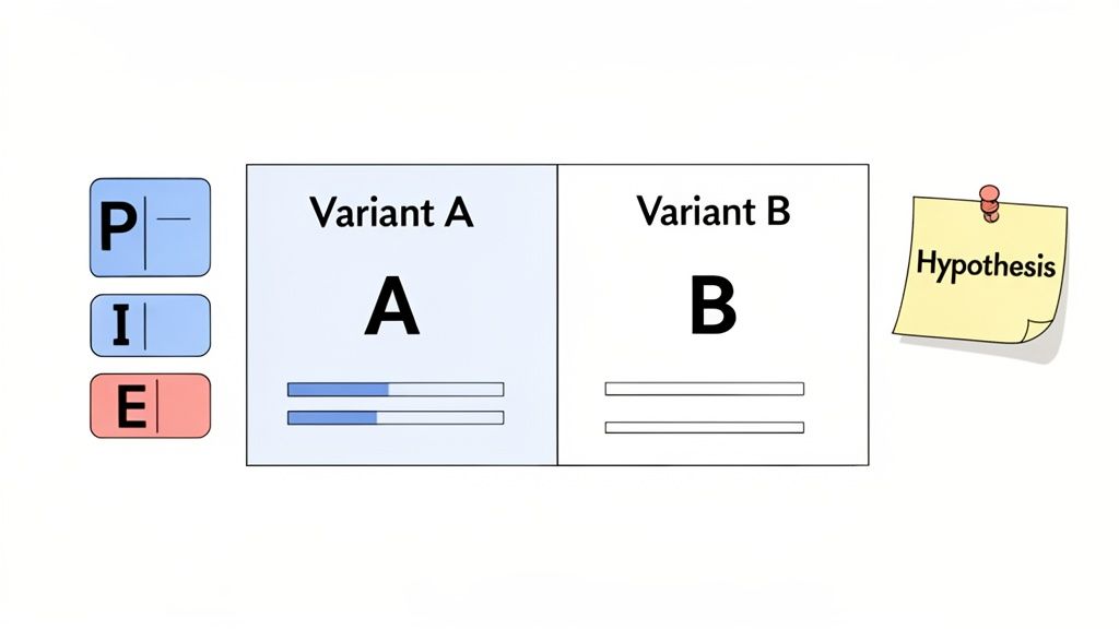
Prioritizing with the PIE Framework
My go-to method for this is the PIE framework. It’s a lifesaver for cutting through the noise and has been a staple in my toolkit for years. It forces you to evaluate each idea against three simple criteria: Potential, Importance, and Ease.
Just score each factor on a scale of 1 to 10.
- Potential: How much better can this page realistically perform? A page with a sky-high bounce rate or a pitiful conversion rate is screaming with potential. That’s a 9 or 10.
- Importance: How critical is this page to the business? Your pricing and checkout pages are your money pages—visitors there are ready to act. These are always high importance.
- Ease: How much time and effort will this take? A simple headline change is a low-effort task (a 1 or 2), while a complete checkout overhaul could be a major project (a 9 or 10).
Once you have your scores, just multiply them: P x I x E. The ideas with the highest totals are your winners. This isn’t just about picking the easy wins; it’s about finding the highest-leverage wins and keeping your team focused on what truly drives revenue.
Crafting a Strong A/B Test Hypothesis
With a prioritized list in hand, you’re ready to shift from educated guesses to controlled experiments. Every test needs to start with a solid hypothesis—and I don’t mean a vague idea like, “Let’s try a blue button.”
A proper hypothesis is a structured statement about the change you’re making, who it’s for, and the outcome you expect. It connects your proposed solution directly to a problem you’ve identified.
Here’s a format that works wonders: “By changing [Independent Variable] for [Target Audience], we will impact [Primary Success Metric] because [Rationale].”
Real-World SaaS Example: By replacing our “Free Trial” CTA with “View Demo” for visitors from enterprise IP addresses, we will increase qualified demo requests because our research shows larger companies prefer a guided tour over a self-serve trial.
That “because” statement is everything. It’s your rationale, the crucial link back to the user behavior you observed in your analytics or session replays.
Designing Your Experiment for Clean Data
Now it’s time to put on your lab coat. A strong hypothesis is only half the battle; you also need a clean, well-designed experiment to get results you can trust. If you’re looking for more ideas on what to test, our article on how our company uses surveys to inform product development is a great resource.
Before you hit “launch,” make sure you’ve clearly defined these components:
Primary Success Metric: What is the one key number that decides if this test is a win or a loss? For an ecommerce store, this might be revenue per visitor. For SaaS, it could be trial signups. Pick one primary metric and stick to it to avoid getting fooled by randomness.
Sample Size: How many people need to see each version to know the results are statistically significant? Don’t skip this step. Use an A/B test calculator to determine your target sample size before you start. Calling a test early is one of the most common and costly mistakes in CRO.
Test Duration: Plan to let your test run for at least one full business cycle—usually one or two weeks. This accounts for natural dips and spikes in traffic and conversions that happen on different days of the week (like the weekend vs. weekday slump).
For an ecommerce store, it might look like this:
- Hypothesis: By consolidating our multi-page checkout into a single page, we will increase the checkout completion rate because it reduces friction and perceived effort.
- Primary Metric: Checkout Completion Rate.
- Sample Size: 5,000 visitors per variation.
- Duration: 14 days.
Following a structured process like this—prioritizing with data, building a sharp hypothesis, and designing clean experiments—is what turns CRO from a guessing game into a reliable growth engine.
Turn Doubters into Buyers with Social Proof and Smart Offers
Alright, you’ve done the hard work of finding the leaks in your funnel. Now for the fun part. This is where we stop just fixing what’s broken and start actively persuading people to click, buy, or sign up. We’ll do this using two of the most powerful tools in conversion optimization: social proof and well-timed smart offers.
Think of it this way: you’re building an environment where people feel confident in their decision while giving them a timely, irresistible reason to follow through.
At our core, we’re social creatures. We look to others for cues on what to do, especially when we’re feeling uncertain. This is the heart of social proof, and it’s your single best defense against the dreaded “purchase anxiety.” When a potential customer is on the fence, seeing that others have already taken the leap and are happy about it is often the nudge they need.
The numbers don’t lie. Websites that feature user-generated content (UGC), like customer reviews, see a baseline conversion rate of 3.2%. That’s a solid starting point. It gets better when people actually interact with it—just scrolling through UGC can bump conversions by another 3.8%. But the real magic happens when they engage deeply. When a user actually reads reviews or watches customer videos, their likelihood of converting skyrockets by an incredible 102%.
Sprinkle Social Proof at Every Step
Don’t just create a “Testimonials” page and call it a day. The real power comes from placing these trust signals exactly where your user is having a moment of doubt.
- Homepage First Impressions: Immediately build credibility with a rotating banner of your best customer quotes. If you’re B2B, include their headshot and company logo. It instantly says, “We’re legitimate.”
- Product & Service Pages: Match the review to the feature. Got a customer raving about your amazing support? Place that quote right next to the section describing your support features.
- Next to the “Add to Cart” Button: This is a high-stakes click. A simple five-star rating or a punchy review like, “This was a game-changer for our team,” can be the final push someone needs to commit.
- During Checkout: This is the home stretch. Subtle trust badges from security partners or logos of well-known clients serve as a final reassurance that they’re making a safe, smart choice.
I worked with a SaaS client who saw a 15% jump in free trial signups from one simple change. We added the logos of their most recognizable customers right below the main signup form. It instantly answered the visitor’s unspoken question: “Do companies like mine actually use this?”
The secret is context. Your social proof should directly counter the specific hesitation a user feels at that exact point in their journey.
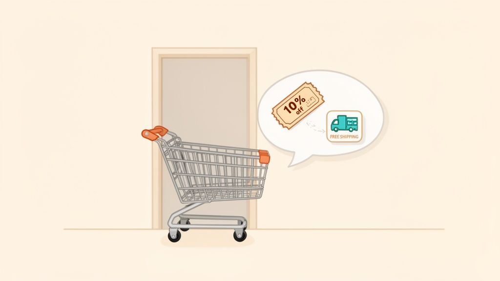
Win Back Hesitant Visitors with Smart Offers
Let’s be real: not every visitor is going to convert on their first visit. But what about those who are so close? The ones who load up a cart or study your pricing page, only to hesitate at the last second? These are your hottest prospects, and you can often bring them back from the brink with a smart, well-timed offer.
This isn’t about annoying every visitor with a generic “10% OFF!” popup. It’s about using exit-intent technology to detect when someone is about to leave—like when their mouse moves up to close the tab—and presenting them with a highly relevant offer. This is a core function of our platform, Receiver; it automatically spots at-risk checkouts and deploys smart incentives to save the sale.
Here’s what this looks like in the real world:
- For an Ecommerce Store: A shopper is about to abandon a cart with over $100 worth of items. Instead of letting them go, trigger an offer for free shipping. Since shipping cost is the #1 reason for cart abandonment, this directly solves their biggest problem.
- For a SaaS Business: Someone has been staring at your pricing page for a while, then moves to leave. They’re likely wrestling with the price or commitment. This is the perfect time to offer an extended 30-day trial instead of your usual 14, or a complimentary one-on-one setup call.
- For a Complex Product: A user has been digging through technical docs and feature comparisons but now seems ready to bounce. They might just be overwhelmed. Offer them a chat with a product specialist or a popup to download a detailed case study that speaks to their industry.
When you tailor the offer to the user’s specific behavior, it stops feeling like a desperate sales pitch. It feels like a helpful assist, solving the exact problem that was holding them back and turning a potential bounce into a happy new customer.
Making Your Checkout and Signup Flows Effortless
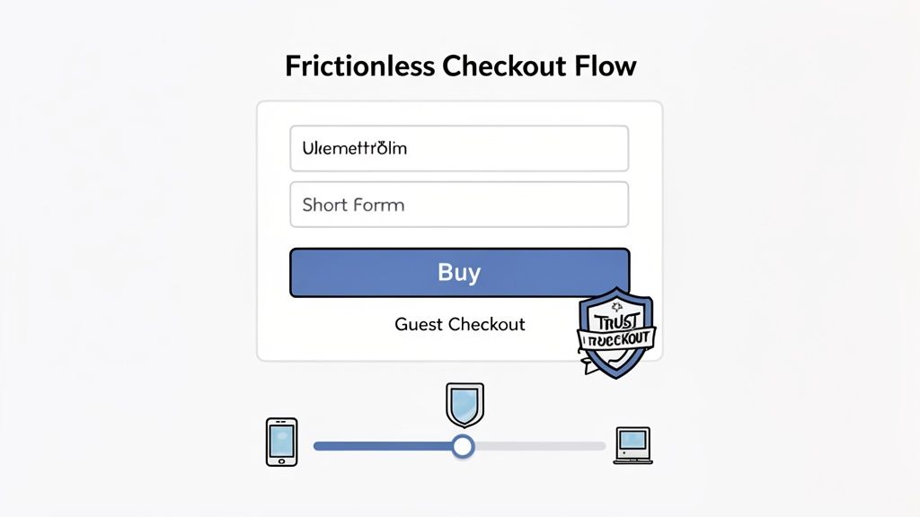
Think of your checkout or signup page as the final handshake. All the effort you’ve put into your website, your product, and your marketing comes down to this single moment. If there’s any friction here—even a tiny bit—you risk watching that hard-earned customer simply walk away.
This is where you have to pave a silky-smooth path from “I want this” to “It’s mine.” Every extra field, every surprise cost, every confusing step is a chance for them to hesitate. Let’s make it so easy to convert that it feels like the most natural thing in the world.
Streamline Your Ecommerce Checkout
For any ecommerce site, the checkout is the final boss battle. This is where most of your revenue leaks happen. The biggest culprits? Unexpected costs, forcing people to create an account, and ridiculously long forms.
Here are a few things I’ve seen work time and time again to patch these leaks:
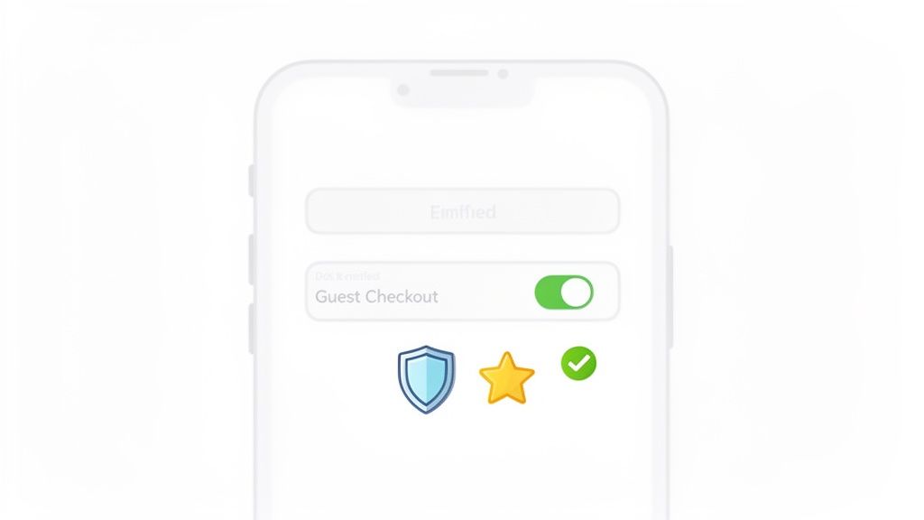
- Offer Guest Checkout. This one is non-negotiable. Forcing a user to create an account is a surefire way to lose them. In fact, 27% of users will abandon a form if it’s too long or complicated. Let them check out as a guest, and then offer the option to save their details by creating an account.
- Be Brutally Honest About Costs. The number one killer of conversions is surprise shipping fees or taxes at the final step. Show all costs upfront, right on the cart page if possible. Nobody likes a nasty surprise when their credit card is out.
- Build Trust Visually. You can’t overdo it with trust signals. Prominently display your SSL certificate badge and the logos of the payment methods you accept. These little icons are powerful visual cues that tell customers their data is safe.
Simplify and Shorten Your Forms
Whether it’s for a purchase or a free trial, your mantra should be: less is more. I’ve seen clients spend months optimizing ad campaigns when the real problem was a bloated form. Every field you add is another mental hurdle for your user.
I once worked with an ecommerce store that boosted its checkout completion rate by 11% with a single change: we removed the optional “Company Name” field. That’s it.
Go through your forms field by field and be ruthless. Ask yourself, “Do I absolutely need this to process the order or set up the account right now?” If the answer is no, cut it.
One of the easiest wins here is to enable features like address auto-complete and one-click payment options (Apple Pay, Google Pay, Shop Pay). They drastically reduce typing, prevent typos, and make the whole process feel slick and modern, especially on a phone.
If you genuinely need a lot of information, don’t show it all at once. Break the form into a few small, logical steps and add a progress bar. A three-step process feels far less daunting than one giant page of empty boxes.
Optimize Your SaaS Signup and Trial Flow
If you’re in SaaS, your signup flow is the front door to your product. A clunky, confusing signup experience sends a terrible message: “If they can’t even get this right, how bad is the actual product?”
One of the biggest strategic forks in the road is deciding whether to require a credit card for a free trial. There’s no one-size-fits-all answer; it really depends on what you’re trying to achieve.
- No Card Required: Want to get as many people as possible to try your product? This is the way. You’ll maximize trial signups and build your top-of-funnel pipeline. The trade-off is that you might attract more looky-loos with no real intent to buy.
- Credit Card Upfront: This acts as a powerful filter. You’ll get far fewer signups, but nearly every single one will be a high-quality, high-intent lead. It weeds out the tire-kickers and typically leads to a much stronger trial-to-paid conversion rate.
Beyond that, your immediate goal is to rush the user to their “aha!” moment. Don’t just drop them on a blank dashboard and hope for the best. Use a simple, interactive tour to guide them to complete one key action that shows off your product’s value. You can also explore options like Using a Chat Widget for Website Growth to proactively engage users and guide them through the initial setup.
And for the love of all things good, keep the signup form itself minimal. Name, work email, password. That’s all you need to get started. You can always ask for more details later, after they’re hooked.
Measuring Attribution to See What Really Works
Boosting your conversion rate feels great, but it’s only half the battle. The real breakthrough comes when you know exactly which marketing channels are delivering not just more customers, but your best customers. This is where attribution becomes your bridge, connecting your CRO wins directly to your marketing budget.
You have to look beyond that final click and understand the whole journey. Tracing a sale all the way back to its origin—whether that was a specific ad, a social media post, or an organic search—is how you prove what’s really working. It gives you the hard data you need to confidently double down on what drives profit.
Moving Beyond Last-Click Attribution
Out of the box, most analytics platforms lean on a last-click attribution model. This is exactly what it sounds like: 100% of the credit for a sale goes to the very last touchpoint a customer had before they converted. If they click a Google Ad and buy, Google Ads gets all the glory.
While it’s simple, this model is dangerously incomplete. It totally ignores every other interaction that guided the customer. Maybe they first saw your brand on Instagram, read one of your blog posts a week later, and then finally clicked that ad to buy.
In that real-world scenario, Instagram and your content did the heavy lifting of building awareness and trust. But last-click gives them zero credit. Sticking only to this model can trick you into cutting budgets for top-of-funnel channels that are actually feeding your entire pipeline.
Think of the customer journey as a team sport. Each channel plays a different position, from introducing your brand to assisting the final goal. You need to understand how they work together to allocate your budget effectively.
Uncovering the Full Customer Journey
To get a more honest picture, you need to explore different attribution models. Most modern analytics tools let you toggle between them, giving you fresh perspectives on the same data.
Here are a few models I always compare:
First-Click Attribution: Gives all the credit to the very first touchpoint. This is fantastic for figuring out which channels are your best “introducers” and are bringing new people into your orbit.
Linear Attribution: Spreads credit evenly across every single touchpoint. It’s a fair model that acknowledges every step played some part in the conversion.
Time-Decay Attribution: Gives more weight to the touchpoints that happened closer to the sale. The first interaction gets a little credit, but the last click before purchase gets the most.
There’s no single “perfect” model; the magic is in the comparison. If you see a channel crushing it in first-click reports but looking weak in last-click, you’ve just found a powerful awareness-driver you might have otherwise ignored.
Filling in the Gaps with Post-Purchase Surveys
Let’s be honest: even the best tracking scripts have blind spots. Ad blockers, privacy updates, and people switching between their phone and laptop can mess with your data. One of the easiest and most powerful ways to fill in those gaps? Just ask.
A simple, one-question survey right after someone buys or signs up can be incredibly revealing. Just ask them: “How did you hear about us?”
The answers are pure gold. You’ll uncover “dark social” channels that analytics can never see, like word-of-mouth recommendations, private Slack communities, or that podcast you were mentioned on. Platforms like Receiver integrate this perfectly with tools like SurveyPilot, which captures these insights right at the moment of conversion.
When you combine this direct customer feedback with your analytics, you build a far more accurate map of what truly drives your business. You can finally stop guessing and start investing your marketing dollars with precision.
Got Questions About CRO? We’ve Got Answers.
As you start digging into conversion optimization, you’re bound to run into some head-scratchers. It happens to everyone. Over the years, we’ve heard just about every question in the book, but a few pop up time and time again.
Let’s tackle some of the most common ones right now.
What’s a “Good” Conversion Rate in 2026 Anyway?
Everyone wants to know the magic number, but the honest answer is: it depends. While you might see a global average floating around 2.35%, that figure is almost meaningless without context. An e-commerce store might be happy with 1-3%, but a B2B SaaS company aiming for demo requests could easily hit 5% or more on a high-intent landing page.
The real pros? The top-tier sites consistently pull in conversion rates over 10%. But don’t get hung up on chasing someone else’s number. Your goal should be to constantly beat your last record. Pushing your rate from 1% to 1.2% might not sound like much, but that’s a 20% lift—a huge win that goes straight to your bottom line.
Your most important benchmark is your own past performance. Focus on steady, incremental improvements, not on an industry average that probably doesn’t apply to your unique business or audience.
How Long Does an A/B Test Really Need to Run?
This depends entirely on two things: your website traffic and statistical significance (you should always aim for 95% confidence). A hard and fast rule is to run any test for at least one full business cycle, which is typically one to two weeks. This helps smooth out the weird daily spikes and dips in user behavior.
Before you even think about launching, use an A/B test calculator to estimate the sample size you’ll need for each version. This isn’t optional. Calling a test early just because one variation pulls ahead after three days is probably the single most expensive mistake you can make in CRO. Be patient and let the data mature.
Where Should I Even Start Optimizing?
You want the biggest bang for your buck, right? Go straight for the pages that have both high traffic and a high exit rate. These are the biggest leaks in your funnel, and fixing them offers the greatest potential for a quick revenue boost.
Your treasure map will likely point you to these usual suspects:
- Homepage: It’s your digital storefront. First impressions matter.
- Pricing Pages: This is where people decide if you’re worth the investment.
- Key Landing Pages: Especially the ones you’re sending paid traffic to.
- Checkout/Signup Step 1: The first point where a user has to commit. Any friction here is a killer.
Fire up your analytics, find where you’re bleeding the most visitors, and focus your energy there first.
Can I Actually Improve Conversions on a Shoestring Budget?
Absolutely. You don’t need a massive budget to see massive results. In fact, some of the most powerful CRO wins come from smart thinking, not big spending.
You can get started right now with high-impact, low-cost tactics:
- Sharpen Your Copy: Is your headline and value proposition crystal clear?
- Beef Up Your CTA: Ditch “Submit” for something specific and action-oriented.
- Add Social Proof: Weave in customer testimonials, case study logos, and reviews.
- Simplify Your Forms: Every field you remove is a bit of friction gone.
These tweaks are all about understanding what makes your users tick—an effort that costs a lot less than a fancy new tool.
At Receiver, we’re all about helping you find these opportunities automatically. Our platform can spot visitors who are ready to buy, figure out why others are leaving, and deploy smart offers to close the deal. We help you convert more of the traffic you already have. Find out how it works at Receiver.