Tag: saas growth

  • Pop Up Window Guide: From Annoyance to Revenue Asset

    Pop Up Window Guide: From Annoyance to Revenue Asset

    Most pop up window advice is too polite.

    It says things like “use them sparingly” or “make them look nice,” which is not wrong, but it misses the core issue. Pop-ups fail when teams treat them as decoration or desperation. They work when teams treat them like timed interventions tied to intent.

    That distinction matters. A pop up window is not just a box on a page. It is a moment where you ask for an action, capture an objection, recover a sale, or qualify a lead before the visitor disappears. If the message is irrelevant, the timing is off, or the form feels like paperwork, people close it instantly. If the message matches what the visitor is trying to do, it can become one of the most impactful assets on the site.

    For SaaS and ecommerce teams, the opportunity is bigger than list growth. Pop-ups can support trial starts, plan selection, cart recovery, referral capture, objection mining, and channel attribution. In practice, that means more than “getting attention.” It means using on-site behavior to influence revenue while the visit is still live.

    Why Pop Up Windows Get a Bad Rap and Why They Still Work

    Pop-ups deserved their bad reputation.

    Early versions were noisy, irrelevant, and impossible to close. They appeared before the page loaded, covered the content, and asked for commitment before the visitor had any reason to trust the site. That pattern trained users to see the pop up window itself as the problem.

    It is not.

    Bad pop-ups are the problem. The format still works. Across billions of examples, the average conversion rate for pop-up windows sits around 3 to 4%, and the top 10% average 9.28% according to BDow’s pop-up statistics analysis. That is not a vanity metric. It is proof that the channel performs when the setup is right.

    A useful way to think about it is this. A banner hopes to be noticed. A pop up window forces a decision. That is why it can outperform passive page elements, and also why poor execution backfires faster.

    Why the best pop-ups feel less annoying

    The highest-converting pop-ups usually do three things well:

    • They arrive late enough: The visitor has already shown some level of interest.
    • They ask for one decision: Subscribe, claim, answer, continue, or save.
    • They offer obvious value: A discount, a trial extension, a guide, a comparison, or a chance to explain friction.

    A good pop up window does not interrupt the journey. It responds to the journey that is already happening.

    That is the shift many teams need to make. Stop asking, “Should we use pop-ups?” Start asking, “At which moments is a pop up window the most useful next step for this visitor?”

    Understanding the Different Types of Pop Up Windows

    The easiest way to choose a pop up window is to ignore the software labels and focus on the job.

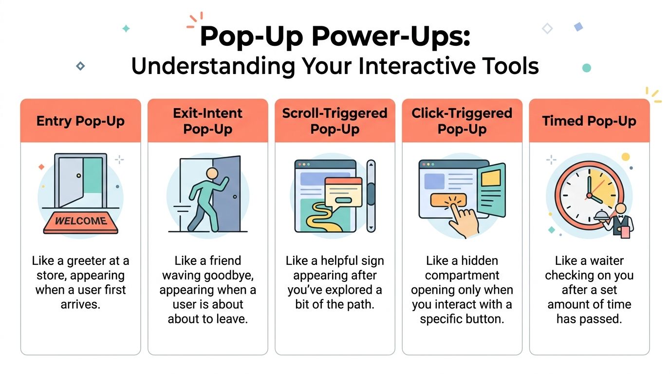
    Some pop-ups introduce. Some rescue. Some clarify. Some close. If you map the format to the job, the design decisions become simpler.

    Infographic

    The five core types

    Entry pop-up
    This is the greeter at the door. It appears soon after arrival or on first page load. It is useful when the entire site has one dominant campaign, such as a storewide promotion, a launch, or an event announcement. It is also the easiest type to overuse.

    Timed pop-up
    This behaves more like a store associate who waits a bit before asking if you need help. It appears after a set delay, which can work when the page needs a short reading period first. Timed pop-ups are common on blogs, feature pages, and documentation hubs where immediate interruption would feel clumsy.

    Scroll-triggered pop-up
    This one appears after the visitor has explored enough of the page to show interest. It is a strong fit for long-form content, collection pages, and landing pages where depth of engagement matters more than raw arrival.

    On-click pop-up
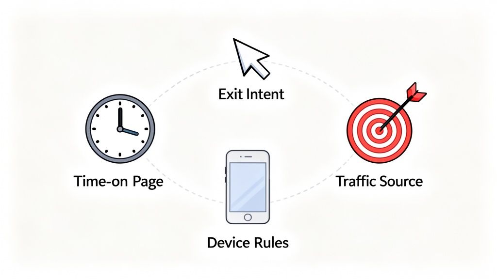
    This is the most respectful format because the visitor asks for it. A click on “See pricing options,” “Get the template,” or “Apply discount” opens the window. If you want to reduce friction without forcing attention, this format is hard to beat. For more ideas on where this fits inside a revenue capture flow, this guide on exit-intent popup strategy is useful context.

    Exit-intent pop-up
    This is the concierge catching someone at the door with one last relevant question or offer. It works best when you need to save a conversion, collect feedback, or redirect a hesitant buyer before the tab closes.

    Pop Up Window Types and Their Core Jobs

    Pop Up TypeTriggerPrimary Use CaseIntrusiveness Level
    Entry Pop-UpOn arrivalAnnouncements, welcome offers, major campaignsHigh
    Timed Pop-UpAfter delayLead capture, content offers, gentle promptsMedium
    Scroll-Triggered Pop-UpAfter reading progressContent upgrades, newsletter signup, mid-page engagementMedium
    Click-Triggered Pop-UpUser clicks a button or linkPricing reveals, gated assets, offer detailsLow
    Exit-Intent Pop-UpLeaving behaviorCart recovery, objection capture, last-chance offerHigh but context-sensitive

    What works for which goal

    If your goal is lead generation, timed or scroll-triggered pop-ups usually fit better because they wait for some engagement.

    If your goal is offer redemption or feature explanation, on-click works well because the visitor chooses to open the window.

    If your goal is abandonment prevention, exit-intent is the obvious choice because it catches a moment you cannot recover later with certainty.

    The mistake is not choosing the “wrong” pop-up type. The mistake is choosing a trigger before deciding what job the pop up window needs to do.

    Designing Pop Ups That Convert Without Annoying Users

    Most design advice focuses on aesthetics. Conversion-focused design starts with respect for context.

    A pop up window should feel easy to understand, easy to dismiss, and impossible to misread. If a visitor has to scroll inside it, hunt for the close icon, or decode what you want, the pop-up is already underperforming.

    Size first, then copy

    The practical desktop ceiling matters more than many teams realize. Digioh recommends a maximum size of 900×650 pixels, with a sweet spot around 700×500 pixels, so the pop-up stays fully visible across common screens without forcing a scroll. For mobile, the recommendation is 360×660 pixels maximum. Their guidance is worth reviewing in full if you are rebuilding templates for responsiveness and visibility: recommended pop-up sizes for desktop and mobile.

    The reason this matters is simple. A conversion pop-up is not a landing page. It needs to complete one interaction quickly.

    Modal behavior is powerful, but expensive

    A modal pop up window blocks the page and demands attention. That can help when the action matters and the timing is justified. It can also create friction if you show it too early or for a weak ask.

    IBM’s documentation on pop-up windows explains the underlying modal pattern clearly. The user must complete or dismiss the window before returning to the underlying task. That is exactly why modals are effective for checkout rescue, urgent clarification, or a final pre-exit offer. It is also why they feel intrusive when used for generic newsletter prompts. See the original IBM pop-up window guidelines for the interaction model.

    The copy should answer one question

    Do not write clever headlines first. Write the answer to the visitor’s likely hesitation.

    A few reliable patterns:

    • Pricing friction: Offer a comparison, a short explanation, or a lower-commitment next step.
    • Cart hesitation: Surface shipping clarity, a limited offer, or a support route.
    • Content engagement: Offer a checklist, template, or follow-up resource tied to the page topic.
    • Trial uncertainty: Ask what is holding the visitor back, then route them based on the answer.

    Good visual treatment helps, but message hierarchy does most of the heavy lifting. If you need examples of broader design elements that boost conversions, study how contrast, spacing, and call-to-action placement support clarity rather than ornament.

    A quick quality check

    Use this before launch:

    • Visible close option: Make dismissal obvious on desktop and mobile.
    • Single ask: One form, one CTA, one outcome.
    • Context match: The offer should make sense on that specific page.
    • Short form: Ask only for the information you need now.
    • Consent handled cleanly: If you collect data or marketing permission, make it explicit and easy to understand.
    • Mobile review: Check spacing, keyboard behavior, and tap targets by hand.

    For teams running frequent experiments, this archive of conversion optimization articles is a good companion read because pop-up design usually improves when it is treated as part of a larger CRO system, not a one-off overlay.

    Using Strategic Triggers to Unlock High Intent Moments

    Timing decides whether a pop up window feels helpful or clueless.

    The same offer can perform poorly on a timer and work beautifully on exit. The difference is not creative quality. It is intent recognition.

    Exit-intent is about behavior, not guesswork

    Exit-intent systems watch for signals that suggest the session is ending. On desktop, that often means pointer movement toward the browser chrome or tab area. On a product page or checkout page, that final moment is often the only chance to ask a direct question or present a rescue offer before the visit disappears.

    That makes exit pop-ups useful for things that benefit from urgency:

    • Cart rescue
    • Plan selection hesitation
    • Demo abandonment
    • “Not now” feedback capture

    A simple offer is not always the best move. Sometimes the better tactic is a one-question survey that surfaces the reason for hesitation. That answer can guide the next action better than a blanket discount ever will.

    This video gives a practical visual overview of how these triggers can be used on site:

    On-click and scroll triggers often qualify intent better

    On-click is underrated because it does not feel like a “pop-up strategy.” It should.

    If someone clicks “show me the offer,” “compare plans,” or “unlock the template,” they are self-identifying as interested. That makes the interaction cleaner and often easier to attribute to the next action.

    Scroll-based triggers serve a different purpose. They work best when engagement depth matters. Someone who has read thoroughly into an article, feature page, or buying guide has earned a more specific ask than a new visitor on page load.

    Trigger selection by page type

    Use a simple mapping approach:

    • Pricing page: Exit-intent for objections, on-click for plan clarification
    • Blog post: Scroll-triggered for content upgrades or newsletter signup
    • Product page: Timed or on-click for feature details and FAQs
    • Cart or checkout: Exit-intent for recovery, reassurance, or support

    For stores struggling with drop-off near checkout, this guide on reducing shopping cart abandonment is a useful reference point because trigger logic matters most when the buyer is close to revenue.

    Trigger strategy works best when each pop up window answers the question the visitor is most likely asking at that exact moment.

    Measuring Pop Up Performance and Attributing Real ROI

    A pop up window should be measured like a revenue lever, not a design asset.

    Too many teams stop at impressions, clicks, or raw signups. Those metrics tell you whether the box got attention. They do not tell you whether it improved the business.

    Track outcomes, not just interactions

    The better reporting model connects pop-up exposure and interaction to downstream events such as:

    • Qualified leads created
    • Trials started
    • Checkout completion
    • Subscription selection
    • Offer acceptance
    • Captured objections that explain churn risk

    That last one matters more than most dashboards admit. A survey response like “too expensive,” “missing integration,” or “just researching” changes how you evaluate the session. Some pop-ups create immediate conversions. Others generate decision data that improves your pricing, roadmap, messaging, or retargeting later.

    Privacy changes make lazy attribution unreliable

    Many setups break at this point.

    Since Chrome’s third-party cookie phaseout began, there has been a 35% drop in pop-up display rates, and Safari’s ITP can block up to 60% of traditional intent-based pop-ups, according to the source referenced in this overview: cookie-less popup strategy discussion. If your pop-up program depends on brittle client-side tracking, your reporting can look cleaner than reality while becoming less trustworthy.

    That changes the job of the growth team. You need a first-party view of behavior and attribution that survives browser restrictions.

    A better test framework

    Do not test five variables at once. Pick one layer at a time.

    Try this order:

    1. Trigger
      Test whether the pop-up appears at the right moment.

    2. Offer or question
      Compare a discount, reassurance message, or feedback prompt.

    3. Form friction
      Remove unnecessary fields. Reduce decision load.

    4. CTA language
      Make the action explicit and outcome-based.

    Then judge the result by business impact. Did the campaign recover more carts, influence more trials, or uncover better reasons for non-conversion? Those are the outcomes stakeholders care about.

    If your attribution cannot connect the pop up window to revenue or a meaningful buying signal, you are optimizing theater.

    Real World Pop Up Examples and Performance Benchmarks

    Benchmarks matter, but examples matter more because they show where the pop up window sits in the buying flow.

    Ecommerce recovery

    A shopper adds products to cart, reaches checkout, pauses, and starts to leave. The worst response is a generic “join our newsletter” prompt. The better response is an exit pop-up with one relevant decision. A small incentive, shipping reassurance, or a quick “what stopped you?” survey can all work, depending on the business.

    Pop-ups earn their keep in this scenario. They are not trying to create demand from scratch. They are trying to rescue intent that already exists.

    SaaS objection capture

    On a pricing page, many visitors are interested but not ready. A pop-up that appears at exit can ask a direct question such as what prevented sign-up. The answer is often more valuable than one more anonymous pageview. Product teams can use those responses to improve packaging and messaging, while growth teams can segment follow-up by objection type.

    Content and lead capture

    Publishers and B2B teams often use scroll or click-triggered pop-ups for guides, calculators, webinar registration, or newsletter signup. The best versions feel like a continuation of the page, not a detour from it. The offer matches what the visitor was already consuming.

    What “good” looks like

    The ceiling is much higher than many teams assume. Average pop-ups convert around 3 to 4%, while elite, highly optimized campaigns can reach 42 to 57%, based on OptiMonk’s pop-up statistics roundup. That does not mean every site should expect those numbers. It does mean mediocre performance is not a reason to dismiss the channel. It is usually a reason to fix the trigger, the offer, or the fit.

    Strong pop-up programs usually share the same traits:

    • Tight message-to-page match
    • A clear reason to act now
    • Low-friction interaction
    • Relentless testing

    Frequently Asked Questions About Pop Up Windows

    Will pop-ups hurt SEO

    They can, especially on mobile, if they block core content immediately and make the page hard to use. The safer approach is to delay the ask, reduce screen takeover, and make dismissal obvious. Search visibility problems usually come from intrusive implementation, not from using a pop up window at all.

    How many pop-ups are too many

    If a visitor sees multiple unrelated pop-ups in one session, you are probably overdoing it. Many teams should think in terms of priority, not volume. Pick the single most important intervention for that page and suppress lower-priority ones.

    Can I show different pop-ups to different visitors

    Yes, and you should. Traffic source, landing page, cart state, product category, and visit behavior all change what a useful message looks like. A first-time blog reader should not see the same pop up window as a returning shopper abandoning checkout.

    Should every pop-up offer a discount

    No. Discounts solve one problem. They do not solve confusion, lack of trust, unclear value, or missing information. In many cases, a FAQ-style clarification, a comparison guide, or a one-question survey is the better move.

    Where can I find good examples before building my own

    Reviewing strong examples is one of the fastest ways to spot weak copy and lazy trigger logic. This collection of High-Converting Exit Intent Popup Examples is a useful place to study angles, offers, and CTA structure before launching your own tests.

    What is the simplest rule to follow

    Make the pop-up earn its interruption. If the timing is earned and the value is obvious, users tolerate it. If not, they close it and remember the annoyance.


    If you want to turn pop-ups into a measurable revenue channel instead of another on-site widget, Receiver is built for that job. It helps SaaS and ecommerce teams combine exit surveys, targeted offers, intent signals, and attribution in one real-time dashboard so you can see why visitors leave, intervene before they churn, and connect those interactions to actual revenue.

  • 10 Actionable SaaS Customer Retention Strategies for 2026

    10 Actionable SaaS Customer Retention Strategies for 2026

    Customer churn is the silent killer of SaaS growth, yet most advice on the topic is frustratingly vague. We’re constantly told to ‘delight customers’ or ‘listen to feedback,’ but what does that actually mean day-to-day? In an environment of steadily rising acquisition costs, keeping the customers you’ve already won is the single most effective growth lever you can pull. Forget the platitudes; a strong set of SaaS customer retention strategies is no longer a nice-to-have, it’s a core business function.

    This article cuts through the noise. We’re not here to talk about abstract theories. Instead, we’re diving into 10 specific, high-impact playbooks you can implement this quarter to protect your revenue and build a more resilient company. We’ll provide a clear roadmap for everything from deploying real-time exit-intent offers that save subscribers at the last second to building data-driven attribution models that pinpoint your most valuable acquisition channels.

    Each strategy is broken down into a practical, actionable guide, including:

    • Step-by-step implementation notes
    • Key metrics to track success
    • Real-world examples for inspiration

    You’ll walk away with a clear understanding of not just what to do, but how and when to do it. Let’s move beyond the hype and explore the tactics that actually reduce churn and create lasting customer relationships.

    1. Exit-Intent Offers and Dynamic Incentives

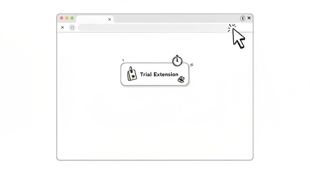
    Imagine a customer is about to click “cancel subscription.” What if you could intervene at that exact moment with the perfect offer to make them reconsider? That’s the power of exit-intent offers, a real-time strategy that detects when a user’s cursor moves to leave the page and triggers a dynamic, targeted incentive. It’s one of the most direct SaaS customer retention strategies for preventing voluntary churn before it happens.

    This isn’t about throwing a generic “Please stay!” popup at everyone. It’s a precise tactic that combines behavioral analytics with immediate action. By tracking mouse movements, scroll speed, and time on page, you can identify a user on the brink of churning and present a compelling reason to stick around, like a discount, a trial extension, or a helpful resource.

    Cartoon illustration of a web browser displaying a 'Trial Extension' pop-up with various icons.

    How to Implement Exit-Intent Offers

    This approach works best when you customize the offer to the user’s context. A new trial user might see a different message than a long-time paying customer. For instance, the email marketing platform ConvertKit uses exit-intent offers on its sign-up page to convert abandoning visitors into newsletter creators, while Drift might trigger a chatbot with a special offer when a user on the pricing page shows signs of leaving. For a deeper dive into the mechanics, you can explore how to build effective exit-intent popups.

    Here are some actionable tips for getting started:

    • Segment Your Offers: Don’t show the same popup to everyone. Create distinct offers for different user stages, such as free trial users, paying customers, and even recently churned users visiting your help docs.
    • Test Non-Discount Incentives: Discounts can devalue your product. Experiment with offering a free consultation, a temporary feature unlock, or an extended trial. These can be more effective and protect your average revenue per user (ARPU).
    • Set Frequency Caps: Annoying your users is counterproductive. Ensure you set strict rules so the same person doesn’t see an exit offer every time they visit. Once a week per user is a good starting point.

    2. Intent Scoring and Risk Segmentation

    What if you could predict which customers are likely to churn before they even think about canceling? That’s the core idea behind intent scoring and risk segmentation. This data-driven method assigns a “health score” to each user based on their behavior, allowing you to proactively identify at-risk accounts and prioritize your retention efforts. It’s one of the most powerful SaaS customer retention strategies for moving from a reactive to a proactive mindset.

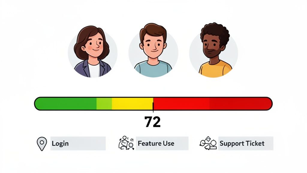
    This isn’t about guesswork; it’s a systematic approach to understanding customer engagement. By tracking key signals like login frequency, feature adoption, and support interactions, you can build a clear picture of who is getting value from your product and who is drifting away. This allows you to focus your resources on the customers who need attention the most, preventing churn before it becomes a problem.

    A dashboard displaying customer health scores, user avatars, and key engagement metrics like login, feature use, and support tickets.

    How to Implement Intent Scoring

    This approach is highly effective when you define what a “healthy” user looks like for your specific product. Customer success platforms like Gainsight build entire workflows around account health scores, triggering CSM interventions when a key account’s score drops. Similarly, product analytics tools like Amplitude and Mixpanel help teams identify user segments with declining engagement, signaling a need for re-engagement campaigns. You can even start simply, as explained in this guide to creating a basic customer health score.

    Here are some actionable tips for getting started:

    • Start with Core Signals: Don’t overcomplicate it initially. Begin by tracking 3-5 core positive signals, such as login frequency, adoption of key features, and recent upgrades.
    • Include Negative Signals: A complete picture includes warning signs. Add negative indicators to your model, like an increase in support tickets, recent billing failures, or a significant decrease in usage.
    • Create Segment-Specific Models: The definition of a “healthy” customer can vary. Build separate scoring models for different segments, like SMB versus Enterprise clients, as their usage patterns will likely differ.
    • Validate Your Model: A scoring model is only useful if it’s accurate. Validate its predictive power quarterly by comparing the scores of churned customers against those who stayed.

    3. Customer Feedback and Exit-Survey Collection

    Quantitative data tells you what is happening, but it rarely tells you why. To understand the human reasons behind churn, you need a systematic way to listen to your customers. This is where customer feedback loops and exit surveys become one of the most insightful SaaS customer retention strategies, turning the moment of cancellation into a powerful learning opportunity.

    This strategy involves capturing direct feedback at critical points in the customer journey, especially when a user decides to leave. By asking focused questions, you can uncover specific feature gaps, pricing objections, usability issues, or competitive threats that your analytics dashboards might miss. The goal is to collect qualitative insights that fuel product development, refine marketing messages, and prevent future churn.

    How to Implement Feedback and Exit Surveys

    Effective implementation is about asking the right questions at the right time without creating friction. For instance, Typeform presents a simple, clean survey when a user cancels to understand their exact reasons. Slack takes a proactive approach by asking new users how they heard about the platform, which helps them attribute sign-ups to specific acquisition channels and double down on what works. To effectively gather these actionable insights, organizations should master Voice of the Customer programs, which formalize the process of listening and acting on feedback.

    Here are some actionable tips for getting started:

    • Keep It Short and Focused: To maximize completion rates, limit your exit survey to one or two crucial questions. A user who has already decided to leave has little patience for a long questionnaire.
    • Include an “Other” Field: Always provide an open-text “Other” option. This is often where you’ll find the most surprising and valuable insights that you didn’t anticipate.
    • Aggregate and Analyze Trends: Review feedback responses monthly. This helps you distinguish between persistent patterns (like a recurring request for a specific feature) and isolated, one-off complaints.
    • Close the Loop with Product Teams: Don’t let the data sit in a spreadsheet. Create a monthly ritual to share aggregated findings with your product and engineering teams to directly influence the development roadmap and prioritization.

    4. Channel Attribution and ROI-Based Acquisition Focus

    What if your customer retention efforts started before a user even signed up? That’s the core idea behind shifting your acquisition focus to channels that bring in high-value, long-term customers. It’s a proactive retention play that moves beyond surface-level metrics like Cost Per Lead (CPL) and instead prioritizes the channels that deliver the best lifetime value (LTV). This is one of the most impactful SaaS customer retention strategies because it directly links acquisition spending to long-term profitability.

    This strategy requires you to stop treating all acquisition channels equally. It involves a deep analysis of your customer data to identify which sources-whether it’s organic search, a specific paid ad campaign, or a referral partner-produce users who stick around the longest and generate the most revenue. By doing this, you can double down on what works and cut spending on sources that attract low-quality, high-churn signups.

    How to Implement a Retention-Focused Acquisition Strategy

    The key is connecting acquisition data (like UTM parameters) to post-signup behavior and revenue. For example, HubSpot has famously focused on organic content marketing because it consistently drives customers with higher LTV compared to other channels. Similarly, Calendly’s viral, product-led growth motion became its primary acquisition channel because users acquired this way showed superior retention rates. You can discover how to attribute revenue to marketing sources to build a similar feedback loop.

    Here are some actionable tips for getting started:

    • Implement Rigorous UTM Tracking: Consistency is crucial. Ensure every single campaign across all channels uses a standardized UTM parameter system. This data is the foundation for your entire analysis.
    • Calculate LTV by Channel: Don’t just look at initial conversion rates. Segment your customer base by acquisition source and calculate the average LTV for each. A 12-month timeframe is a great starting point to see the full retention picture.
    • Review and Reallocate Quarterly: This isn’t a “set it and forget it” task. Channel performance can change. Dedicate time each quarter to review your channel LTV data and shift your budget toward the top performers.
    • Test New Channels with a Retention Mindset: When experimenting with a new channel, measure its success not just by the cost per acquisition (CAC) but by the retention and LTV of the users it brings in over the first few months.

    5. Personalized Onboarding and Feature Adoption Paths

    First impressions are everything, and in SaaS, the first impression is your onboarding process. A generic product tour won’t cut it. Personalized onboarding guides new users directly to the features that solve their specific problems, dramatically accelerating their time-to-value. This tailored experience is one of the most effective SaaS customer retention strategies because it proves your product’s worth from the very first session.

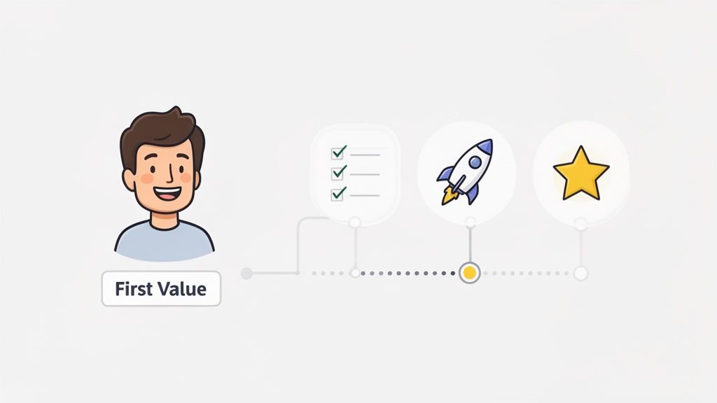
    Instead of a one-size-fits-all tutorial, this approach customizes the initial product experience based on a user’s role, goals, or industry. It’s about quickly connecting them to their “aha!” moment, that point where they truly grasp how your tool makes their life easier. This immediate sense of accomplishment and value is a powerful antidote to early-stage churn.

    Illustration of a customer journey showing initial value, task completion, growth, and ultimate success.

    How to Implement Personalized Onboarding

    Success here means treating different users differently from the moment they sign up. For example, Calendly’s famously minimal onboarding gets a solo consultant to their first scheduled meeting in seconds. In contrast, Notion offers a library of templates during onboarding, guiding a project manager toward a “Project Roadmap” while steering a student toward a “Class Notes” setup. The goal is to make the user feel the product was built just for them.

    Here are some actionable tips to personalize your user onboarding:

    • Segment by Job-to-be-Done: During signup, ask users what they want to achieve. Use their answer to trigger a unique onboarding path that focuses on the relevant features for that specific job.
    • Focus on the First Core Action: Identify the single most important action a new user must take to see value. Design your entire initial flow around getting them to complete that one action, whether it’s creating a task, sending an email, or connecting an integration.
    • Use Progress Indicators: A simple progress bar or checklist gives users a sense of momentum and achievement. This encourages them to complete the full onboarding process.
    • Make It Skippable: Power users or those already familiar with similar tools don’t need their hands held. Always provide a clear “skip” option to respect their time and prevent frustration. For a deeper look at optimizing these early user interactions, you can explore more on the topic of conversion optimization.

    6. Proactive Customer Success and Health Check Programs

    Instead of waiting for a customer to send a complaint or a cancellation request, what if you could address their problems before they even fully form? This is the core idea behind a proactive customer success program. It’s a structured approach where your team regularly engages customers to ensure they’re succeeding with your product, spotting issues, and finding growth opportunities long before churn becomes a risk. This makes it one of the most foundational SaaS customer retention strategies for building long-term loyalty.

    This isn’t about aimless check-in calls. It’s a data-driven system that uses customer health scores, usage trends, and adoption metrics to guide your outreach. Whether through a dedicated Customer Success Manager (CSM) or automated in-app messages, the goal is to provide value and guidance at every turn, transforming your relationship from a simple vendor to an indispensable partner.

    How to Implement a Proactive CS Program

    A successful program requires a tiered approach that matches resources to customer value. High-value enterprise accounts benefit from direct, personal attention, while smaller accounts can be managed effectively through automated, tech-touch workflows. For instance, Salesforce assigns dedicated CSM teams to its high-ACV accounts for personalized guidance, while a tool like Intercom might automate check-ins based on product usage triggers for its smaller customers. The key is to make every interaction relevant and timely.

    Here are some actionable tips for getting started:

    • Create a Tiered Structure: Segment your customers to allocate resources effectively. Offer high-touch, hands-on support with dedicated CSMs for top-tier accounts, and use a low-touch, automated approach (like email sequences and in-app guides) for your smaller customer base.
    • Base Outreach on Risk Level: Don’t treat all customers the same. Set up health scores to identify at-risk accounts and engage them frequently, perhaps weekly. Healthy, stable customers might only need a quarterly business review to stay on track.
    • Develop Conversation Playbooks: Equip your CS team with clear playbooks for common scenarios. Create scripts and checklists for onboarding calls, adoption check-ins, and renewal conversations to ensure consistency and effectiveness.
    • Measure CS Impact: Track how your proactive efforts affect key metrics. Measure the improvement in net revenue retention (NRR) and churn rates for segments managed by your CS team versus those that are not.

    7. Expansion Revenue and Upsell Strategies

    True customer retention isn’t just about preventing churn; it’s about growing with your customers. Expansion revenue, earned by upselling existing users to higher-tier plans or cross-selling them new products, is a powerful indicator of a healthy SaaS business. This approach shifts the focus from simply keeping customers to actively increasing their value, turning retention into a significant growth engine.

    This is one of the most critical SaaS customer retention strategies because it proves your product delivers escalating value. When customers upgrade, they’re signaling that your solution has become indispensable to their operations. Take HubSpot, for example. It masterfully guides users from its free tools or a single “Hub” (like Marketing) into a full suite of products covering sales, service, and operations as their business needs grow.

    How to Implement Expansion Revenue Strategies

    A successful upsell feels like a natural next step for the customer, not a sales pitch. This requires building clear upgrade paths directly into your product and pricing. Stripe does this well by allowing a business to start with payments and then easily add on modules like Connect, Billing, or Radar as their company scales. To get more ideas on this topic, you can explore detailed guides on SaaS growth.

    Here are some actionable tips for getting started:

    • Map Your Upgrade Paths: Design your product tiers with clear value propositions. Conduct a “Jobs to be Done” analysis for each tier to understand what problem a customer is solving by upgrading. This clarifies the “why” behind the higher price.
    • Use Data to Time Your Nudges: Identify key usage metrics that signal a customer is outgrowing their current plan. For instance, if a project management tool sees a team constantly hitting their file storage limit, it’s the perfect time to prompt an upgrade.
    • Train CS on Value-First Upselling: Equip your customer success team to spot expansion opportunities during their regular check-ins. They should position upgrades as solutions to emerging challenges, not as a way to extract more money.
    • Measure Net Dollar Retention: Track your expansion MRR by cohort. A net dollar retention rate over 100% means your growth from existing customers is outpacing any revenue lost to churn, which is the gold standard for a sustainable SaaS model.

    8. Win-Back Campaigns and Churn Recovery

    What if you could turn a “goodbye” into a “welcome back”? A churned customer isn’t necessarily lost forever. With a smart win-back campaign, you can re-engage users who have canceled, reminding them of your value and giving them a compelling reason to return. It’s one of the most cost-effective SaaS customer retention strategies because you’re targeting a warm audience that already understands your product.

    This strategy goes beyond a simple “we miss you” email. It involves a deliberate program that uses data from churn surveys to address the specific reasons a customer left. By targeting recently lapsed or inactive users with tailored messages, special offers, and news about relevant product improvements, you acknowledge their past objections and demonstrate that you’ve evolved.

    How to Implement Win-Back Campaigns

    A successful win-back program hinges on understanding why the customer left in the first place. For instance, Netflix often sends emails to former subscribers highlighting new, popular shows or offering a discounted first month back. Similarly, Adobe might target users who churned due to a missing feature by sending an update announcing that the exact feature has now been released. The key is to make the offer directly relevant to their original pain point.

    Here are some actionable tips for getting started:

    • Segment by Churn Reason: Group churned users based on their exit survey feedback (e.g., price, missing features, poor support, switched to a competitor). This allows you to create highly targeted messaging that speaks directly to their concerns.
    • Lead with Product Improvements: If a user left because of a feature gap, your most powerful message is “We heard you.” Start your email by announcing the new feature they wanted. This shows you listen to feedback and actively improve your service.
    • Create Time-Sensitive Incentives: Offer a limited-time discount or a special “welcome back” plan to create urgency. This encourages immediate action without permanently devaluing your pricing structure.
    • Set a Clear Recovery Target: Define what success looks like. Aiming to recover a specific percentage of churned customers, such as 10-15% annually, helps you measure the campaign’s effectiveness and justify the investment.

    9. Product-Led Growth and Self-Service Expansion

    What if your product was so good it sold itself and kept customers coming back for more? That’s the core idea behind Product-Led Growth (PLG), a model where the product acts as the primary driver of acquisition, conversion, and expansion. By enabling self-service adoption through a freemium or trial plan, you place the product’s value front and center, making it one of the most organic SaaS customer retention strategies available.

    This approach flips the traditional sales-led model on its head. Instead of a sales team convincing prospects of the product’s value, users experience it directly. Retention becomes a natural outcome of a great product experience, as users who find value are more likely to stay, upgrade, and advocate for the tool. This creates a powerful, self-sustaining growth loop.

    How to Implement a Product-Led Strategy

    Success with PLG relies on making your product accessible and demonstrating its value quickly. Calendly is a perfect example; its core scheduling function is so intuitive and immediately useful that it requires almost no formal onboarding. Users adopt it, share it, and eventually upgrade for advanced features. Similarly, Slack’s freemium model allows teams to form deep usage habits before they ever need to speak to a salesperson.

    Here are some actionable tips for getting started:

    • Design a Valuable Free Tier: Your free plan shouldn’t be a crippled version of your product. It must be fully functional but limited by usage, features, or team size to create natural upgrade points when users hit a ceiling.
    • Create Obvious Upgrade Moments: As users adopt your product, make the path to paid features clear and contextual. A prompt to upgrade could appear when a user tries to access a premium feature or hits a usage limit.
    • Invest in Flawless Onboarding: With no sales team to guide them, users must be able to achieve their “Aha!” moment on their own. Invest heavily in in-app guides, checklists, and tutorials to ensure a smooth self-service experience. For a deep dive on this, you can learn about building effective user onboarding.
    • Measure Free-to-Paid Conversion: Your key metric is the free-to-paid conversion rate. Constantly analyze your funnel to identify friction points and optimize the journey from free user to paying customer.

    10. Community Building and Peer-Driven Retention

    What if your most effective retention tool wasn’t a feature or a discount, but your other customers? That’s the core idea behind community building, where you foster an engaged network of users who support each other. This approach creates a powerful, self-reinforcing source of value that goes far beyond your product’s core functionality, making it one of the most durable SaaS customer retention strategies.

    An active community turns users into advocates and experts. Members share best practices, solve problems for one another, and create content that showcases your platform’s potential. This peer-driven learning and social proof create deep product stickiness, as customers become invested not just in your software, but in the ecosystem and relationships built around it.

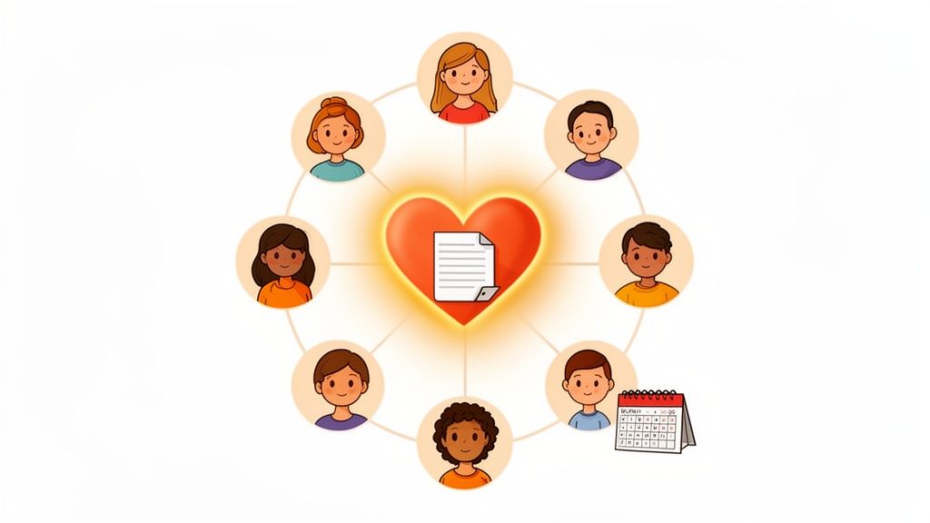
    A diagram of diverse cartoon people connected to a central heart containing a document, symbolizing community.

    How to Implement Community Building

    This strategy is about cultivating a space for genuine connection, not just a glorified support forum. For example, Figma’s Community allows designers to share files, templates, and plugins, directly integrating user-generated value into the product experience. Similarly, Airtable’s Universe is a gallery where users share their custom-built “bases,” inspiring others and demonstrating the platform’s versatility. Notion and Zapier also thrive on user-created templates and integrations shared within their communities.

    Here are some actionable tips for getting started:

    • Start Small and Focused: Begin with a small, highly engaged core group of power users or beta testers. Their enthusiasm and expertise will set the tone before you open the community to a wider audience.
    • Establish Clear Guidelines: Create and enforce clear moderation standards and community guidelines from day one. This ensures the space remains safe, respectful, and constructive for everyone involved.
    • Recognize and Reward Contributors: Implement tiers to acknowledge active members, such as “Experts,” “Moderators,” or “Super Users.” Feature top community content in your blog, newsletter, or social media to give contributors visibility.
    • Measure Community Impact: Don’t treat community as a cost center. Track the retention rates and lifetime value (LTV) of community members versus non-members to prove its direct impact on churn reduction and revenue.

    10 SaaS Customer Retention Strategies Comparison

    StrategyImplementation complexityResource requirementsExpected outcomesIdeal use casesKey advantages
    Exit-Intent Offers and Dynamic IncentivesMedium — real-time detection and A/B testing setupModerate: front-end scripts, analytics, marketing operationsImmediate uplift in conversions and recovery of imminent churnSaaS trials, subscription services, ecommerce cart abandonmentCaptures users at decision moment with measurable ROI
    Intent Scoring and Risk SegmentationHigh — modeling, integrations, real-time scoringHigh: historical data, analytics/ML, dashboards, engineeringProactive churn prediction and prioritized retention actionsProducts with rich usage data and enterprise accountsFocuses resources on highest-impact customers; early warning signals
    Customer Feedback and Exit-Survey CollectionLow — deploy forms/surveys and aggregationLow–moderate: survey tools and analyst time for insight extractionQualitative reasons for churn and feature-gap identificationAny product seeking root-cause insight, cancellation flowsReveals customer voice to inform product and roadmap decisions
    Channel Attribution and ROI-Based Acquisition FocusMedium–High — multi-touch tracking and LTV modelingModerate–high: attribution stack, UTMs, time to collect LTV dataOptimized acquisition spend and higher-quality customer sourcingCompanies with multiple channels and long LTV horizonsEliminates wasted spend and aligns marketing to retention metrics
    Personalized Onboarding and Feature Adoption PathsHigh — conditional flows and in-app guidanceHigh: product/
    design/
    development effort + onboarding tooling
    Faster time-to-value and significantly improved early retentionProducts with complex workflows or varied user personasDramatically improves Day 1/7 retention and reduces support load
    Proactive Customer Success and Health Check ProgramsMedium — playbooks and scheduled outreach (hard to scale)High: dedicated CSMs, analytics, trainingReduced churn, stronger relationships, more expansion opportunitiesHigh-ACV enterprise accounts or strategic customersPrevents issues before they escalate and uncovers upsell paths
    Expansion Revenue and Upsell StrategiesMedium — pricing tiers and upgrade triggersModerate: product roadmap work, CS/sales enablementIncreased revenue per customer and higher net retentionMature products with clear upgradeable featuresLower CAC for growth and improved unit economics through expansion
    Win-Back Campaigns and Churn RecoveryLow–Medium — automated segmented campaignsModerate: marketing automation, tailored offers, messagingPartial recovery of churned customers at lower costRecently churned cohorts, seasonal churn patternsCost-effective way to recover customers and validate product fixes
    Product-Led Growth and Self-Service ExpansionHigh — product-first design and freemium mechanicsHigh: product development, analytics, onboarding investmentScalable adoption, viral expansion, and organic retentionSelf-serve SMB and individual-user focused productsLow-friction acquisition with product driving retention and growth
    Community Building and Peer-Driven RetentionMedium — platform setup and community managementModerate–high: community managers, events, moderationHigher LTV and lower churn among engaged membersCollaborative tools, creative/design communities, advanced usersPeer support reduces support costs and creates strong advocacy

    From Strategy to System: Building Your Retention Engine

    We’ve just explored a full toolkit of powerful SaaS customer retention strategies, from dynamic exit-intent offers to proactive customer health checks and community-led growth. It’s a lot to take in, but the key isn’t to implement all ten at once. The real goal is to stop treating retention as a series of isolated fire drills and start building a cohesive, data-driven system.

    Retention isn’t a single department’s job; it’s the outcome of your entire customer experience. It’s the product of a smooth onboarding process, a pricing model that scales fairly, and a support system that makes users feel heard. The strategies we’ve covered are the building blocks for that system. Think of them not as a checklist, but as a menu of solutions you can deploy to solve specific problems.

    Your First Steps: From Insight to Action

    The journey from high churn to high retention begins with a single, focused step. Don’t get overwhelmed by the possibilities. Instead, start by identifying your biggest “leaky bucket.”

    • Is your trial-to-paid conversion rate alarmingly low? Focus your energy on Personalized Onboarding (Strategy #5) and Product-Led Growth tactics (Strategy #9) to demonstrate value quickly.
    • Are established customers leaving unexpectedly after a year? Dive into Proactive Customer Success Programs (Strategy #6) and use Intent Scoring (Strategy #2) to spot at-risk accounts before they decide to leave.
    • Is your marketing spend bringing in the wrong type of user? Your priority should be Channel Attribution (Strategy #4) to double down on acquisition sources that deliver high-LTV customers.

    Once you’ve identified the most significant point of friction, pick one or two strategies from this guide that directly address it. Implement them, measure the impact with clear metrics, and then iterate. To successfully implement and build your retention engine, it’s essential to look at comprehensive guides that offer proven strategies to increase customer retention. This methodical approach prevents you from spreading your resources too thin and ensures you get measurable wins early on.

    The Power of a Connected Retention Engine

    The true magic happens when these individual strategies start working together. Imagine this: a customer’s usage drops, triggering a low health score (Intent Scoring). This automatically alerts your Customer Success team to schedule a check-in (Proactive CS). During that call, you learn they’re missing a key feature. You guide them through it, and their engagement recovers.

    Later, if that same customer visits your cancellation page, an Exit-Intent Offer appears with a message tailored to their usage history. If they still churn, an automated Exit Survey asks why, and their feedback is routed directly to your product team. Six months later, you launch a feature they asked for and enroll them in a targeted Win-Back Campaign.

    This is no longer a collection of tactics; it’s a living, breathing retention engine. It’s a system that learns, adapts, and turns potential churn events into opportunities for re-engagement and product improvement. Building this engine is the ultimate goal, as it transforms your business from being reactive to proactive, creating a powerful growth loop where retention fuels acquisition, and acquisition brings in customers more likely to be retained.


    Ready to stop guessing why customers leave? Receiver gives you the tools to automatically survey churning customers, uncover hidden intent signals on your site, and attribute churn back to its source. Start building your retention engine today by understanding exactly what needs fixing. Find out more at Receiver.

  • A Friendly Guide to Reduce Shopping Cart Abandonment

    A Friendly Guide to Reduce Shopping Cart Abandonment

    If your online store feels like it’s hemorrhaging money right at the finish line, you’re not wrong. To reduce shopping cart abandonment, the first step is realizing it’s not just a metric on a dashboard—it’s high-intent customers walking away with your revenue in their pockets. The real work begins when you stop just watching the number and start diagnosing why they’re leaving.

    Understanding the Cart Abandonment Problem

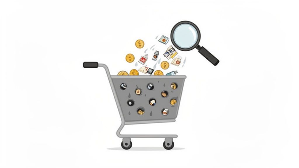
    Magnifying glass over a leaky shopping cart with products and money, symbolizing lost sales.

    It’s tempting to get bogged down in industry benchmarks, but the problem is fundamentally simple. Someone wanted your product. They liked it enough to click “Add to Cart,” but then… something went wrong.

    That’s not just a lost sale; it’s a failure at the most critical moment in the entire customer journey. Whether you’re a SaaS business watching potential users drop off during sign-up or an ecommerce store with carts full of abandoned goods, the result is the same: a direct hit to your bottom line.

    Why Your Bottom Line Is Leaking

    The numbers put the scale of the challenge into perspective. The global average shopping cart abandonment rate is a staggering 70.19%. This means more than 7 out of every 10 shoppers who start a purchase simply walk away.

    What’s tripping them up? The number one culprit is unexpected shipping costs, which deter 1 in 4 (25%) shoppers. When you factor in other extra fees, that number jumps to 55%. For anyone running an online store, this is a clear signal that you can’t afford to wait. You have to intervene to win back that massive slice of revenue.

    But it’s not always one big, glaring issue. Often, it’s death by a thousand cuts. A confusing form, a missing trust seal, or a slow-loading payment page—any of these small friction points can be the final straw that sends a customer packing.

    The goal isn’t to eliminate abandonment entirely—that’s a fool’s errand. The real win is plugging the biggest, most obvious leaks in your checkout to recover revenue from the traffic you’re already getting.

    Shifting from Problem to Action

    Looking at a 70% abandonment rate can feel paralyzing. Where do you even begin? The trick is to stop thinking of it as one giant problem and start seeing it as a series of smaller, fixable ones.

    Instead of asking, “Why is my abandonment rate so high?” start asking sharper, more diagnostic questions:

    • Is our pricing crystal clear from the start? Hidden costs are the fastest way to break trust and lose a sale.
    • Are we forcing people to create an account? This is a huge barrier, especially for first-time buyers who just want to get in and out.
    • Does our mobile checkout feel clunky? If it’s not smooth and effortless on a phone, you’re bleeding sales. Period.
    • Do we look trustworthy? A lack of security badges or a cheap-looking design can spook customers right before they enter their credit card details.

    For a quick look at the most common reasons shoppers leave and what you can do about them right now, here’s a simple breakdown.

    Common Reasons for Cart Abandonment and Your First Fixes

    Reason for AbandonmentWhat Your Shopper ExperiencesYour Actionable Fix
    Unexpected Costs“Whoa, shipping is how much? No thanks.”Show all costs upfront on the product and cart pages. Offer a free shipping threshold.
    Forced Account Creation“I don’t want to create another account just to buy this one thing.”Offer a prominent “Guest Checkout” option.
    Complicated Checkout“This is taking too long. Too many steps and confusing forms.”Simplify your checkout to a single page. Use address auto-fill and offer express pay options.
    Security Concerns“This site looks a bit sketchy. I’m not putting my card info in here.”Display trust badges (SSL, McAfee, etc.) and customer reviews clearly.
    Poor Mobile Experience“These buttons are too small, and the site is slow on my phone.”Test and optimize your entire checkout flow for mobile. Ensure buttons are large and pages load fast.

    Each fix might seem small, but together they create a much smoother path to purchase.

    By breaking the problem down this way, you can finally move from staring at data to taking meaningful action. Every little improvement directly contributes to a better customer experience and, most importantly, more revenue.

    For a complete playbook on turning this challenge into an opportunity, check out An AI-Powered Guide to Reduce Cart Abandonment. It’s the perfect starting point for transforming browsers into buyers.

    Finding Out Why Your Visitors Are Leaving

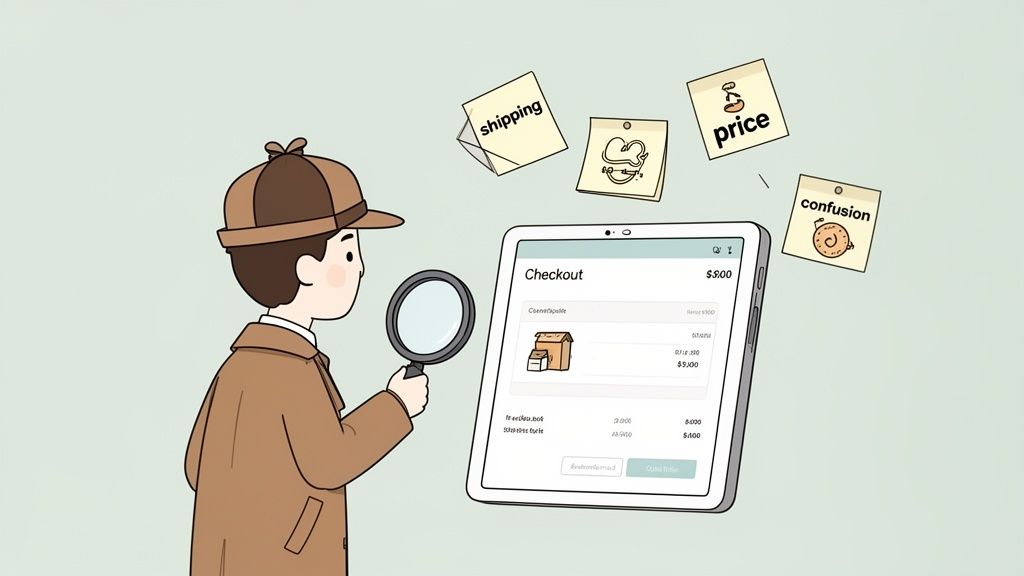
    Cartoon detective with magnifying glass analyzes e-commerce checkout issues, surrounded by sticky notes.

    Before you can patch the holes in your checkout funnel, you have to find them. To meaningfully reduce shopping cart abandonment, stop guessing and start diagnosing. This is where you put on your detective hat, gather clues, and figure out the exact friction points pushing people away.

    Your analytics dashboard is great for telling you what is happening—say, a huge drop-off between the cart and the payment page. But it’s completely silent on the why. The actionable insight comes from combining quantitative data with genuine human feedback.

    Start with Accurate Measurement

    First, you need a solid baseline. Calculating your cart abandonment rate isn’t just an academic exercise; it’s the benchmark you’ll use to measure every single improvement you make.

    The formula is straightforward:

    Cart Abandonment Rate = 1 – (Total Completed Transactions / Total Carts Created) x 100

    So, if 1,000 people add an item to their cart but only 300 actually buy it, your abandonment rate is 70%. Having this number turns that vague feeling of “losing sales” into a concrete metric you can actively improve.

    A Baymard Institute study found that 18% of shoppers bail on their carts because the checkout process is too long or complicated. Without asking your customers, you’d have no idea if that was your problem or if something else—like surprise shipping costs—was the real culprit.

    Use Surveys to Uncover the “Why”

    Once you know your numbers, it’s time to dig into the human side of the story. The most powerful way to find out why people are leaving is simple: just ask them. This is where a well-placed, non-intrusive exit-intent survey becomes your best friend.

    A smart exit survey only appears when someone signals they’re about to leave—by moving their mouse toward the back button or to close the tab. It’s your one last shot to capture a golden nugget of feedback.

    The goal is to get straight to the point with a single, relevant question that won’t annoy the user. The question should feel like it belongs, tailored to the specific page they’re on and what they were trying to do.

    Crafting the Perfect Survey Questions

    Vague questions get you vague, useless answers. For real insight, your questions must be specific and contextual.

    Here are actionable examples you can use:

    For Ecommerce Stores:

    • On the Cart Page: “What’s holding you back from completing your order today?” This is a great open-ended question that catches all sorts of issues.
    • On the Shipping Page: “Did you find our shipping options and costs fair?” This hits the #1 reason for cart abandonment head-on.
    • On the Payment Page: “Is there a payment option you were looking for but didn’t find?” This can quickly tell you if you need to add Apple Pay, Afterpay, or other popular services.

    For SaaS Companies:

    • On the Pricing Page: “Is our pricing clear? If not, what’s confusing?” This is perfect for uncovering problems with your pricing tiers or feature descriptions.
    • During Signup: “What’s the main thing stopping you from creating an account right now?” Use this to find and eliminate friction right in your onboarding flow.

    By gathering this direct feedback, you create a powerful loop that directly informs your strategy to reduce shopping cart abandonment. You’re no longer working off assumptions; you’re solving the real problems your almost-customers are telling you about. This is the foundation for making impactful changes that actually move the needle on revenue.

    Creating a Frictionless Checkout Experience

    A smartphone screen displaying a 'Guest Checkout' toggle in the ON position, along with security and rating icons.

    Alright, you’ve done the diagnostic work and have a good idea of why people are leaving. Now it’s time to fix the leaks. A smooth, confidence-inspiring checkout is your most powerful weapon to reduce shopping cart abandonment.

    Every extra click, unexpected fee, and confusing field is a potential exit ramp. Your job is to make buying from you feel completely effortless. The goal is to create a path from cart to confirmation so clean that your customers glide through without a second thought.

    Prioritize Mobile Optimization

    The modern checkout experience is overwhelmingly mobile. This is where the battle for conversions is won or lost. Mobile shopping is an abandonment minefield, with rates expected to hit 84% globally by 2026. That’s a huge jump from desktop’s 72%.

    So why the gap? It’s all about friction. Mobile web checkouts see 32% more drop-offs than native apps, and sites that take more than three seconds to load lose 44% more sales. The good news is that simple fixes make a huge difference. Adding 1-click checkout options can slash abandonment by 22%, while offering “Buy Now, Pay Later” (BNPL) can lower it by another 16%.

    Here’s how to win on mobile with ruthless simplicity:

    • Make Buttons Large and Tappable: Tiny “Continue” buttons or small radio selectors are a recipe for frustration. Make sure every interactive element is thumb-friendly.
    • Use Mobile-Native Features: This is a big one. Implement digital wallets like Apple Pay and Google Pay to let customers bypass all the tedious form-filling.
    • Test on Real Devices: Don’t just trust your browser’s “mobile view.” Test your entire checkout flow on actual iOS and Android phones to catch device-specific glitches.

    Simplify Your Forms Relentlessly

    Did you know the average checkout form has almost 15 fields? That’s roughly double what’s actually necessary. Each field is a tiny point of friction that adds up to a major barrier to purchase.

    A Baymard Institute report found that 18% of shoppers abandon carts because the checkout process is too long or complicated. Almost one in five lost sales are from a form that’s simply asking for too much.

    Go through every single field in your checkout and ask, “Is this absolutely critical to fulfill the order?”

    • Do you really need a phone number? For many businesses, the answer is no. Make it optional or remove it.
    • Combine “First Name” and “Last Name” into a single “Full Name” field. That’s one less tap for your customer.
    • Use Address Autofill: Integrate Google’s Places API to auto-populate the shipping address as the user types. This saves time and prevents typos.
    • Hide the Billing Address: If the billing address is the same as the shipping, just use a simple checkbox. When ticked, the redundant fields should disappear, making the page look shorter and less intimidating.

    Offer Guest Checkout and Build Trust

    Forcing a first-time buyer to create an account is a classic conversion killer. They don’t want a commitment; they just want to buy your product. Always, always offer a prominent guest checkout option. You can always invite them to create an account on the thank you page, right after you’ve secured their payment.

    At the same time, you must build rock-solid trust, especially at payment. Customers are on high alert when they pull out their credit cards.

    Boost their confidence with these visible trust signals:

    • Display Security Badges: Logos from McAfee, Norton, or your SSL provider matter. Over 60% of customers have bailed on a purchase because trust logos were missing.
    • Showcase Payment Options: Displaying familiar logos like Visa, Mastercard, PayPal, and Apple Pay reassures shoppers that you use standard, secure payment methods.
    • Use Social Proof: A quick testimonial or a simple line like “Join over 10,000 happy customers” right in the checkout can provide a final nudge of confidence.

    A huge part of creating this frictionless experience comes down to the layout itself. Many online stores see a major lift by consolidating their checkout process. If you’re looking for deeper insights on this, a great place to start is Mastering One Page Checkout. When you put all these pieces together, you turn hesitant browsers into confident buyers.

    Using Real-Time Offers to Save the Sale

    A shopping cart next to a door, with a speech bubble showing 10% off coupon and free shipping.

    What if you could jump in with the perfect offer right as a customer starts to second-guess their purchase? That’s what real-time engagement is all about. Instead of just cleaning up your checkout flow and hoping for the best, you can step in to reduce shopping cart abandonment before it happens.

    This isn’t about hitting every visitor with a generic, annoying pop-up. It’s about using smart triggers to deliver a helpful, relevant incentive at the exact moment of doubt. Think of it as a well-timed assist that turns a hesitant “maybe” into a confident “yes.”

    How Exit-Intent Technology Works

    The secret sauce here is exit-intent technology. This software tracks a visitor’s mouse movements and speed, predicting when they’re about to leave—like when their cursor makes a beeline for the back button or the ‘X’ on the browser tab. That’s your cue.

    This is your final shot to overcome an unspoken objection. Maybe the final price was a bit higher than they anticipated, or they’re on the fence because of shipping costs. A well-timed offer can be the exact nudge they need to get over that last hurdle and click “Complete Purchase.”

    Exit-intent pop-ups are your front line of defense, turning window shoppers into paying customers. By presenting an offer—like a small discount or free shipping—you create just enough urgency to convince someone to stick around and finish what they started.

    Crafting Offers That Actually Help (and Don’t Annoy)

    The key to getting this right is context. A generic “10% Off!” pop-up might catch a few people, but the real magic happens when your offer directly addresses the user’s behavior. This makes it feel less like a desperate sales tactic and more like a helpful hand.

    Here are actionable examples that work:

    • The Shipping Cost Sticker Shock: A customer loads up their cart, heads to checkout, then freezes on the shipping page. An exit-intent rule can trigger a banner offering free shipping. This solves the exact problem that caused them to hesitate.
    • The High-Value Cart Cold Feet: Someone has a cart over $200 but seems hesitant to commit. You can set up an offer that only appears for carts over a certain value, giving them a $20 discount. It’s a great way to reward a big purchase and make the price feel more manageable.
    • The SaaS Trial Timer: For SaaS businesses, the “cart” is the sign-up or upgrade page. If a user is on your pricing page and about to leave, you can trigger an exit-intent offer for a 14-day extension on their free trial. This gives them more time to see your product’s value firsthand.

    This is where you can use automation tools to set up rules that respond to specific behaviors, like a user abandoning their cart.

    With the right setup, you can clearly connect specific triggers—like a visitor leaving the cart page—to automated actions, like sending them a targeted offer to win them back.

    Automate the Save for Maximum Impact

    You can’t manually watch every single visitor. The true power here comes from smart automation. By using a platform like Receiver, you can create these “if-then” rules once and let them run 24/7, catching sales you would have otherwise lost.

    Here’s how to set up these automated interventions:

    1. Pinpoint the Trigger: What specific action signals a high risk of abandonment? It could be lingering on the shipping page, having a high-value cart, or visiting the pricing page multiple times without converting.
    2. Define the Offer: What’s a compelling incentive that solves their likely problem? Think discounts, free shipping, a trial extension, or even a link to a super-helpful FAQ page that answers common questions.
    3. Set the Conditions: Make sure your offer only shows up for the right people. You don’t want to hand out discounts to customers who were going to buy anyway. Use conditions like cart value, the specific URL they’re on, or where they came from to target your offers with surgical precision.

    By putting these moments on autopilot, you build a system that consistently recovers revenue. It’s a proactive strategy that not only helps reduce shopping cart abandonment but also makes the customer experience better by offering help right when it’s needed most.

    Winning Back Customers After They’ve Left

    Two figures reaching out to each other

    So, they’ve left your site without buying. It happens. But don’t write off that sale yet. What you do after a visitor leaves is often where the real magic happens in cutting down your cart abandonment rate.

    This isn’t about sending a generic, one-size-fits-all “You left something!” message. It’s about having a smart, automated follow-up system that re-engages shoppers with the right message at the right time, using everything from email and SMS to well-placed ads.

    Crafting Abandoned Cart Emails That Actually Convert

    Once someone leaves your checkout, the clock is ticking. You’ve got a golden window—usually about an hour—to get in touch while your store and products are still fresh in their mind. This first email is critical.

    Abandoned cart emails have an open rate that can top 40%. That’s worlds away from your standard marketing newsletter. But getting the open is just the first step; the message inside has to do the heavy lifting.

    The Perfect Three-Part Email Sequence

    One email is a start, but a well-timed sequence is what really moves the needle. It lets you tackle different reasons for abandonment without being pushy. Here’s an actionable flow you can implement:

    1. The Friendly Nudge (Send within 1 hour): Keep this first one simple and helpful. Think of it as a customer service touchpoint, not a hard sell. Maybe their connection dropped, or the kids started screaming. A low-pressure subject line like, “Did you forget something?” or “Your cart is waiting for you” is perfect. The only goal here is to make it easy for them to get back.

    2. Handling the Hesitation (Send 24 hours later): If they didn’t come back, there’s likely a specific objection holding them back. This is your chance to address it. Are shipping costs a common complaint? Remind them about your free shipping threshold. Worried about returns? Highlight your “no-questions-asked” policy. Sprinkling in some social proof, like a few glowing reviews for the items in their cart, can work wonders here.

    3. The Final Offer (Send 3 days later): This is the last-chance saloon. If they’re still on the fence, a little nudge might be all it takes. Consider a small, time-sensitive offer like 10% off or free shipping. Urgency is key. But a word of caution: don’t overdo this. You don’t want to train your customers to abandon carts just to snag a discount. Test it carefully and watch your margins.

    Pro tip: Personalization is everything. A study found that adding the customer’s name to the subject line can push open rates over 46%. Including the product name can hit 44%. Small tweaks, big impact.

    Reaching Customers Instantly with SMS Recovery

    Email is the reliable workhorse of cart recovery, but SMS is your ace in the hole for immediate engagement. With open rates often clearing 90%—most within minutes of delivery—it’s the perfect channel for a quick, timely prompt.

    The key to SMS is to be brief and direct. Always, always include a link that takes them straight back to their pre-filled cart. One tap, and they’re right back where they left off.

    • A solid SMS example: “Hey [Name], looks like you left the [Product Name] in your cart at [Your Store]. It’s still waiting for you! Finish your order here: [Direct Cart Link]”

    Winning Them Back with Laser-Focused Retargeting Ads

    Your recovery plan shouldn’t stop at their inbox. Retargeting ads on platforms like Facebook and Instagram are brilliant for keeping your brand top-of-mind while abandoners are scrolling through their feeds.

    You already know exactly what they wanted to buy, so you can serve them incredibly relevant ads. Dynamic product ads are fantastic for this, as they automatically show the very items the person left behind.

    Then, you tie it all together. Let’s say your second email talked up your easy return policy. Your retargeting ad copy could echo that: “Still thinking it over? Remember, we offer 30-day, no-questions-asked returns. Shop with confidence!” This creates a consistent story across multiple channels, building trust and making it incredibly simple for them to click back and finally check out.

    How to Measure Your Success and Prove ROI

    You’ve rolled out your exit-intent offers, streamlined the checkout, and your new email flows are live. Now for the million-dollar question: is any of it actually working? To truly reduce shopping cart abandonment, you have to move beyond gut feelings and start measuring your success with cold, hard numbers.

    This is where the rubber meets the road—connecting your actions directly to revenue. Proving the return on investment (ROI) isn’t just about making your boss happy. It’s about getting the clarity you need to double down on what’s working and cut what isn’t.

    Using A/B Testing to Find Your Winners

    Not every change you make will be a home run. That’s why A/B testing needs to be your best friend. It’s the only scientific way to compare different strategies and see what your audience genuinely responds to.

    Instead of just guessing what might work, you can test specific variables to find a clear winner. Start with a simple hypothesis based on the data you’ve gathered or the customer feedback you’ve read.

    Here are a few A/B test ideas to run now:

    • The Offer: Test a 10% discount against a free shipping offer. Your hypothesis might be that for your customers, the psychology of “free” is a bigger draw than a small percentage off.
    • The Email Subject: Pit an urgent subject line (“Your cart is about to expire!”) against a helpful one (“Did you have trouble checking out?”).
    • The Button Text: Don’t underestimate the small stuff. Try testing “Complete Purchase” against “Secure Checkout” to see which phrase builds more confidence and drives more clicks.

    Running controlled experiments like these lets your customers vote with their clicks. It ensures your efforts are guided by real data, not just assumptions.

    A critical piece of the puzzle is attributing sales correctly. When you run a test, you need to know without a doubt which version—A or B—led to the recovered sale. This is where a tool like Receiver is invaluable, as it connects the dots between the specific offer a user saw and their eventual purchase.

    Calculating the Real Revenue Impact

    At the end of the day, success comes down to the revenue you’ve recovered. When you can put a dollar amount on your work, its impact becomes undeniable. You can start with just a few key metrics to paint a clear picture.

    For instance, simply tracking “Revenue Recovered from Abandonment” shows the direct financial gain from your entire strategy. This isn’t a vanity metric; it’s the bottom-line result that proves your work is paying off.

    To make this tangible, use this framework to quantify the revenue recovered from your cart abandonment initiatives.

    Calculating the Impact of Your Abandonment Strategy

    Metric to TrackSimple FormulaExample Calculation
    Recovery Rate(Carts Recovered / Total Carts Abandoned) x 100(150 Carts Recovered / 1,000 Carts Abandoned) x 100 = 15% Recovery Rate
    Recovered RevenueNumber of Carts Recovered x Average Order Value (AOV)150 Carts x $80 AOV = $12,000 Recovered Revenue
    ROI((Recovered Revenue – Cost of Tools/Campaign) / Cost) x 100(($12,000 – $500) / $500) x 100 = 2,300% ROI

    This kind of simple analysis transforms your role. You're no longer just someone who "fixes the website"—you become a key driver of business growth. By tracking these numbers, you can confidently report on your success and make data-backed decisions on where to invest your time and budget next.

    A Few Common Questions We Hear

    As you start digging into how to reduce shopping cart abandonment, a few questions inevitably pop up. Here are the straight answers I give to founders and marketers, so you can get right back to recovering lost revenue.

    How Quickly Can I See Results From These Strategies?

    Honestly, some of these fixes start working almost instantly.

    A few tactics are incredibly fast. Slap a real-time exit-intent offer, like a free shipping banner, on your site, and you could be saving sales within a few hours. Other on-site improvements, like simplifying your checkout form or adding a guest option, often show a measurable lift in your conversion rate within the first week.

    Of course, some strategies are more of a long game. Building out a thoughtful, multi-part abandoned cart email sequence will show its true value as it runs and you collect more data. The key is using a tool that gives you real-time feedback from day one, so you can spot your winners early.

    What Is a Good Shopping Cart Abandonment Rate to Aim For?

    This is a big one. While you'll see stats floating around that the industry average is a scary 70%, a "good" rate really depends on your market, your products, and who you're selling to. Chasing a universal number is a distraction.

    Instead, focus on your number.

    If your current abandonment rate is 80%, setting a goal to get it down to 75% is a huge, achievable win. That small percentage drop goes straight to your bottom line.

    A high-volume fashion store will naturally have a higher abandonment rate than, say, a B2B SaaS company selling to a handful of qualified leads. The goal is a consistent downward trend in your own analytics. Even a 5% reduction is a massive victory worth celebrating.

    Should I Force Users to Create an Account to Check Out?

    For almost every ecommerce store, the answer is a hard no. Don't do it.

    Making someone create an account is one of the biggest conversion killers out there. It’s pure friction, thrown in their path right when they’re ready to give you money.

    Always, always offer a prominent "Guest Checkout" option. It’s the single best way to respect a customer’s time and get the sale over the line. If you want them to create an account, prompt them after the purchase is complete. You can frame it as a benefit—"Create an account to easily track your order!"—when the pressure is off.

    For subscription or SaaS businesses where an account is a must, your job is to make signing up completely painless. Ask for the absolute bare minimum and offer social logins to speed things up.


    Ready to turn more of your hard-earned traffic into paying customers? Receiver gives you the tools to understand why visitors leave and the power to win them back automatically. Start your timeless trial and see the revenue you can recover.

  • Mastering The Exit Intent Popup To Win Back Visitors

    Mastering The Exit Intent Popup To Win Back Visitors

    Ever had a visitor on your site, seconds away from leaving, only to be won back by the perfect offer? That’s the power of a well-executed exit intent popup. It’s your last, best chance to convert a visitor before they click away for good. This guide provides actionable steps to turn those departing visitors into customers, subscribers, and valuable sources of feedback.

    What Is An Exit Intent Popup And How Does It Work

    An exit intent popup is a smart marketing tool that detects when a user is about to leave your website and presents them with a targeted message. This isn’t just another popup; it’s a strategic final touchpoint.

    Pictures of different types of exit intent popup offerings

    The technology behind it is straightforward. On desktop, it tracks mouse velocity and direction. When a user’s cursor moves rapidly towards the top of the browser—aiming for the close button, a new tab, or the back button—the software triggers the popup. On mobile, it relies on behaviors like rapid scrolling up or hitting the back button.

    The Magic Is In The Timing

    The effectiveness of an exit intent popup lies in its timing. It appears at the exact moment a visitor disengages, creating a final opportunity to re-engage them. Instead of interrupting their browsing, it acts as a helpful last-ditch effort.

    Here are three actionable ways you can use this moment to your advantage:

    • Save a sale: Implement a popup on your checkout page that offers free shipping or a 10% discount to users abandoning their cart. This directly addresses one of the top reasons for cart abandonment.
    • Grow your email list: On a blog post, offer a relevant resource like a downloadable checklist or an exclusive video in exchange for an email. This captures high-intent leads.
    • Get priceless feedback: Trigger a one-question survey on your pricing or cancellation page asking why a visitor is leaving. Use this data to improve your offerings.

    Actionable Tip: Frame your popup offer as a helpful solution to a problem. A discount on the checkout page solves a price hesitation; a checklist on a blog post provides a next step. This shifts the perception from an ad to a helpful suggestion.

    For a quick overview, here’s a look at the essentials.

    Exit Intent Popup At A Glance

    AspectDescriptionKey Metric
    ConceptA popup triggered when a user shows intent to leave a website.Visitor Abandonment Rate
    GoalTo re-engage the visitor with a relevant offer and prevent them from leaving.Conversion Rate
    PerformanceCan recover 10-15% of visitors who would have otherwise left for good.Leads Captured / Sales Recovered

    This simple tool has become a go-to for marketers for a good reason—it works.

    Proven Performance And Potential

    Exit intent popups have been a staple in conversion optimization since they first gained traction around 2012. Why? Because the numbers don’t lie. On average, they can bring back 10-15% of abandoning visitors.

    While a solid baseline conversion rate for these popups is around 3.09%, the best ones do much, much better. Highly targeted campaigns with compelling offers can see conversion rates soar to 15-25% or even higher. It all comes down to presenting the right offer to the right person. Someone leaving a product page might love a discount, while a visitor leaving a blog post might prefer a related ebook.

    To dive deeper into the tactics that drive these results, exploring expert guides on Exit Intent Popup Strategies is a great next step. This approach is all about turning a potential loss into a happy new customer or a valuable lead for the future.

    So, What Can Exit Popups Actually Do For You?

    Let’s move from theory to practical application. A smart exit intent popup is your last line of defense against lost revenue and missed opportunities. It’s a proactive tool that can solve some of the most persistent challenges for online businesses, like cart abandonment and low lead capture rates.

    Three icons representing marketing strategies: recover sales, grow emails, and get feedback.

    When implemented correctly, exit popups deliver tangible results. Here are the three primary actions you can drive with them.

    Recover Sales You Would Have Lost

    This is the most direct and financially rewarding use of an exit popup. Every visitor who leaves with items in their cart represents lost revenue. An exit popup is your final opportunity to intervene.

    Actionable Insight: Unexpected shipping costs are the #1 reason for cart abandonment. Set up an exit popup that triggers exclusively on your checkout page when a user tries to leave. The offer? “Wait! Get Free Shipping On This Order.” This directly counters their objection and can instantly save the sale.

    For SaaS companies, the same logic applies. If a user hesitates on your pricing page, a well-timed popup offering a 14-day extended trial or a free one-on-one demo can provide the reassurance they need to convert.

    Grow Your Email List (With People Who Actually Care)

    Building a quality email list means attracting subscribers who are genuinely interested in your content. Exit popups excel at this by capturing leads at their peak moment of engagement.

    Actionable Insight: Identify your most popular blog posts. On these pages, set up an exit popup that offers a “content upgrade”—a resource that complements the article. For instance, if the article is about “10 Time-Saving Tips,” offer a “Free Productivity Checklist.” This targeted approach yields higher-quality subscribers than a generic “Join our newsletter” form.

    By matching your offer to what the visitor was just doing, you attract subscribers who are genuinely invested in your topic. This naturally leads to better open rates, more clicks, and an email strategy that actually works.

    The numbers don’t lie. In the tough worlds of ecommerce and SaaS, exit-intent popups used for cart abandonment see an average conversion rate of 17.12%. That blows most general popups out of the water and proves their power to not just grab an email, but to save a sale. You can check out more data on popup performance to see how these stats compare.

    Get Honest Feedback You Can Actually Use

    One of the most powerful—and often overlooked—uses for exit popups is gathering unfiltered customer feedback. By understanding why people leave, you get an actionable roadmap for improving your website and product.

    Here’s how to implement it:

    • For Ecommerce: On the cart page, trigger a one-question survey for abandoning visitors: “What’s stopping you from buying today?” with options like “Price,” “Shipping Costs,” or “Trust Concerns.” Use these answers to prioritize site improvements.
    • For SaaS: On the subscription cancellation page, use an exit survey: “What could we do differently to convince you to stay?” This feedback is invaluable for reducing churn and guiding your product development.

    This strategy transforms a negative event (a user leaving) into a positive learning opportunity. You get a final chance to win them back and collect data to improve the experience for all future visitors.

    Creative Exit Intent Popup Examples That Actually Convert

    A generic “Join Our Newsletter” popup is a wasted opportunity. To be effective, an exit intent popup must present an offer so relevant it stops the visitor in their tracks. The best popups are tailored to a specific goal: saving a sale, capturing a lead, or gathering feedback.

    Online shopping interface with 30% discount offer

    Here are three actionable strategies, broken down by objective, that you can implement on your site today.

    Goal 1: Close The Sale With A Strategic Incentive

    For an ecommerce store, every abandoned cart is a direct hit to the bottom line. Instead of a generic coupon, create a targeted offer that feels both personal and urgent.

    Actionable Insight: Target first-time visitors who abandon a cart over a specific value (e.g., $75). When they move to exit, trigger a popup with this message: “Wait! As a new customer, take 15% OFF your first order. Complete your purchase now.” This tactic works by:

    1. Personalizing the offer (“As a new customer”).
    2. Incentivizing a higher order value.
    3. Creating urgency to complete the purchase immediately.

    You’re doing more than just offering a coupon. You’re giving them a specific, compelling reason to overcome their last-second hesitation and validating their decision to shop with you.

    Goal 2: Generate Leads With An Irresistible Resource

    For SaaS and content-driven sites, lead generation is paramount. Don’t just ask for an email—earn it by offering something of tangible value that directly relates to the content they’re leaving.

    Actionable Insight: A visitor just read your guide on team productivity. As they move to exit, offer a “Free Productivity Cheatsheet.” It’s a logical next step, not an interruption.

    The most effective lead magnets are practical tools users can apply immediately:

    • Checklists or templates that help them put your advice into action.
    • Exclusive video guides that go deeper than the blog post.
    • Free calculators or diagnostic tools that solve a specific problem.

    With this tactic, you’re not just getting an email. You’re turning a casual reader into a qualified lead who sees you as a valuable expert.

    Goal 3: Guide Users And Gather Feedback

    Sometimes, the best offer is an offer of help. This strategy is perfect for complex product pages, pricing tables, or SaaS cancellation flows. The goal is to start a conversation and resolve friction.

    Actionable Insight: On your pricing page, if a user spends more than 60 seconds and then tries to leave, trigger a popup that asks, “Have questions about our plans? Chat with an expert now.” This simple question can initiate a conversation that leads directly to a sale.

    Another powerful tactic is the conditional exit survey. On the subscription cancellation page, ask: “What’s the main reason you’re canceling?” If the user selects “It’s too expensive,” you can instantly present a follow-up offer: “How about 30% off for 3 months?”

    Exit Intent Use Case By Business Goal

    To make this crystal clear, here’s a breakdown of how different goals translate into practical use cases for both ecommerce and SaaS, and how you could set them up with a tool like Receiver.

    Business Goal Ecommerce Use Case SaaS Use Case Receiver Implementation
    Close Sales Offer free shipping or a 10% discount to users abandoning a high-value cart. Provide a limited-time discount on an annual plan for users leaving the pricing page. Trigger a smart incentive based on cart contents or time spent on the pricing page.
    Generate Leads Offer a "Style Guide" PDF to visitors leaving a fashion category page. Offer a free setup checklist to users leaving a "Getting Started" guide or help document. Use a targeted survey to offer a downloadable asset based on the visitor’s browsing history.
    Guide Users Show a "Find Your Perfect Fit" quiz popup on product pages with high bounce rates. Ask a one-question survey on the cancellation page to understand churn reasons. Deploy SurveyPilot to ask "Why are you leaving?" and offer a retention incentive.

    By aligning your exit intent popup with a clear business goal and the visitor’s specific context, you stop being intrusive and start being helpful. This simple shift turns a moment of potential loss into a massive opportunity for conversion and connection.

    Actionable Best Practices For Timing And Targeting

    The difference between a high-converting exit intent popup and an annoying one comes down to context. Smart timing and targeting make your offer feel like a helpful suggestion rather than a disruptive ad. This is how you convert abandoning visitors into customers.

    Diagram illustrating key factors for web engagement: time on page, exit intent, traffic source, and device rules.

    Here are actionable rules you can apply to make your popups smarter and more effective.

    Start With Page-Specific Offers

    A one-size-fits-all popup is a major missed opportunity. The page a visitor is on reveals their intent. Match your offer to that context for an easy win.

    • On a Blog Post: Don’t ask for a sale. Offer a related content upgrade, like a free checklist or an in-depth eBook on the same topic.
    • On a Product Page: Trigger a small discount, a free shipping offer, or a “notify me when back in stock” form for sold-out items.
    • On a Pricing Page: This is your moment to be direct. Offer a personalized demo, an extended trial, or a limited-time introductory rate.

    Target Based On Traffic Source

    Knowing where a visitor came from gives you a powerful clue about their mindset. Tailor your exit offer to their referral source to create a more personalized experience.

    Actionable Insight: A visitor from a Facebook ad is likely new to your brand. Create a specific exit popup for this segment that reinforces the ad’s message and includes a “welcome” discount. A visitor from an organic search, however, might be looking for information. Offer them a relevant case study or guide.

    When you segment offers by traffic source, you’re acknowledging how the visitor found you. It makes the entire experience feel connected and your offer feel more exclusive.

    For example, if someone lands on your site from a popular review blog, they’re likely in the final stages of making a decision. An exit popup highlighting customer testimonials or an industry award could be the final nudge they need to commit.

    Implement Device-Specific Rules

    A popup that works on desktop can be a disaster on mobile. You must adapt your strategy for smaller screens and different user behaviors.

    Standard cursor-based exit intent doesn’t work on mobile. Instead, use these triggers:

    • Back-Button Taps: Trigger a popup when a user taps the “back” button on a critical page, like checkout.
    • Rapid Up-Scrolling: Sense when a user scrolls quickly to the top of the page, a clear sign they’re about to leave.
    • Tab Switching: For Android users, you can sometimes trigger an offer when they switch to another browser tab.

    This level of device-specific control ensures your popups are helpful, not intrusive, and avoids potential penalties from Google for aggressive mobile interstitials.

    Use Advanced Behavioral Triggers

    Layer behavioral triggers to distinguish casual browsers from engaged prospects. This allows you to save your best offers for those most likely to convert.

    • Time on Page: Reserve your most valuable offers for visitors who have spent a significant amount of time (e.g., over 60 seconds) on a key page.
    • Scroll Depth: If a visitor has scrolled 75% down a long sales page, they are highly engaged. This is a perfect moment to present a strong CTA before they leave.
    • Visit Frequency: Show a “welcome” discount to first-time visitors. For returning visitors, offer a loyalty reward or early access to a new product.

    By combining these tactics, you can create highly effective campaigns. For example, show a high-value discount only to first-time visitors who came from a paid ad, spent over a minute on the pricing page, and scrolled at least 50% down before trying to leave. That’s how you put your best offers in front of the people most likely to convert, maximizing your ROI while delivering a relevant, perfectly timed message.

    How to A/B Test Your Popups for Maximum Impact

    Launching an exit-intent popup is just the first step. To unlock its true potential, you must move from guessing to data-driven optimization through A/B testing. This process transforms your popup from a simple feature into a reliable growth engine.

    A/B testing, or split testing, involves creating two versions of your popup (an ‘A’ and a ‘B’) and showing them to different segments of your audience to see which one performs better.

    Key Metrics You Must Track

    To run meaningful tests, focus on metrics that directly impact your business goals.

    • View Rate: The percentage of eligible visitors who see the popup. A low rate may indicate your trigger rules are too strict.
    • Conversion Rate: The percentage of viewers who take the desired action (e.g., submit an email, use a discount). This is the primary indicator of your offer’s effectiveness.
    • Direct Revenue Impact: For ecommerce, this tracks the actual sales generated from your popup’s discount codes, providing a clear ROI.

    A real-time dashboard is essential for monitoring these metrics and making quick, informed decisions.

    This immediate feedback loop is priceless. You can quickly see which offers are hitting the mark and how much revenue they’re recovering for you.

    A Framework for Effective A/B Testing

    A structured approach is necessary for reliable results. Before you start, ensure you have the right tools by choosing the right A/B test platform to guarantee clean data.

    Follow this simple, repeatable process:

    1. Formulate a Hypothesis: Start with a specific, testable idea. For example: “I believe changing the headline from ‘Join Our Newsletter’ to ‘Get 15% Off Your First Order’ will increase conversions because it offers immediate, tangible value.”
    2. Isolate One Variable: Test only one element at a time. If you change the headline, the offer, and the button color simultaneously, you won’t know which change caused the result.
    3. Run the Test to Statistical Significance: Be patient. Don’t end a test prematurely. Most testing tools will notify you when you have collected enough data to declare a statistically significant winner.

    Key Insight: A structured testing process takes the guesswork out of optimization. It’s about making small, data-backed changes that add up to massive improvements over time.

    Elements to Test for Big Wins

    Not sure where to start? Focus on the elements that have the most significant impact on conversion rates.

    Here is an actionable checklist of high-impact variables to test:

    • The Offer: This is your most powerful lever. Test a percentage discount vs. a fixed dollar amount, free shipping vs. a free gift, or a downloadable guide vs. an interactive quiz.
    • The Headline: Your first impression. Test a direct question (“Confused by our pricing?”), an urgent statement (“Wait! Your 15% off coupon expires soon”), or a benefit-driven phrase (“Unlock Your Free Guide”).
    • The Call-to-Action (CTA): Test specific, action-oriented button text like “Claim My Discount” against a generic “Submit.” Also, experiment with button color and size to see what draws the most clicks.
    • The Visuals: Test a popup with a relevant product image or a customer photo against a text-only version.
    • The Copy: Brevity is key. Test short, punchy copy against a slightly longer version that provides more context or overcomes a specific objection.

    By systematically testing these elements, you will gain a deep understanding of what motivates your audience, allowing you to turn more abandoning visitors into loyal customers.

    Your Step-By-Step Exit Intent Popup Strategy

    Let’s translate theory into action. This section provides a step-by-step guide to building an exit intent strategy from scratch for two common scenarios: an ecommerce store recovering a sale and a SaaS company reducing churn.

    The goal is to create a smart, automated system that uses data and targeted offers to transform leaving visitors into positive outcomes.

    Ecommerce Scenario: The Cart Recovery Offer

    Abandoned carts are a major source of lost revenue for online stores. This strategy uses a laser-focused exit intent popup to stop last-minute hesitation and save the sale.

    The Goal: Recover sales from shoppers who are about to abandon a cart worth more than $100.

    The Strategy:

    1. Define the Trigger: Set the popup to fire only when a user with items in their cart attempts to leave the checkout page. Add a condition: the cart value must be over $100. This reserves your best offers for high-value customers.
    2. Craft the Offer: Create urgency with a time-sensitive discount. Use clear language: “Wait! Get 15% OFF your order. Complete your purchase in the next 10 minutes to lock in your discount.”
    3. Implement the Workflow: In your conversion tool, create a new popup. Set the trigger to “exit intent” and add a targeting condition for “cart value greater than 100” and “URL is checkout page.”
    4. Design the Popup: Use a strong headline, bold the discount, and include a countdown timer. The CTA button should be compelling, such as “Claim My 15% Discount.”
    5. Track the Results: Ensure your analytics can track the usage of the unique discount code. This directly attributes recovered revenue to your popup and proves its ROI.

    SaaS Scenario: The Churn Reduction Survey

    For a SaaS business, understanding why customers cancel is critical for long-term growth. This strategy uses an exit survey to gather feedback and actively retain customers.

    The Goal: Understand cancellation reasons and retain users who are on the “Cancel Subscription” page.

    This approach flips a negative moment—a customer canceling—into a chance to learn or even win them back. You either get priceless feedback to improve your product, or you keep a customer you were seconds away from losing.

    The Strategy:

    1. Define the Trigger: Set the popup to appear on exit intent, but only on your subscription cancellation page. This is the critical moment to intervene.
    2. Deploy a Quick Survey: Use a simple, one-question survey: “What’s the main reason you’re canceling?” Provide clear, multiple-choice options like “It’s too expensive,” “Missing a key feature,” or “I’m not using it enough.”
    3. Create a Conditional Offer: This is the smart part. Set up an automation rule: if a user selects “It’s too expensive,” instantly display a targeted retention offer: “We understand. How about 30% off for the next 3 months?”
    4. Automate the Save: If they accept the offer, the discount can be applied to their account automatically. If they decline, you have still captured crucial feedback data for your product team.

    Platforms like Receiver are built for this. They let you create these kinds of automated workflows right inside their dashboard, seamlessly connecting a user’s action (like clicking a survey response) to a specific, targeted offer.

    By creating a unified strategy like this, you can get much more out of the traffic you already have. You’re not just throwing up a generic popup; you’re having a smart, targeted conversation that can have a direct and measurable impact on your bottom line.

    A Few Lingering Questions

    Even with a solid plan, some common questions often arise. Let’s address them so you can implement your exit intent strategy with confidence.

    Will An Exit Intent Popup Wreck My SEO Ranking?

    No—a properly implemented exit intent popup will not harm your SEO. Google’s penalties target “intrusive interstitials,” which are popups that block content immediately upon arrival from a search result, especially on mobile. An exit intent popup is different because it only appears when the user is already leaving. It doesn’t disrupt the initial user experience, so it complies with Google’s guidelines.

    How Do I Keep My Popups From Being Annoying?

    The key to creating popups people don’t hate is to make them relevant and helpful. Annoyance comes from irrelevant interruptions, not the popup itself.

    Follow these simple rules:

    • Context is Everything: Match the offer to the page. Free shipping on the checkout page is helpful. Free shipping on a blog post is confusing.
    • Don’t Be Clingy: Use frequency caps (cookies) to control how often a visitor sees a popup. Limit it to once per session or once every few days.
    • Keep It Simple: The visitor must understand the offer in a split second. Use a clear headline, concise copy, and an obvious way to accept or close the popup.

    Are Popups Even Effective On Mobile?

    Yes, but they require a different approach. On mobile, there is no mouse cursor to track, so exit intent is triggered by actions like tapping the back button, scrolling up quickly, or switching tabs.

    Actionable Insight: The key to mobile success is to use less intrusive formats. Avoid full-screen takeovers, which are frustrating and penalized by Google. Instead, use slide-in banners or small bars at the top or bottom of the screen that deliver the message without blocking the entire page.

    What’s A Good Conversion Rate For An Exit Popup?

    While the industry average for all popups is 3-5%, you should aim higher for exit-intent popups due to their timely and contextual nature.

    A conversion rate between 5% and 10% is a great initial goal for a well-targeted campaign.

    But don’t stop there. Top-tier campaigns, especially for cart abandonment, can achieve conversion rates of 15% or higher. The path to these numbers is continuous A/B testing. Systematically tweak your headline, offer, and design to discover what resonates with your audience and steadily increase your baseline performance.


    Ready to turn those abandoning visitors into loyal customers? With Receiver, you can launch smart exit-intent surveys and offers that feel helpful, not intrusive. Find out why visitors are leaving and automatically give them the perfect reason to stay. Start your Timeless Trial and see the results for yourself.